Paint is the closest thing home design has to a magic trick. One gallon can calm a chaotic room, wake up a sleepy hallway, or make a boring box feel like it suddenly has a point of view. That’s exactly why the paint ideas tied to the 2025 RS Home resonated with so many design lovers: they weren’t just pretty colors slapped on drywall and prayed over. They reflected a smarter, more intentional way to think about mood, light, contrast, flow, and finish.
What stood out most from RS Home designers wasn’t some secret handshake reserved for pros with perfect cheekbones and very expensive ladders. It was a set of practical paint lessons anyone can borrow. The best rooms didn’t rely on color alone. They used paint as a tool to shape feeling, soften architecture, highlight texture, and connect what was already in the room. Translation: the right paint choice is less about chasing a trendy swatch and more about understanding how color behaves in real life.
Below are 10 life-changing paint lessons inspired by RS Home designers and backed by broader expert guidance from top American design and paint authorities. If you’ve ever painted a room, stepped back, and thought, “Why does this look like oatmeal in a dentist’s office?” this is for you.
1. Start With the Feeling, Not the Fan Deck
The smartest paint decisions begin with a simple question: How do I want this room to feel? Cozy? Crisp? Airy? Moody? Focused? Designers at RS Home approached paint as a mood-setting device, not just a decorative afterthought. That’s a huge mindset shift, and honestly, it saves a lot of future regret.
If you start by hunting for “the perfect beige,” you may end up with a technically nice color that still feels emotionally wrong. But if you begin with a room goal, your options get clearer. A bedroom may need softness and quiet. A dining room can handle more drama. A work-from-home nook might benefit from a grounded, focused hue rather than a bright, hyperactive one that makes your email inbox feel even louder.
This is the first big paint lesson: color works best when it supports the purpose of the room. Paint is not just background. It’s atmosphere with a roller.
2. Your Existing Furniture Is Part of the Paint Plan
RS Home designers also reminded us that walls do not live alone. They have to get along with rugs, wood tones, upholstery, art, cabinets, flooring, and that one chair you swear you’ll reupholster “eventually.” In other words, you do not choose paint in a vacuum. You choose it in a room that already has opinions.
One of the best designer tricks is to look for balance instead of perfect matching. If every item in the room sits at the same visual intensity, the space can feel flat and sleepy. Good rooms usually have contrast in value, chroma, or temperature. A soft wall color can make rich wood feel more luxurious. A muddy green can make brass accents sparkle. A warm white can rescue cool stone from feeling icy and aloof.
So before you paint, inventory what is staying. Floors are expensive. Sofas are stubborn. Countertops are not known for their flexibility. Paint should connect those pieces, not fight them like a reality-show reunion.
3. Lighting Is the Ultimate Plot Twist
If paint had a mischievous side hustle, it would be changing personality all day long. Morning light, afternoon light, cloudy weather, warm bulbs, cool bulbs, north-facing rooms, south-facing roomsevery one of these can shift how a color reads. That dreamy warm greige at the paint store may look surprisingly pink by sunset. That soft green may turn gray when the skies do.
This is why expert advice is nearly unanimous on one point: test paint where it will actually live. Not on a tiny paper chip. Not in a fluorescent aisle between mulch and extension cords. On the wall. In the room. Next to your things. See it in daylight, lamplight, and that weird 4 p.m. half-gloom where every home reveals its truth.
RS Home-inspired palettes worked because they responded to real environments. The lesson is simple: don’t judge a paint color until it has survived breakfast, golden hour, and a rainy Tuesday.
4. Undertones Are Tiny, Sneaky, and Absolutely in Charge
Let’s talk about undertones: the quiet little color whispers hiding inside neutrals. White can lean creamy, gray can lean blue, beige can lean pink, taupe can lean violet, and “neutral” can quickly become “why does my hallway look seasick?” if undertones clash.
One of the most useful paint lessons from designers is that you should pair warm undertones with warm undertones and cool with coolunless you’re deliberately creating tension. That means your paint color should be read alongside your fixed finishes. Flooring, countertops, tile, cabinetry, and stone all reveal whether a wall color belongs.
If your sofa is oatmeal-warm and your floor has honey undertones, an icy gray wall can feel detached and accidental. But a soft putty, warm greige, or earthy neutral may make everything click into place. Undertones are not exciting dinner-party conversation, but they are the reason some rooms feel effortless while others feel slightly off in a way you can’t quite explain.
5. Bigger Samples Beat Tiny Swatches Every Time
Designers have said it for years because it is wildly true: tiny swatches lie. They are too small to show scale, depth, or how a color behaves across an entire wall. A shade that looks subtle on a two-inch card can feel dramatically darker once it covers 150 square feet. Paint likes to get louder when given real estate.
That’s why one of the most life-changing habits you can steal from RS Home thinking is to sample generously. Paint large sections. Try multiple walls. Test near trim, windows, and major furniture pieces. Some pros even recommend moving sample boards around the room so you can see how the same color changes from one area to another.
It sounds fussy, but it is far less fussy than repainting an entire room because your “soft mushroom” turned into “wet cardboard under interrogation.” Big samples save time, money, and existential wallpaper-pasting-level despair.
6. Prep Work Is Not BoringIt’s the Whole Ballgame
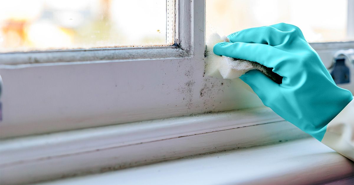
No one wants to hear this when they are in the fun stage of imagining chic new walls, but prep work matters as much as color. Maybe more. Designers and paint pros agree that cleaning, patching, sanding, and priming create the difference between a finish that looks polished and one that looks like it lost a fight with a roller.
Walls hold onto dust, oils, old nail patches, mystery scuffs, and other evidence of human life. If you paint right over all of that, even the most beautiful color can look uneven or cheap. Primer is especially important when you are making a major color shift, covering stains, or working with tricky surfaces. Deep tones often look richer over proper prep, while lighter shades cover more cleanly when they are not battling the ghosts of previous paint jobs.
Think of prep as the skin-care routine of painting. You can buy great makeup, but if the base is a mess, everyone will know.
7. Sheen Is a Design Decision, Not a Boring Technical Detail
Paint sheen affects more than shine. It changes durability, cleanability, and even how color appears. Lower sheens tend to hide imperfections and feel softer. Higher sheens reflect more light, clean more easily, and call more attention to surface texture. That means sheen has both practical and visual consequences.
For living rooms and bedrooms, eggshell or satin often strikes the right balance between elegance and everyday performance. In kitchens, baths, trim, and cabinetry, more durable finishes tend to make sense because splashes, fingerprints, and general household chaos are not theoretical. They are very real and often sticky.
One smart lesson from current design guidance is that you can also use sheen strategically within a monochromatic space. A matte wall with slightly glossier trim keeps the look cohesive while adding subtle depth. So yes, sheen may sound unglamorous. But ignore it, and you may end up with the right color in the wrong costume.
8. The Ceiling Is the Fifth WallUse It
This may be the most delightful paint lesson to come out of RS Home: stop treating the ceiling like a blank afterthought. Designers are increasingly using ceilings as active design surfaces, whether with a crisp reflective white, a soft continuation of the wall color, or a bold statement that adds personality overhead.
Painting the ceiling can make a room feel more intentional and immersive. A lighter ceiling can bounce light and lift the space. A matching ceiling can blur edges and create a cocoon effect. A ceiling accent can add whimsy or architecture where none existed before. In RS Home-inspired spaces, ceiling paint wasn’t a gimmickit was a finishing move.
If you’ve never looked up and considered your options, you may be leaving one of the easiest high-impact design tools untouched. Ceilings deserve better than automatic white by default. Sometimes the room is begging you to look up.
9. Color Drenching Can Make a Room Feel Bigger, Richer, and Smarter
Color drenchingpainting walls, trim, and sometimes ceiling in one hue or closely related toneshas gone from trend to serious designer strategy. And for good reason. It reduces visual breaks, creates cohesion, and can make small rooms feel surprisingly expansive because the eye is not stopping at contrasting trim lines every three seconds.
This approach works especially well in studies, libraries, powder rooms, and bedrooms where atmosphere matters more than crisp contrast. It can feel moody, enveloping, and sophisticated without requiring much architectural drama. In fact, it often helps ordinary rooms feel more special.
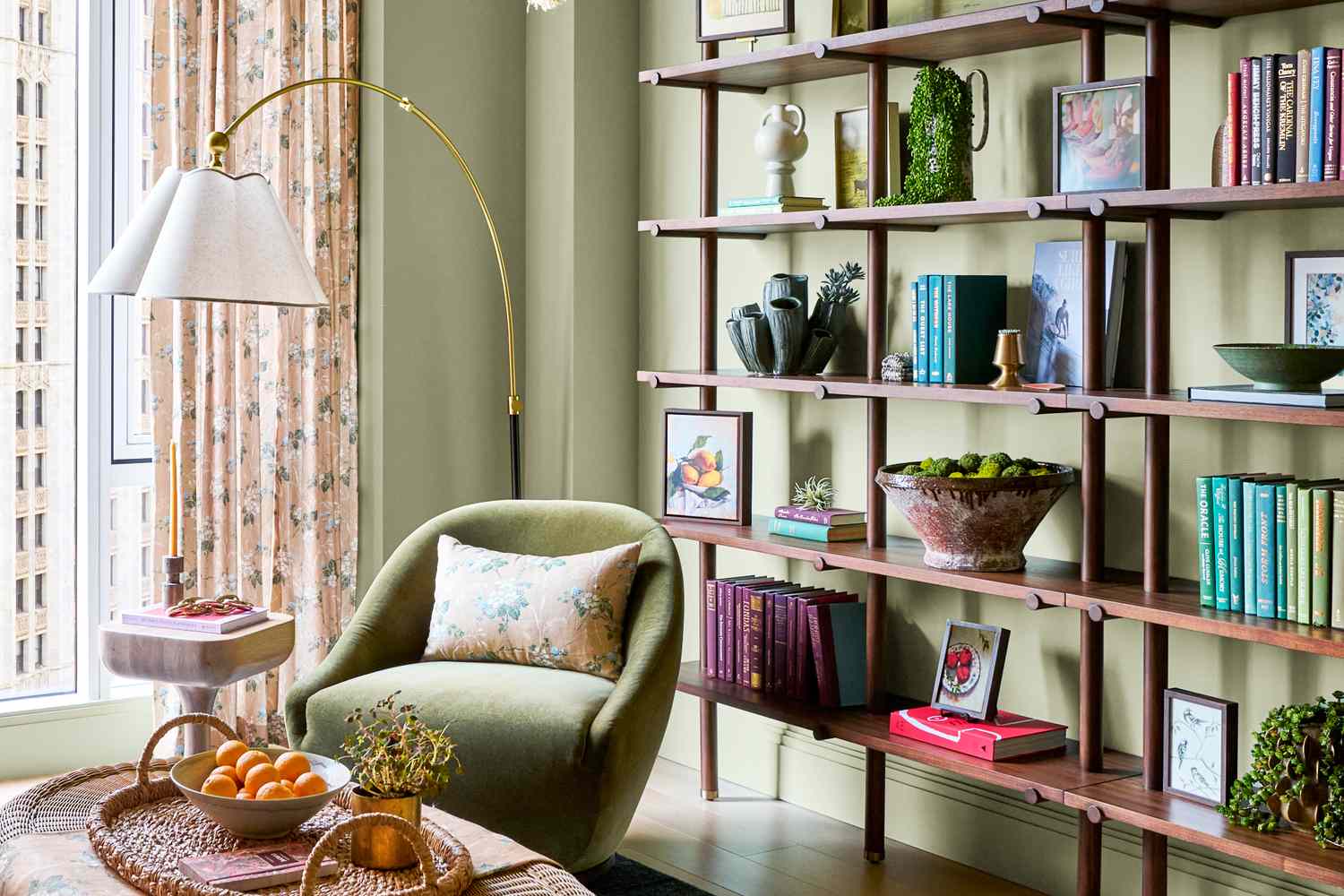
That said, color drenching is not an excuse to skip nuance. Texture, lighting, and finish still matter. A room drenched in a soft green, earthy brown, dusty blue, or muted clay can feel layered and elegant when furnishings, metals, textiles, and art create contrast. Monochrome does not mean monotone. It means the room is singing in one key instead of auditioning for ten.
10. Whole-House Flow Beats One-Room Randomness
The final lesson is one homeowners often learn the hard way: a beautiful room can still feel wrong if it has nothing to do with the rest of the house. Designers often think in terms of flow, not isolated moments. That doesn’t mean every room should be the same color. Please, no. That’s not serenity; that’s surrender.
It does mean your palette should have some connective tissue. Maybe that is a shared undertone, a recurring earthy quality, a consistent softness level, or a deliberate progression from light public spaces to moodier private ones. Hallways, stairwells, and adjoining rooms matter because they create transition. Paint should help your home move, not stutter.
A useful approach is to choose a “central” room or anchor color story first, then build outward. This keeps the house from feeling like each room was painted by a different committee during a caffeine emergency.
How to Apply These Paint Lessons in Your Own Home
If you want the fast version, here it is: define the mood, assess your fixed finishes, test large samples, observe light, prep properly, choose the right sheen, and decide whether the ceiling and trim should blend or contrast. That’s the real paint playbook.
For a small living room, you might use a warm, soft wall color with satin or eggshell finish, hang window treatments high, and avoid a harsh trim contrast if the goal is openness. For a home office, a muted color-drenched scheme can create focus and intimacy. In a kitchen, cleaner-friendly sheen matters more than abstract ideals. In a bedroom, softness and light behavior may matter more than trend reports.
The larger point is this: great paint choices are not about being brave enough to choose navy or safe enough to choose cream. They are about choosing deliberately. Once you understand the rules, you can bend them with style instead of breaking them by accident.
Real-Life Experiences These Paint Lessons Create
What makes these paint lessons so memorable is that they show up in real life almost immediately. You feel them before you can name them. Walk into a room where the undertones work, and everything seems calmer, more expensive, and somehow more put togethereven if your coffee table still has a suspicious stack of unopened mail on it. Walk into a room where the paint ignored the light, and suddenly every object looks like it arrived from a different zip code.
One of the most common homeowner experiences is discovering that the “perfect” store sample was never actually the right answer. People bring home a color they loved under retail lighting, put it on the wall, and watch it morph into something dramatically cooler, darker, or more yellow than expected. That moment is annoying, yes, but it is also educational. After that, sampling feels less optional and more like basic adult survival.
Another experience many people describe is how transformative ceiling paint can be. A formerly forgettable room suddenly feels intentional once the ceiling is treated as part of the design. In a child’s room, that might mean a playful painted shape overhead. In a den or office, it might mean carrying the wall color upward to create a cocoon effect. The room does not necessarily feel louder; it feels more finished. It feels designed.
Color drenching creates its own kind of revelation. People often expect one-color rooms to feel flat, but the opposite is usually true when it’s done well. The walls recede, the architecture softens, and furniture and texture begin to matter more. Bookshelves feel richer. Curtains feel intentional. Lamps and artwork stop floating awkwardly and start belonging. Many homeowners say a color-drenched room becomes the one they want to spend the most time in, because it feels collected and calm rather than visually busy.
Then there is the prep-work lessonthe least glamorous and maybe the most humbling. Nearly everyone who has skipped sanding, patching, or priming has had the same experience: regret with a roller handle. The finish looks streaky. Old marks show through. The new color never quite settles in. By contrast, a well-prepped room takes paint beautifully, and even a modest color looks elevated. That is often the moment people realize paint results are not only about the color itself. The foundation changes everything.
Perhaps the most satisfying experience of all comes from getting the whole-house flow right. Instead of each room feeling like a separate experiment, the home begins to feel connected. You move from entry to hall to living space without visual whiplash. Nothing has to match exactly, but everything feels like it belongs to the same story. That kind of harmony is hard to fake and easy to live with.
In the end, these paint lessons are life-changing because they replace guesswork with confidence. They teach you how to see a room before the roller hits the wall. And once you learn that skill, paint stops feeling risky. It starts feeling powerful.
Conclusion
The biggest takeaway from RS Home designers is wonderfully liberating: great paint is not about memorizing trendy shades or blindly following whatever color is having a moment online. It is about understanding how paint interacts with light, architecture, furniture, function, finish, and feeling. Once you know that, your choices get smarter fast.
So the next time you think about repainting a room, don’t ask only, “What color should I choose?” Ask what the room needs to do, how it should feel, what already lives there, and whether the ceiling deserves a little more respect. Paint can still be fun, dramatic, and creative. But the rooms that really work? They usually have a strategy hiding under all that beauty.