After months of lockdowns, video calls, lonely birthdays, fogged-up glasses, and treating a trip to the grocery store like an expedition to Mars, imagining life after the pandemic became a strangely emotional exercise. Would people rush back into crowded restaurants? Would masks disappear overnight? Would anyone remember how to make small talk without first saying, “You’re on mute”?
Illustrator and School of Visual Arts instructor Tomer Hanuka turned those questions into a class assignment. He asked his third-year illustration students to create conceptual magazine covers envisioning a post-pandemic world in the visual spirit of The New Yorker. The results were thoughtful, polished, funny, hopeful, and occasionally devastating.
When Hanuka shared 17 of the student illustrations online in April 2021, the collection quickly went viral. The images looked professional enough to be mistaken for real magazine covers, prompting the artists to replace the familiar masthead with the clever title Old New World. That small change also captured the project’s central idea: society might reopen, but it would not simply return to the world it had left behind.
Why the Student Covers Connected With So Many People
A successful editorial illustration rarely explains everything. Instead, it presents one carefully chosen moment and lets the viewer complete the story. A deserted office chair, an empty place at a dinner table, a vaccination bandage, or a mask slipping below someone’s nose can carry more emotional weight than an entire page of statistics.
That is exactly what these student artists accomplished. They avoided drawing one generic “pandemic experience” because no such experience existed. Some people were desperate for crowded dance floors. Others were grieving. Some discovered cycling, gardening, or a suspiciously intense relationship with their houseplants. Many wanted normal life back while simultaneously feeling nervous about stepping into it.
The covers capture those contradictions without turning them into a lecture. They show that reopening was not a single grand event accompanied by trumpets and a coupon for free appetizers. It was a series of small, awkward transitions: opening a door, boarding a plane, smelling a flower, hugging someone again, or realizing that the cat preferred the work-from-home arrangement.
The 17 Best Post-Pandemic Magazine Covers
1. Dou Hong: A Park Bench Shared With Memory
Dou Hong’s illustration shows a woman sitting beneath pink blossoms in a busy city park. Beside her is the silhouette of an absent companion, formed from the names of people lost to COVID-19. Around them, picnics and ordinary park life have resumed.
The contrast is quietly powerful. The world is moving again, yet grief remains seated beside those who survived. Instead of treating reopening as an uncomplicated victory, the image acknowledges that joy and loss can occupy the same bench.
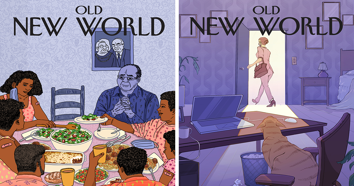
2. Jane McIlvaine: The Work-From-Home Era Ends for Everyone Except the Cat
Jane McIlvaine portrays a woman leaving a purple-toned home office and walking into a brightly lit hallway. Behind her, a cat sits in the abandoned desk chair, staring after the departing human with the unmistakable expression of a manager who was not consulted about the new schedule.
The scene is humorous, but it also reflects a real change in domestic life. Pets became office colleagues, lunch supervisors, and unlicensed therapists during lockdown. Returning to outside workplaces meant another adjustment for households that had developed new routines.
3. Amy Young: A Family Dinner With an Empty Chair
Amy Young’s cover gathers a family around a table filled with food. Several people have vaccination bandages on their arms, and one diner has lowered a mask. An empty chair remains visible beneath a framed portrait of an older couple.
The warm colors suggest reunion, while the cooler background and vacant seat preserve the presence of those who cannot return. It is a beautifully layered portrait of celebration complicated by remembrancethe emotional equivalent of laughing at dinner and then suddenly falling quiet.
4. Lauren Van Stone: Climbing Out of the Video Call
Lauren Van Stone transforms remote learning into a literal escape scene. A masked student carrying a backpack climbs out of a glowing video-call window while other figures step across the laptop keyboard. The familiar red “Leave” button waits nearby like a tiny emergency exit.
The image captures the strange tension surrounding the return to physical classrooms. Students longed to escape their screens, but reentering crowded schools also brought uncertainty. Van Stone gives that mixed feeling movement, humor, and a pair of determined sneakers.
5. Huahua Cui: Nature Reclaims the Classroom
Huahua Cui imagines students returning to a classroom that has been overtaken by thick greeneryand apparently a few prehistoric visitors. Leaves spill across desks while masked newcomers cautiously enter the space.
The fantastical scene exaggerates how long classrooms seemed to sit unused. It also suggests that the old educational environment cannot simply be restarted like a dusty computer. Too much time has passed, too much has changed, and somebody may need to remove the dinosaur before first period.
6. Chenmiao Shi: Smelling the Flowers Again
Chenmiao Shi’s delicate illustration shows a young woman lowering her mask just enough to breathe in the scent of magnolia blossoms. Soft blues, greens, and pinks turn a tiny sensory experience into a major event.
After a period defined by distance and caution, the image celebrates the rediscovery of ordinary pleasures. It also carries a subtle reference to one of the virus’s most discussed symptoms: the loss of smell. Here, fragrance becomes evidence of health, spring, and the possibility of renewal.
7. Jungwoo Lee: The First Embrace
Jungwoo Lee depicts two masked people holding each other tightly, each wearing a fresh vaccination bandage. Their surroundings resemble an airport or transportation terminal, suggesting a long-awaited reunion after travel restrictions and separation.
The masks remain, but they do not diminish the intimacy. Instead, the image recognizes that safety precautions and affection were not opposites. Sometimes love looked like an embrace; sometimes it also looked like bringing hand sanitizer.
8. Jiaci Grace Qiu: Romance Returns to the Big Screen
Jiaci Grace Qiu places viewers inside a dark movie theater, where a giant on-screen kiss towers above a sparse audience. The few moviegoers sit far apart, surrounded by many empty seats.
The cover combines nostalgia and awkwardness. Cinemas could reopen, but the communal movie experience initially remained cautious and incomplete. The exaggerated kiss also feels almost shocking after a year in which standing six feet from another person counted as excellent manners.
9. Fan Zhang: Coming Home to a Room That Moved On
Fan Zhang shows a masked student returning with luggage to a dorm-like room reclaimed by plants and cats. Vines climb the furniture, greenery reaches toward the ceiling, and the resident animals appear to have established their own government.
The image speaks to students who left campuses suddenly and stayed away far longer than expected. Returning to an old room could feel less like coming home and more like visiting an archaeological site containing textbooks, abandoned mugs, and one extremely judgmental cat.
10. Milly Wen: The Return of Travel
Milly Wen organizes the post-pandemic dream into three soft, cinematic panels: a hand holding an airline ticket, a traveler moving beneath blooming trees, and a discarded mask drifting through bright water.
The cover conveys motion after a year of confinement. Travel is presented not merely as tourism but as the return of possibilitythe freedom to choose a destination, miss a train, overpack three pairs of shoes, and complain about airport coffee like a fully restored citizen.
11. April Xinyu Chen: Nightlife, Now With Coordinated Masks
April Xinyu Chen imagines a glamorous bar where patrons socialize in decorative masks. The city glitters outside, drinks are served, and people are once again dressed for an evening that does not involve sweatpants or staring into the refrigerator.
Rather than making masks disappear, the illustration turns them into fashion accessories. That decision feels both playful and perceptive. The post-pandemic world would not erase every new habit; some precautions might remain, accessorized with embroidery and paired with a cocktail.
12. Katrina Catacutan: Opening the Door to Human Contact
Katrina Catacutan fills an apartment with hanging vines, potted plants, and the evidence of intense indoor nesting. A casually dressed resident opens the door to a visitor carrying flowers, creating a funny and tender snapshot of social life restarting.
The scene suggests that isolation changed both homes and personal standards. After months indoors, welcoming someone inside again could feel thrilling, alarming, and important enough to require flowerseven when one person had apparently forgotten that visitors usually justify wearing pants.
13. Yijun Cai: Vaccination as the Main Event
Yijun Cai stages a vaccination beneath a dramatic beam of light. A healthcare worker administers the shot while waiting figures gather in darker foreground tones, some reduced to almost digital or fragmented forms.
The composition gives a routine medical procedure the atmosphere of a theatrical climax. In early 2021, a tiny syringe carried enormous symbolic weight. It represented protection, reunion, mobility, and perhaps the eventual freedom to stop discussing everyone’s sourdough starter.
14. Yushan Zhou: Happiness Does Not Resume on Command
Yushan Zhou creates a sunny public park where families picnic and children play around a fountain. In the foreground, however, a crying girl sits beside a Dalmatian, separated emotionally from the cheerful scene behind her.
The cover reminds viewers that reopening could not automatically repair loneliness, trauma, or grief. Public spaces may become lively again while individuals continue to struggle privately. It is one of the series’ clearest statements that “back to normal” was never a universal emotional setting.
15. Penni Xiaoyi Peng: Social-Distance Circles Become Ghosts
Penni Xiaoyi Peng takes a more abstract approach, showing an elevator or enclosed floor marked by footprints and green distancing circles. Shadowy traces suggest people who once stood carefully separated from one another.
The minimal composition turns public-health markings into historical remains. Floor stickers that once controlled every line and elevator ride become visual fossilsevidence of a period when choosing the correct circle felt like participating in a very serious, very slow game show.
16. Zoe Stengel: Bicycles Take Over the Streets
Zoe Stengel imagines a city intersection overflowing with cyclists weaving around stalled taxis and cars. The street belongs to human-powered transportation, while familiar yellow cabs appear increasingly boxed in.
The cover reflects how pandemic-era streets changed as people searched for safer ways to commute and spend time outside. It also proposes a greener urban future. The city has not become quieter, exactly; it has simply replaced some honking with bicycle bells and enthusiastic discussions about helmet ventilation.
17. Ruoxi Jiang: A Bright, Almost Magical New Beginning
Ruoxi Jiang closes the collection with a dreamlike outdoor scene featuring a girl, a giraffe, flowers, and clouds of colorful butterflies. The palette is light and joyful, replacing confinement with open space and movement.
Unlike the more somber entries, this cover embraces uncomplicated hope. Its fantasy does not pretend that hardship never happened. Instead, it imagines what emotional freedom might feel like after fear: oversized, sunny, slightly impossible, and filled with enough butterflies to concern a professional lepidopterist.
What Makes These Faux New Yorker Covers So Effective?
The students understood the essential strength of a classic illustrated magazine cover: it must communicate quickly while rewarding a second look. None of these images needs a headline explaining “Society Has Complicated Feelings About Reopening.” The visual details perform that work.
The redesigned Old New World masthead also strengthens the collection. It acknowledges the artistic tradition inspiring the assignment while clearly separating the student concepts from official covers. More importantly, the phrase describes the cultural mood. The reopened world looked familiar, but every familiar setting carried new associations.
Airports meant both adventure and risk. Classrooms represented connection and anxiety. A bandage on the upper arm became a social symbol. Empty chairs felt louder. Even flowers, movie theaters, and dinner tables acquired emotional significance after people had been denied ordinary access to them.
Experiences and Lessons Inspired by the Project
Looking back at these illustrations is an experience in itself because they preserve feelings that are already becoming difficult to describe. Memories of major events often shrink into a few official images, dates, and statistics. Everyday sensations disappear first: the nervous pause before hugging someone, the relief of hearing restaurant noise, or the almost ridiculous excitement of buying an airline ticket.
The student covers restore those small experiences. Chenmiao Shi’s magnolia blossoms recall the first time many people deliberately stopped to smell something outdoors without rushing home. Lauren Van Stone’s video-call escape captures the physical exhaustion of living inside rectangles. Jane McIlvaine’s cat reminds us that human routines were not the only ones disrupted when homes stopped functioning as offices, classrooms, gyms, restaurants, and highly unsuccessful hair salons.
One useful lesson for artists and writers is that broad themes become memorable through specific details. “The pandemic changed education” is accurate but abstract. A student climbing out of a laptop is immediate. “Families experienced loss” is true but general. An empty chair beside a crowded dinner table makes the idea personal without spelling it out.
The assignment also demonstrates why humor belongs beside serious subjects. Humor does not necessarily minimize pain. In many of these works, it makes emotional complexity easier to approach. The pants-free host, the cat occupying an office chair, and the overgrown classroom offer moments of relief without pretending the larger experience was easy.
For students, the project provides a strong example of concept-driven design. Technical skill matters, but polished drawing alone does not guarantee an effective editorial image. Each cover needs a visual argument. What changed? What remained? Which single scene represents that tension? The strongest concepts can usually be summarized in one sentence, even when their emotional meanings continue unfolding after the viewer looks away.
There is also something fitting about students interpreting a historical transition while still living through it. They were not examining the pandemic from a comfortable distance. Remote classes, uncertain careers, interrupted social lives, and changing cities were part of their immediate reality. That proximity gave the work urgency and authenticity.
At the same time, revisiting the series years later changes how it reads. Some predictions proved temporary, while others became lasting features of urban and professional life. Video meetings did not vanish. Flexible work remained important. Cycling infrastructure continued to be debated. Masks became less common in many settings but stayed familiar rather than strange. The “new world” turned out to be neither completely transformed nor neatly restored.
Perhaps that is why the project remains compelling. It does not offer one confident forecast. It presents 17 possibilities, each shaped by a different personality and lived experience. Together, they show that collective history is never experienced collectively in exactly the same way.
Conclusion
The 17 post-pandemic magazine covers created by Tomer Hanuka’s illustration students succeeded because they found visual language for feelings many people had not yet learned to name. Their images balance optimism with grief, freedom with hesitation, and sincerity with just enough humor to keep the emotional temperature manageable.
These were not official New Yorker covers, but they captured the spirit of thoughtful editorial illustration remarkably well. More than speculative designs, they became snapshots of a historical threshold: the moment society began opening its doors while wondering what, exactly, would be waiting outside.
Note: The artworks discussed here were conceptual student projects inspired by the visual tradition of The New Yorker. They were not commissioned, selected, or published as official covers by the magazine.