Responsible note: This article discusses Napa Valley hospitality, design, and winery culture for readers of legal drinking age. Policies, ownership, and visitor experiences can change, so readers should verify current details through official channels before planning any visit.
A Napa Valley Shoppe With a Wink, a Stripe, and a Story
Some places in Napa Valley arrive wearing linen and speaking softly about terroir. Swanson Vineyards’ Sip Shoppe arrived like a guest who brought dessert, wore red stripes, and somehow made the room more interesting before saying a word. It was not merely a tasting-room idea. It was a retail mood, a design joke with excellent posture, and a reminder that luxury does not always need to whisper. Sometimes it can giggle politely behind a painted screen.
The phrase “Shopper’s Diary” fits because the Sip Shoppe was never only about what sat in a glass. Its true magic lived in the browsing: the visual drama, the unexpected gifts, the decorative oddities, the candy-shop-for-grown-ups atmosphere, and the sense that Napa Valley could be elegant without being stiff. In a region famous for polished estates and serious wine language, Swanson’s playful space offered a different kind of sophistication. It said: yes, craftsmanship matters, but so does charm.
Swanson Vineyards itself has a long Napa Valley story. Founded in 1985 by W. Clarke and Elizabeth Swanson, the brand became known for handcrafted Pinot Grigio, Merlot, Alexis Cabernet Sauvignon, and small-lot wines. The family name carried cultural recognition far beyond wine, but in Napa the Swanson identity developed around hospitality, conversation, and a salon-like sense of welcome. That foundation made the Sip Shoppe feel less like a gimmick and more like a natural extension of the family’s personality.
The Legacy of Swanson Vineyards
To understand why the Sip Shoppe mattered, it helps to understand Swanson Vineyards’ place in Napa Valley. The brand was founded during an era when Napa was moving from respected regional destination to global luxury landmark. Instead of following the predictable script completely, Swanson leaned into Merlot, elegance, and intimate hospitality. In a valley where Cabernet Sauvignon often hogs the spotlight like a lead actor who refuses to leave the stage, that choice gave Swanson a distinctive voice.
The winery’s identity blended Midwestern entrepreneurial roots, Southern-influenced entertaining, and California wine-country polish. That combination gave the brand unusual texture. It was refined, yes, but never allergic to fun. The official Swanson story emphasizes intimate settings inspired by old-fashioned salons, where conversation was as important as what was served. That idea explains why the Sip Shoppe felt so memorable: it translated salon culture into a retail environment with a mischievous grin.
Ownership has evolved over time. Swanson became part of Vintage Wine Estates and later joined the Foley Family Wines portfolio. For readers discovering the Sip Shoppe through older travel and design coverage, this matters. The Sip Shoppe is best understood today as a celebrated chapter in Swanson’s hospitality history rather than a guaranteed current visitor experience. Its influence, however, remains useful for anyone studying Napa Valley design, boutique retail storytelling, or the art of making a brand feel unforgettable.
What Made the Sip Shoppe Different?
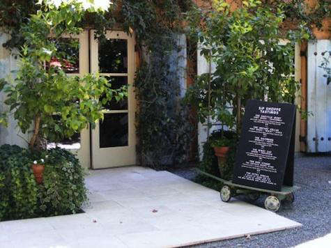
The Sip Shoppe stood apart because it refused the beige-and-barrel routine. Many winery spaces lean on stone walls, dark wood, iron chandeliers, and the universal design language of “someone wealthy has a very large table.” Swanson went in another direction. Reports and design features described bold red-and-white striped interiors, whimsical accents, unusual objects, playful gift displays, and a setting that felt part French Quarter parlor, part candy store, and part artful Napa fever dream.
That visual confidence mattered. The Sip Shoppe showed that a winery retail space could have a point of view beyond rustic luxury. It could be theatrical without being tacky. It could display sweets, stationery, small gifts, and decorative curiosities while still supporting a premium brand. In other words, it understood something many shops forget: people remember how a place made them feel long after they forget the exact shade of the floor.
Alexis Swanson Traina, often credited as a creative force behind the concept, helped shape the shop’s playful personality. The space reportedly involved notable creative collaborators, including figures from fashion, illustration, interiors, and specialty food. That cross-disciplinary approach gave the Sip Shoppe a layered quality. It did not look as if a winery had asked, “Where should we put the cash wrap?” It looked as if someone had asked, “What would happen if a party, a boutique, and a storybook all shared a lease?”
Rutherford: The Napa Valley Setting Behind the Shoppe
The setting also helped. Swanson Vineyards was associated with Rutherford, one of Napa Valley’s most storied areas. Rutherford sits near the heart of the valley floor and is known for warm sunshine, cool evenings, historic vineyards, and a graceful rural atmosphere. The region is often linked with the famous phrase “Rutherford Dust,” a poetic way of describing the fine-grained texture and earthy character associated with many local wines.
Rutherford’s personality is rustic yet refined. That phrase could also describe the best parts of Swanson’s hospitality style. The valley around it offers vineyard views, historic estates, comfortable restaurants, and the kind of scenery that makes visitors suddenly interested in slow living. Even a simple drive through the area can feel cinematic, especially when the afternoon light starts behaving like it has hired a publicist.
Against that backdrop, the Sip Shoppe’s whimsy became even more effective. The contrast between classic Napa landscape and carnival-striped interior created a memorable tension. Outside: vines, sunlight, gravelly soils, and agricultural tradition. Inside: color, wit, decorative surprise, and gifts that seemed chosen by someone who understood both luxury and punch lines. The result was not a rejection of Napa tradition. It was a wink at it.
A Retail Experience Built on Storytelling
Great shops do not merely sell things. They arrange objects into a world. The Sip Shoppe understood this beautifully. Its genius was not simply that it had attractive items; many boutiques do. Its genius was that every detail appeared to support a narrative. Visitors entered a version of Swanson where elegance had loosened its collar and decided to have fun.
The decorative language mattered: striped fabric, garden details, art, curiosities, and stylized displays. Together, they created a sense of discovery. A person could move through the space as if turning pages in a very stylish picture book. This is one reason the Sip Shoppe has continued to appear in design-minded travel writing years after its initial buzz. It gave writers and visitors something concrete to remember. “Nice tasting room” is forgettable. “Candy-striped Napa salon with birdcages, witty gifts, and theatrical charm” has legs.
For modern retailers, the lesson is clear. A boutique does not need to be huge to feel rich. It needs coherence. It needs contrast. It needs a reason for someone to take a second look. The Sip Shoppe combined product, place, personality, and photography-ready design before “Instagrammable” became a word people said in meetings while pretending not to care about Instagram.
The Design Appeal: High-Low, Fancy-Fun, and Fully Memorable
One of the most appealing parts of the Sip Shoppe story is its high-low sensibility. It mixed refined Napa hospitality with playful items and unexpected pairings. Vintage-style details could sit near cheeky gifts. Elegant service could coexist with candy-shop color. This approach made the space feel curated rather than decorated. There is a difference. Decoration fills a room. Curation gives it a pulse.
The best high-low design works because it respects both sides. The “high” elements prevent the room from becoming silly. The “low” elements prevent it from becoming self-important. Swanson’s Sip Shoppe seemed to understand that balance. It could be decadent without becoming cold, stylish without becoming sterile, and humorous without looking like a theme restaurant that had made one too many decisions after midnight.
That balance is especially important in Napa Valley, where luxury can sometimes feel intimidating to first-time visitors. The Sip Shoppe lowered the emotional temperature. It invited people into a premium setting through color and wit. Instead of asking visitors to prove they knew the vocabulary, it gave them something to smile about first. From a hospitality perspective, that is powerful. A relaxed guest is more likely to enjoy the story, remember the brand, and speak about the experience later.
Why Design Lovers Still Talk About the Sip Shoppe
Design lovers remember spaces that break pattern. The Sip Shoppe did exactly that. In a landscape of handsome but familiar wine-country interiors, it offered a different visual grammar. Its stripes, decorative oddities, and theatrical details made it feel closer to a boutique hotel lounge or eccentric European shop than a standard winery stop. That is why it fit naturally into design publications and stylish travel guides.
The space also understood emotional contrast. Napa Valley can be deeply beautiful, but visitor experiences sometimes blur together: vineyard, counter, glass, polite explanation, purchase decision, repeat. The Sip Shoppe interrupted that rhythm. It gave people a new scene. It created a memory hook. For content creators, editors, and travelers, that is gold. For everyone else, it is simply more fun than another beige wall.
In SEO terms, this gives the topic strong long-tail potential. Phrases like “Swanson Vineyards Sip Shoppe,” “Napa Valley retail design,” “Rutherford Napa Valley hospitality,” and “wine country design inspiration” naturally connect the brand story with design, travel, and lifestyle search intent. The article does not need to stuff keywords like grapes into an overfilled tote bag. The subject already contains rich semantic territory.
Shopper’s Diary: What the Sip Shoppe Teaches About Taste
A shopper’s diary is not just a list of items. It is a record of atmosphere. The best shopping experiences are emotional postcards: the color of the walls, the texture of a table, the odd little object that made no sense until suddenly it made the whole room make sense. Swanson’s Sip Shoppe had that quality. It made browsing feel like participation in a miniature world.
The lesson for shoppers is to notice the story behind the shelf. Why are these objects together? What mood do they create? What does the space say about the people who built it? At the Sip Shoppe, the answers pointed toward humor, hospitality, and creative confidence. It was not trying to be every winery experience. It was trying to be itself, loudly enough that nobody could confuse it with the place down the road.
That individuality is the heart of memorable travel. People rarely return home saying, “You would not believe how adequately neutral that room was.” They talk about the birdcages, the stripes, the garden, the strange little gift that made them laugh, the way a formal category suddenly felt approachable. The Sip Shoppe gave visitors language. It turned a stop into a story.
How the Sip Shoppe Fits Modern Napa Valley
Napa Valley has changed significantly since the Sip Shoppe first attracted design and travel attention. Visitor expectations have shifted. Winery ownership has consolidated in some areas. Experiences are often more structured, more premium, and more carefully managed. At the same time, travelers increasingly seek places with personality. They want beauty, but they also want specificity. They want a sense that the experience could not be copied and pasted anywhere else.
That is where the Sip Shoppe remains relevant. It anticipated a modern hospitality truth: guests remember brands that behave like characters. A clear point of view can be more powerful than a long list of amenities. Swanson’s playful retail chapter showed how a wine-country brand could use design to communicate values: conviviality, elegance, wit, abundance, and a little harmless mischief.
For Napa Valley as a whole, the Sip Shoppe stands as a reminder that heritage and imagination do not have to compete. A place can respect agricultural tradition while still embracing theatrical retail. It can be rooted in Rutherford and still look like it wandered in from a stylish carnival. That mix is difficult to pull off, which is exactly why it remains interesting.
Experience Notes: A Longer Shopper’s Diary From the Napa Valley Imagination
Imagine approaching a Napa Valley property expecting the usual cues: vines in neat rows, gravel underfoot, sunlight sliding over the hills, and the soft choreography of people trying to look relaxed while secretly checking whether they made the reservation correctly. Then the mood changes. The space ahead does not behave like a standard tasting room. It has the confidence of a boutique, the color of a celebration, and the personality of a hostess who knows exactly where the good stories are hidden.
That is the kind of experience the Sip Shoppe represented. It offered the pleasure of surprise. In travel, surprise is underrated. Many destinations are beautiful, but beauty alone can become passive. Surprise asks the visitor to wake up. It says, “Look again.” A striped interior in wine country does exactly that. It breaks the expected rhythm and gives the visitor permission to enjoy the setting without performing expertise.
The shopper’s experience here is less about acquisition and more about attention. A well-designed shop teaches you how to look. You notice how color affects mood. You notice how a whimsical object can make a refined environment feel warmer. You notice how humor can make luxury more human. The Sip Shoppe’s decorative choices suggested that taste is not a narrow hallway; it is a room with many doors, and at least one of them may be painted red.
There is also a social dimension. A playful retail space gives people something to talk about immediately. Instead of opening with technical vocabulary or polite silence, guests can comment on the art, the stripes, the garden details, or the unexpected little goods arranged nearby. That creates connection. Hospitality begins before service; it begins when a room makes conversation easier.
For anyone studying lifestyle branding, this is the important takeaway: the Sip Shoppe made Swanson feel personal. It did not rely only on region, reputation, or product category. It created a recognizable atmosphere. The shop acted like a signature, and in a crowded market, a signature is priceless. People may forget a brochure, but they remember a place that looked brave enough to be odd.
The experience also reflects a broader Napa Valley truth. The region is not one single mood. It contains grand estates, family histories, agricultural labor, luxury resorts, roadside charm, old vineyards, new ownership groups, and design experiments that sparkle for a season and linger in memory for years. The Sip Shoppe belongs to that last category. It is part of Napa’s cultural scrapbook: a vivid page where retail design, family personality, and wine-country hospitality met under a striped canopy and decided not to be boring.
That may be the best reason to write about it now. Even as visitor offerings evolve, the Sip Shoppe remains useful as inspiration. It shows how a small space can create a large memory. It proves that shoppers respond to narrative as much as merchandise. And it reminds Napa Valley businesses that serious quality does not require a serious face at all times. Sometimes the smartest thing a brand can do is loosen up, set the table beautifully, and let a little fairy dust fall where it may.
Conclusion: The Lasting Charm of Swanson Vineyards Sip Shoppe
Swanson Vineyards’ Sip Shoppe in the Napa Valley remains a fascinating case study in hospitality, design, and boutique storytelling. It brought a sense of whimsy to Rutherford, blending salon-style elegance with bold retail imagination. More than a shop, it was a mood: playful, polished, eccentric, and deeply memorable.
For readers interested in Napa Valley culture, the Sip Shoppe offers a useful reminder that place matters. A strong design concept can transform a visitor experience from pleasant to unforgettable. A room can tell a story. A brand can have a sense of humor. And in a region often associated with seriousness and tradition, a little theatrical charm can be the detail everyone remembers.