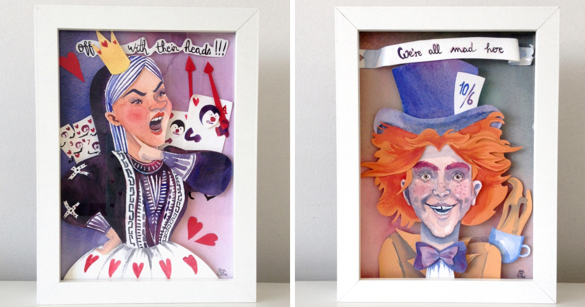
There are stories you read once and politely shelve, and then there are stories that quietly move into your brain, rearrange the furniture, paint the ceiling blue, and invite a rabbit with a pocket watch to live in the guest room. Alice in Wonderland belongs firmly in the second category. It is strange, funny, elegant, a little chaotic, and somehow still fresh after more than a century and a half of readers falling down the rabbit hole.
That is exactly why I decided to create a series of original Alice in Wonderland papercut and watercolor artworks. I wanted to make pieces that felt handmade, layered, and slightly mischievous, the way Wonderland itself feels. Instead of simply drawing Alice, the White Rabbit, the Cheshire Cat, or the Mad Tea Party in a predictable way, I wanted the paper to become part of the magic. The cut edges would act like shadows. The watercolor washes would become fog, moonlight, roses, tea steam, and nonsense made visible.
The result was a small collection of original mixed-media artworks that combine delicate papercutting with transparent watercolor painting. Each piece is inspired by the mood of Lewis Carroll’s classic world, but the compositions are my own: part storybook, part paper theater, part “why is there glitter in my coffee?” studio adventure.
Why Alice in Wonderland Works So Well as Papercut and Watercolor Art
Alice’s Adventures in Wonderland has always been visual. The story is filled with instantly recognizable scenes: Alice falling, changing size, meeting talking animals, attending the Mad Tea Party, facing the Queen of Hearts, and puzzling over creatures who speak in riddles. Even before modern movies and merchandise, the original illustrations by John Tenniel helped shape how generations imagined Wonderland.
But the best part of Alice is that it never belongs to just one image. Wonderland is a dream logic universe. A door can be too tiny. A cat can become a grin. A garden can behave like a royal courtroom. That flexibility makes the story perfect for handmade art, especially papercut and watercolor. Papercutting gives Wonderland crisp silhouettes and theatrical depth, while watercolor adds softness, movement, and surprise.
Watercolor is especially fitting because it has a mind of its own. You may think you are painting a calm blue wash, and suddenly the pigment blooms like it has received secret instructions from the Caterpillar. That unpredictability feels wonderfully appropriate. Wonderland should not look too controlled. It should feel like it might shift shape when you blink.
The Creative Concept Behind the Collection
My main idea was to create original Alice-inspired artworks that looked as if they were made from pages, shadows, and daydreams. I did not want flat fan art. I wanted layered pieces that invited the viewer to lean closer and discover small details: a tiny key, a teacup hidden in leaves, a crown-shaped shadow, a rabbit hole that looks deeper than the paper should allow.
The collection developed around three visual ingredients:
1. Storybook Silhouettes
Papercut art naturally works well with silhouettes. A black rabbit, a white dress shape, a crooked tree, or a line of playing cards can communicate a character quickly without overexplaining. I used silhouettes to create mystery rather than literal illustration. Sometimes Alice appears only as a small figure near a giant door. Sometimes the Cheshire Cat is suggested by a curved grin and floating eyes. Sometimes the Queen of Hearts appears through sharp red shapes rather than a full portrait.
2. Transparent Watercolor Atmosphere
Watercolor allowed me to build atmosphere behind and around the cut paper. Pale blues became moonlit hallways. Rose pinks and reds suggested the Queen’s garden. Tea-colored washes gave the Mad Hatter scenes a warm, vintage look. Soft greens and violets helped create an enchanted forest mood without making the artwork feel too heavy.
3. Layered Paper Depth
By placing cut elements over watercolor backgrounds, I could make each piece feel like a miniature stage. The paper layers cast tiny shadows, and those shadows matter. They make a flat sheet feel dimensional. In some artworks, the foreground is a cut-paper frame of vines, cards, clocks, or mushrooms. Behind it, watercolor creates the dreamlike world Alice is entering.
Materials I Used for the Alice in Wonderland Papercut Artworks
Good materials do not automatically make good art, but bad materials can absolutely make you question every life choice that led you to a cutting mat at midnight. For this project, I kept the materials simple but reliable.
Watercolor Paper
I used heavyweight watercolor paper because lighter paper tends to buckle when wet. A sturdy surface is important when a painting will later support cut-paper layers. Cold-pressed paper worked beautifully for backgrounds because it has enough texture to catch pigment without fighting the details.
Fine Art Paper for Cutting
For the papercut elements, I chose smooth acid-free paper in white, black, cream, and deep red. Smooth paper gives cleaner cuts, especially for tiny clock hands, playing card symbols, rabbit ears, and curling vines. Acid-free paper is also better for artworks meant to last.
Watercolor Paints
I used transparent watercolor paints for luminous washes. Wonderland needs glow, not mud. I leaned into blues, violets, soft greens, dusty pinks, gold ochre, and a few dramatic reds. The red was essential, of course, because the Queen of Hearts would not appreciate being represented in beige.
Cutting Tools
A sharp craft knife, replacement blades, a metal ruler, and a self-healing cutting mat were my best friends. Papercutting is not the place to be sentimental about dull blades. A dull blade tears paper, ruins curves, and generally behaves like it has been hired by the Queen to shout, “Off with the clean edges!”
Adhesive and Spacers
For assembly, I used archival glue for flat areas and small foam spacers when I wanted more depth. The spacers helped separate layers and create subtle shadows, especially in scenes with doors, trees, teacups, and character silhouettes.
Designing the First Artwork: Alice at the Tiny Door
The first artwork in the series focused on one of the most iconic Wonderland moments: Alice facing a tiny door. I wanted the scene to feel quiet, magical, and slightly funny. The idea of a child standing before an impossible doorway is already charming, but it also says something universal about curiosity. We have all faced a door that seemed too small, too strange, or too unlikely to open.
I painted the background with pale blue and lavender watercolor, letting the colors blend softly like a dream. Then I cut a large keyhole-shaped frame from cream paper. Inside the frame, I placed a small silhouette of Alice and a tiny golden door. Around the edges, I added cut-paper vines, miniature keys, and little bottle shapes labeled only with tiny blank tags. I avoided writing “Drink Me” directly because I wanted the piece to feel inspired rather than copied.
The most satisfying detail was the shadow behind the door. By slightly lifting the door layer, it looked as though there might truly be another world behind it. That small shadow did more storytelling than a paragraph of explanation could.
The White Rabbit: Motion, Panic, and a Pocket Watch
The White Rabbit artwork was pure fun. I wanted it to feel fast, fussy, and full of anxious energy. The challenge was creating movement with paper, which is, unfortunately, famous for standing still.
I solved this by cutting repeated clock shapes in different sizes and placing them in a swirling path behind the rabbit silhouette. The watercolor background used warm gray, pale yellow, and faint blue washes to suggest time spinning out of control. The rabbit itself was cut from white paper, with a tiny red waistcoat shape layered on top.
The pocket watch became the star detail. I cut it separately, painted it with gold watercolor, and attached it slightly raised from the rabbit’s paw. It is small, but it gives the piece personality. The whole artwork has the feeling of someone being late to a meeting that may or may not exist. Relatable, honestly.
The Mad Tea Party in Papercut Layers
The Mad Tea Party was the most complex piece in the collection because it involved multiple objects: teacups, saucers, chairs, hats, spoons, pastries, and a long table that absolutely refused to stay visually simple. This scene could easily become cluttered, so I treated it like a stage set.
The watercolor background was soft and warm, with tea-stained browns, peach, and faded green. I wanted it to feel like an old invitation card found in a drawer. The table and characters were cut from dark paper as silhouettes. Instead of making detailed faces, I focused on recognizable shapes: the Hatter’s tall hat, the March Hare’s ears, and the Dormouse tucked near a teapot.
I added tiny cut-paper steam curls rising from the cups. Those little curls were ridiculous to cut, and at one point one stuck to my sleeve and traveled around the room like a ghost noodle. Still, they were worth it. The steam made the scene feel alive.
The Queen of Hearts and the Garden of Red Roses
No Alice-inspired collection feels complete without the Queen of Hearts. For this artwork, I wanted bold contrast: white paper roses, red watercolor blooms, black thorny silhouettes, and a crown shape hovering like a warning sign.
The background began as a loose red and pink watercolor wash. While the paint was still damp, I dropped in deeper red pigment to create blooming effects. This gave the roses a slightly wild, uncontrolled look. Over the painted background, I layered cut-paper rose bushes and playing card symbols.
The Queen herself appears only as a dramatic shadow with a crown and heart-shaped collar. I liked this better than a full portrait because it made her feel larger than life. She becomes a force in the garden rather than just a figure standing in it.
The Cheshire Cat: Painting a Grin Without Overdoing It
The Cheshire Cat is tricky because the grin is famous. Too much detail can make it cartoonish; too little, and people might wonder why there is a suspicious banana floating in a tree. I wanted mystery, not confusion.
I painted a twilight forest background using violet, indigo, and deep green washes. Then I cut layered branches from black paper and placed them over the painted sky. The cat is not fully visible. Instead, the eyes and grin appear as pale cut-paper shapes tucked among the branches.
This piece may be my favorite because it changes depending on the angle. From far away, you see a moody forest. Up close, the grin appears. It feels like the artwork is keeping a secret, which is exactly what a Cheshire Cat artwork should do.
How Papercut and Watercolor Changed the Mood of Wonderland
Combining papercut and watercolor gave the collection a balance of control and chaos. Papercutting is precise. Every line is intentional. Watercolor is fluid and sometimes rebellious. Together, they create a visual conversation: structure versus surprise, edge versus bloom, logic versus nonsense.
That contrast fits Alice beautifully. The story is full of rules, but the rules keep changing. A trial has procedures, but the evidence is absurd. A tea party has manners, but nobody follows them sensibly. A garden has roses, but the roses may require emergency repainting. The medium itself helped express that playful instability.
Tips for Creating Your Own Alice in Wonderland Inspired Art
If you want to make your own Alice-inspired papercut and watercolor artwork, start small. Wonderland is enormous, but your first piece does not need to include every character, every mushroom, and a full legal transcript from the Queen’s courtroom.
Choose One Scene or Symbol
Pick one strong image: a key, a rabbit, a teacup, a rose, a door, a crown, a grin, a mushroom, or a playing card. A focused artwork is usually stronger than a crowded one.
Sketch Before Cutting
Plan your composition lightly before touching the craft knife. Papercutting rewards patience. It also punishes overconfidence with tiny torn rabbit ears.
Paint the Background First
Watercolor needs time to dry completely before paper layers are added. If you glue cut paper onto a damp background, the paper may warp, stain, or behave dramatically.
Use Contrast Wisely
Dark silhouettes over soft watercolor can look magical. White cut paper over saturated washes can feel delicate and elegant. Red accents are excellent for Queen of Hearts scenes, but use them with intention so they remain powerful.
Let Imperfections Add Charm
Handmade art does not need to look machine-perfect. A slightly uneven wash, a tiny wobble in a vine, or a soft pigment bloom can make the piece feel alive. Wonderland was never meant to be sterile.
Why Original Handmade Alice Art Still Feels Fresh
Alice has been adapted countless times, but handmade art keeps the story personal. Papercut and watercolor artworks do not try to compete with film, animation, or digital illustration. They offer something quieter and more intimate. You can see the blade marks. You can see the brush decisions. You can see where the pigment settled and where the paper lifted just enough to cast a shadow.
That handmade quality matters. In a world of fast images and endless scrolling, original paper art asks the viewer to slow down. It rewards attention. A tiny key hidden in the corner becomes a discovery. A layered rabbit hole becomes a question. A painted wash becomes a mood.
For me, making these Alice artworks was not only about illustrating a beloved story. It was about translating the feeling of curiosity into paper, color, and shadow. It was about making something that feels like opening a strange little door and finding, to your delight, that the room on the other side is bigger than expected.
Studio Experience: What I Learned While Making These Alice in Wonderland Papercut and Watercolor Artworks
Creating this collection taught me that Wonderland is not just a theme; it is a working method. The more I tried to control every detail, the less magical the artworks felt. The pieces improved when I allowed room for surprise. A watercolor bloom that appeared by accident became mist around the rabbit hole. A slightly crooked cut branch became perfect for the Cheshire Cat’s tree. A red wash that spread farther than planned turned into a dramatic rose garden. Apparently, Wonderland likes to supervise.
The most important lesson was patience. Papercutting looks peaceful from the outside, but inside the artist’s head there is often a tiny orchestra playing suspense music. One wrong move can slice through a detail you spent twenty minutes shaping. I learned to slow down, rotate the paper instead of forcing my hand into awkward angles, and replace blades often. Sharp tools made the work safer and cleaner, while rushing made everything worse.
I also learned that watercolor and papercut layers need to be planned as partners. At first, I painted backgrounds that were too detailed. They competed with the cut-paper silhouettes, and the final pieces felt busy. Once I simplified the watercolor areas, the papercut shapes had room to breathe. A soft wash behind a strong silhouette created more drama than a background full of tiny painted details.
Another experience that surprised me was how emotional the small symbols became. A key is just a key until it is placed beside a tiny door. A teacup is just a teacup until it sits on a long, strange table with mismatched chairs. A grin is just a curved shape until it floats in a dark tree. Working with simple symbols reminded me that visual storytelling does not always require complexity. Sometimes the smallest cutout carries the whole mood.
Framing the artworks also changed how I saw them. Before framing, the pieces felt like studio experiments. Once mounted with a little space between the layers and protected behind glass, they became miniature worlds. The shadows from the raised paper became more visible, and the watercolor looked softer. Presentation matters, especially for delicate mixed-media artwork.
If I made the series again, I would create even more depth with layered frames and perhaps experiment with translucent papers. Vellum clouds, pale moon shapes, or semi-transparent tea steam could add another dreamlike effect. I would also test larger formats because some scenes, especially the Mad Tea Party and the Queen’s garden, could become wonderfully theatrical at a bigger scale.
Most of all, this project reminded me why handmade art is so satisfying. It is slow, imperfect, and occasionally covered in mysterious scraps of paper that appear in your hair hours later. But it also gives you the joy of building a world with your hands. For an Alice in Wonderland project, that felt exactly right. Wonderland should not look mass-produced. It should look discovered, assembled, painted, cut, and slightly argued with over tea.
Conclusion
Making original Alice in Wonderland papercut and watercolor artworks was a joyful experiment in storytelling, texture, and controlled chaos. The combination of crisp cut paper and luminous watercolor gave each scene its own personality, from the anxious White Rabbit to the mysterious Cheshire Cat and the dramatic Queen of Hearts. What began as a simple art idea became a deeper exploration of how handmade techniques can reinterpret a classic story without losing its wonder.
That is the real magic of Alice: the story keeps opening new doors. Sometimes those doors are in books. Sometimes they are in paintings. And sometimes they are cut very carefully from paper while the artist whispers, “Please do not tear, please do not tear,” like a perfectly normal person.