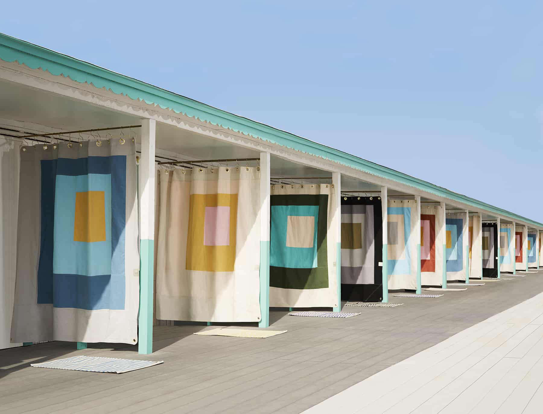
Some decorating ideas whisper politely from the corner. Josef Albers-style squares walk into the room, rearrange the furniture, and begin an energetic discussion about orange.
Inspired by the artist’s famous experiments with nested squares and interacting colors, this geometric decorating approach turns ordinary walls, rugs, pillows, cabinets, and tabletops into miniature lessons in perception. The shapes are simple enough for a ruler to understand, but the color relationships can make a flat surface appear deeper, warmer, brighter, or more animated than it really is.
The good news is that you do not need a museum budget or an advanced degree in color theory. You need a restrained palette, thoughtful proportions, a roll of painter’s tape, and the courage to admit that beige may require supervision.
Why Josef Albers-Style Squares Still Look Modern
Josef Albers spent decades exploring a deceptively basic question: What happens when one color sits beside another? His best-known Homage to the Square works used repeated square formats and solid fields of color to demonstrate that a hue never operates entirely alone. A gray can appear bluish beside orange, dull beside white, or surprisingly luminous beside black.
The format was consistent, but the visual results were remarkably varied. Nested squares could seem to advance, recede, glow, flatten, or vibrate depending on their neighbors. This is why an Albers-inspired room feels more sophisticated than a collection of random colorful rectangles. The objective is not merely to add bright paint. It is to create a controlled conversation among colors.
A Simple Shape With Serious Range
Squares work especially well in interiors because homes already contain them everywhere. Windows, cabinet fronts, tile grids, bookcases, cushions, frames, and rugs provide ready-made geometric structure. Repeating the form creates rhythm without introducing a fussy pattern.
The square is also visually neutral. It does not arrive with the romantic associations of a floral motif or the speed and movement of a diagonal stripe. It holds still and lets color perform the dramatic partwhich is useful when your mustard yellow is clearly auditioning for a leading role.
Color Interaction Matters More Than Matching
Traditional decorating advice often tells homeowners to “match” colors. An Albers-style approach asks a better question: How do the colors change one another?
Imagine a small coral square placed inside a tomato-red square. The coral may look pale and almost pink. Move the same coral into a field of cool blue, and it may suddenly appear warmer and more orange. Nothing about the original paint changed. Its context did.
This effect is valuable when designing a colorblocked interior because it allows a modest palette to produce more visual variety. Three carefully selected colors can feel richer than eight unrelated ones.
Build a Three- or Four-Color Palette
Begin with a dominant color, a supporting color, and one visual spark. A fourth shade can act as a bridge or neutral. Useful combinations include:
- Terracotta, apricot, cream, and deep brown
- Mustard yellow, olive green, warm white, and charcoal
- Cobalt blue, pale sky blue, rust, and sand
- Burgundy, dusty rose, tan, and muted coral
- Forest green, mint, black, and soft gray
For a calmer room, keep the colors close in value or temperature. For more energy, introduce a sharp light-dark contrast or place warm and cool hues together. Avoid choosing every color at maximum saturation unless you want the room to feel like four traffic cones arguing inside a toy store.
Where to Use Geometric Color Blocking Around the House
The Living Room: Start With One Strong Composition
A large living room wall offers the most obvious canvas. Paint three nested squares behind a sofa, sideboard, or reading chair. An off-center arrangement often feels more dynamic than a perfectly centered target. It also resembles the grounded proportions associated with many Albers compositions.
Keep the surrounding furniture simple. A low-profile sofa, a clean-lined coffee table, and solid-color upholstery will allow the wall to dominate without turning the room into a geometry convention.
Renters can achieve a similar effect with removable wall panels, framed painted boards, square textile hangings, or a grid of solid-color art prints. The goal is color interaction, not permanent evidence on a security-deposit inspection.
The Bedroom: Use Softer Transitions
In a bedroom, reduce contrast and intensity. Try a large clay-colored square behind the bed, a smaller blush square inside it, and a muted plum center. Another option is a tonal arrangement of sage, moss, and forest green.
The outer square can function like a painted headboard, framing the bed without adding bulky furniture. Extend the largest block slightly wider than the mattress and place its lower edge behind the headboard or bedding. This creates architectural presence while maintaining a restful atmosphere.
The Kitchen: Let Cabinets Join the Experiment
Kitchen cabinets already provide a grid, so they are natural candidates for geometric color blocking. Paint a bank of upper cabinets one color and the lower cabinets another, then use a contrasting island or pantry door as the central “square” in the composition.
For a smaller commitment, repaint only the recessed panels of selected cabinet doors. Mustard panels within cream frames can feel warm and retro, while navy panels in pale blue frames create a cooler, more tailored effect.
Use a durable, washable finish on cabinets and test the colors beside countertops, flooring, backsplash tile, and appliances. A green that looks sophisticated on a sample card can become surprisingly amphibian next to the wrong granite.
The Dining Room: Make the Table Part of the Artwork
A square dining table provides an ideal foundation for an Albers-inspired arrangement. Place a smaller square rug beneath it, use square placemats in another color, and add a compact centerpiece that echoes the geometry without becoming painfully literal.
A painted square on the ceiling above the table can also define the dining zone in an open-plan home. Choose a color found elsewhere in the room and frame it with a pendant light. The effect creates a visual room within the larger space.
The Bathroom: Think in Tile
Bathrooms offer one of the easiest ways to introduce nested squares because tile is already modular. Use a field of neutral square tile, create a larger contrasting block behind the vanity, and place a smaller colored section inside the shower niche.
Grout color adds another layer. Matching grout produces a unified field, while contrasting grout emphasizes the grid. In a small bathroom, limit the palette to two main hues and one neutral so the space feels intentional rather than assembled from the clearance aisle five minutes before closing.
Hallways and Entryways: Add a Geometric Welcome
Narrow transitional spaces can handle surprisingly bold color. Paint a sequence of overlapping squares along a hallway, or create a single nested-square composition around a console table in the entry.
These areas are ideal for experimentation because people pass through them rather than spending hours surrounded by the palette. A saturated orange that feels excessive in a bedroom may be delightful in a compact foyer.
How to Paint an Albers-Inspired Colorblock Wall
1. Sketch the Proportions
Measure the wall and draw it to scale on graph paper. Decide whether the squares will be centered, offset, aligned with furniture, or extended around a corner. Three nested shapes are usually enough. Four can work on a large surface, but additional layers may begin to resemble a malfunctioning spreadsheet.
2. Test Real Paint Samples
Digital color tools are useful for developing a palette, but screens cannot predict exactly how paint will respond to your room’s light. Apply large samples to poster board and move them around throughout the day. Observe them in morning daylight, afternoon sun, and artificial evening light.
Place the sample colors directly beside one another. Evaluating them separately defeats the purpose because their relationship is the design.
3. Paint From the Outside In
Apply the largest color field first and allow it to dry fully. Measure the second square carefully, use a level to mark straight lines, and seal high-quality painter’s tape firmly along the edges. Paint the next block, remove the tape according to the manufacturer’s directions, and repeat for the center.
If your wall has texture, lightly sealing the tape edge with the underlying color can help prevent the new shade from bleeding beneath it. Straight edges matter because the geometry magnifies small errors.
4. Consider Sheen as Another Form of Contrast
Color is not the only variable. Using the same hue in matte and satin finishes can create a quiet square that changes as light moves across the wall. This approach works especially well in neutral rooms where dramatic color contrast would feel too aggressive.
Bring the Square Motif Into Furniture and Accessories
An Albers-inspired house does not require every wall to become a mural. Repeating square forms through movable objects can establish the idea more subtly.
Look for nesting tables, cube-shaped side tables, modular shelving, square pillows, geometric rugs, block-patterned throws, and lamps with rectangular shades. Josef Albers designed functional furniture as well as art, and his multicolored nesting tables demonstrate how practical objects can carry disciplined geometric color.
Paint Existing Furniture
A plain dresser can become a focal point by painting its rectangular case one color and dividing the drawer fronts into tonal blocks. A square coffee table can receive two or three inset painted squares across its top. Seal frequently handled surfaces with a finish appropriate for the material and intended use.
Small projects are also useful palette tests. Before committing an entire wall to rust and lavender, try the combination on a tray, stool, planter, or set of storage boxes. Furniture is much easier to move when your color theory develops stage fright.
Use Textiles to Soften Hard Geometry
Too many crisp edges can make a room feel rigid. Balance painted squares with wool, linen, bouclé, velvet, woven baskets, natural wood, and plants. The geometry supplies order; tactile materials make the room comfortable enough for actual humans.
A rug featuring large blocks rather than tiny repeating patterns can anchor the theme. Pillows should echo one or two wall colors without copying the whole arrangement. Repetition creates cohesion, but exact repetition can make a home feel like a branded showroom.
Common Colorblocking Mistakes to Avoid
Making Every Element Compete
If the wall, rug, sofa, curtains, and art all contain high-contrast geometry, the eye has nowhere to rest. Select one hero element and allow the rest of the room to support it.
Ignoring Architecture
Use doors, windows, molding, cabinets, and built-ins as part of the composition. A square that ends two inches away from a window frame may look accidental. Aligning it deliberately with an architectural edge makes the entire room feel considered.
Choosing Colors in Isolation
Paint colors must interact with flooring, upholstery, daylight, and nearby rooms. A successful palette on a white screen may behave differently beside red oak or cool marble. Test everything together before buying multiple gallons.
Copying a Famous Artwork Too Literally
Take inspiration from Albers’s method rather than reproducing a specific painting. Develop original proportions and colors that respond to your home. This creates a more personal result and honors the experimental spirit behind the work.
Forgetting Negative Space
The unpainted wall around the squares is part of the design. Leave enough breathing room for the composition to read clearly. Crowding it against every edge can make a thoughtful geometric statement look like a contractor stopped mid-project.
A Practical Formula for a Balanced Room
Homeowners who feel nervous around bold color can begin with a modified 60-30-10 approach. Let a neutral or quiet background cover most of the room. Use the largest square or a major piece of furniture as the secondary color, then reserve the strongest hue for the smallest central block and a few accessories.
For example, a living room might use warm white across most walls, a large ocher square behind the sofa, and a compact cobalt center. Cobalt could reappear in one ceramic object and a narrow stripe on a pillow. The repetition is enough to connect the room without multiplying blue objects until the house develops a theme song.
Living With the Look: What the Experience Is Really Like
The most revealing part of an Albers-inspired decorating project begins before any paint reaches the wall. Lay three colored sample boards on the floor, and the palette may appear perfectly sensible. Tape the same samples vertically near a window, and one color may suddenly become louder, duller, or warmer. Move them beside a sofa, and the entire hierarchy changes again. The experience teaches an immediate lesson: color selection is less like choosing individual singers and more like assembling a band.
A realistic first project might begin with a neglected wall behind a reading chair. The homeowner chooses rust, peach, and cream because the chips look comfortably related. After testing larger samples, the cream appears nearly white against the rust, while the peach becomes unexpectedly pink. Replacing the cream with a muted tan makes the composition feel deeper and less sugary. The adjustment seems small, but the room stops resembling a dessert package and starts feeling architectural.
Measuring the squares offers another education. A pencil line that looks straight from six inches away may wander visibly once it extends four feet. A laser level or long spirit level quickly earns its place among the supplies. The center square also tends to look smaller on the wall than it did in the sketch, especially when furniture overlaps the composition. Temporarily marking every edge with low-tack tape before painting prevents a great deal of geometric regret.
Once the first outer block is painted, the room may briefly look worse. This is normal. A single large rectangle without its inner colors can resemble an unfinished repair. The design gains meaning only as the neighboring blocks appear. By the final layer, the wall begins producing subtle optical effects: the center may seem brighter, one band may appear to project forward, and a previously flat corner may acquire surprising depth.
Living with the wall for several days usually reveals details that were invisible during installation. Morning light might make the warmest color glow, while an evening lamp emphasizes the darker block. Accessories that looked harmless before may compete with the new focal point. Removing two patterned pillows and replacing them with one solid cushion can improve the arrangement more than purchasing additional décor. The square wall often teaches restraint by making unnecessary objects suddenly confess.
The motif can then spread through the house without repeating the mural. A painted tray in the kitchen can borrow the central color. A square planter in the entry may repeat the darkest hue. In the bedroom, two tonal pillow covers can echo the palette at a lower intensity. These small connections create continuity while allowing each room to retain its own character.
The most satisfying experience is discovering that bold geometry does not automatically make a home cold or severe. When combined with wood, woven textiles, books, plants, and comfortable furniture, the squares become a framework rather than a costume. They organize color, sharpen attention, and reward repeated looking. Guests may see a striking wall first, but residents gradually notice the quieter pleasure: the colors never seem exactly the same twice.
Conclusion: Let Color Do More Than Decorate
Josef Albers-style squares offer more than a fashionable geometric motif. They provide a practical way to understand how colors influence one another and how proportion can transform a room. Whether you paint a dramatic living room wall, update cabinet panels, arrange modular rugs, or experiment with a small tabletop, the strongest results come from observation rather than decoration by formula.
Start with a few colors. Test them together. Give the composition breathing room, repeat its palette selectively, and let surrounding materials soften the edges. A successful colorblocked home should feel lively but controlledlike a very intelligent party where every square knows exactly why it was invited.