Claybrook Tiles brings London polish, practical surfaces, and a little “please touch the wall” energy to kitchens, bathrooms, entryways, and design-minded homes that want character without chaos.
Meet Claybrook: London Taste, Tile-Room Confidence
Some tile brands arrive with a whisper. Claybrook Tiles arrived with the confidence of someone who knows exactly where the grout float is hiding. Based in London, Claybrook Studio built its identity around design-led wall and floor tiles, carefully curated bathroom pieces, paint, and a service-minded approach that appeals to both homeowners and interior designers.
The brand’s story has extra credibility because its founders came from deep tile and interiors backgrounds. Early coverage of Claybrook noted the experience behind the company, including leaders who had previously worked with Fired Earth, one of Britain’s best-known tile names. That pedigree matters. Tile is not like buying a throw pillow. A pillow can be emotionally dramatic, yes, but it usually does not require waterproofing, substrate prep, trim pieces, or a contractor named Dave with strong opinions about spacers.
Claybrook’s pitch is simple but smart: beautiful tile should feel special, not intimidating. Its collections lean into color, surface variation, texture, and approachable luxury. In other words, the brand speaks fluent design, but it does not make you feel as if you need a degree in Victorian conservatory restoration to choose a backsplash.
Why Claybrook Tiles Feel Fresh
Claybrook Tiles stand out because they balance three things many renovation shoppers want at the same time: style, durability, and personality. The line includes porcelain tiles, glazed ceramic tiles, marble looks, mosaics, stone effects, metro-style rectangles, zellige-style surfaces, patterned porcelain, and tactile finishes that make a flat wall look like it has taken up storytelling as a hobby.
1. Texture Is the Star of the Show
Modern interiors have been moving away from cold, flat minimalism and toward richer surfaces. Claybrook fits neatly into that shift. Glossy glaze, crackle effects, handmade-style edges, kit-kat mosaics, fluted profiles, and stone-inspired porcelain all give rooms dimension. Even a simple white tile can feel warmer when the surface catches light unevenly.
This is why zellige-style tiles remain so popular. Traditional Moroccan zellige is prized for irregularity, shimmer, and hand-finished character. Claybrook’s zellige-inspired and glazed collections give homeowners a way to bring that artisanal mood into a kitchen or bathroom while still considering practical installation and maintenance. Translation: your wall gets charm; your installer gets fewer reasons to quietly judge you.
2. Color Feels Collected, Not Loud for the Sake of Loud
Claybrook’s palette often leans into blues, greens, terracotta tones, soft neutrals, warm whites, pinks, and moody jewel-like shades. These colors work because they feel connected to real materials: clay, water, stone, foliage, plaster, and old city buildings. The result is color that looks designed rather than randomly shouted at the wall.
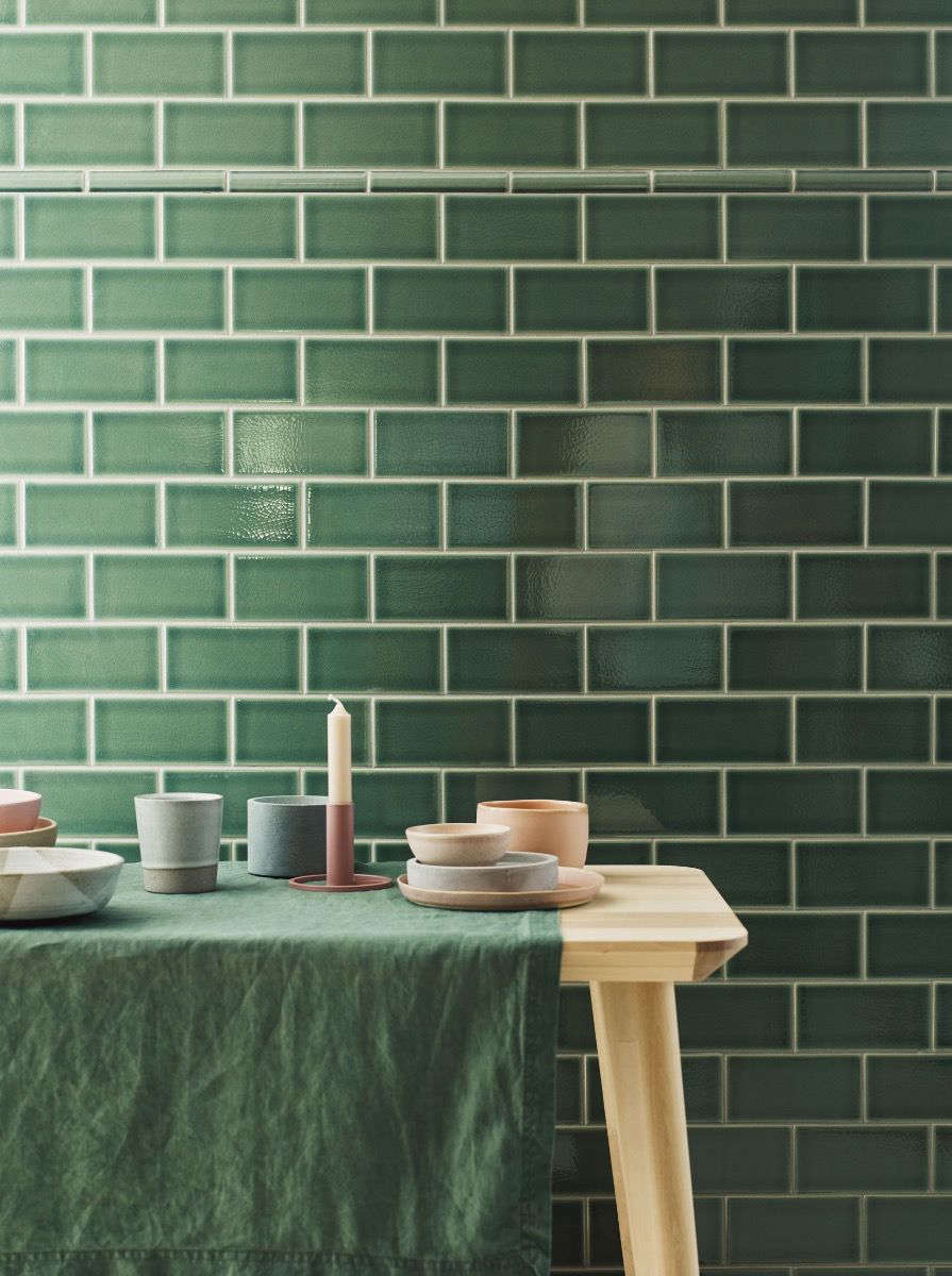
For example, a deep green glazed tile can make a powder room feel like a tiny London cocktail bar, minus the overpriced olives. A dusty pink square tile can soften a laundry room. A blue brick tile can bring movement to a shower wall without turning the space into a theme park called “Nautical Regret.”
3. The Range Covers Both Statement and Background Tiles
One of the biggest mistakes in tile shopping is assuming every surface must be the main character. It does not. A successful room usually needs a mix: one statement, one supporting actor, and one quiet surface that does not try to steal the Oscar speech. Claybrook’s line is useful because it includes both decorative pieces and calmer field tiles.
A patterned porcelain floor can anchor a bathroom while a simple glazed wall tile keeps the room from feeling busy. A terrazzo-look porcelain can add playfulness underfoot, while a plain rectangular tile brings order to the walls. A marble mosaic can frame a vanity niche, while large-format porcelain keeps the rest of the room visually clean.
Claybrook Tiles and the Bigger Tile Trend
Claybrook’s appeal makes sense when you look at where kitchen and bath design is heading. Designers and homeowners are embracing warm neutrals, nature-inspired palettes, large-format tile, handmade looks, patterned layouts, texture, and surfaces that feel personal. Tile is no longer just the waterproof thing behind the sink. It is architecture, decoration, mood lighting’s best friend, and occasionally the reason someone suddenly says, “Maybe we should redo the whole bathroom.”
Porcelain is especially popular because it offers strong performance for floors, wet areas, and high-traffic spaces. Industry standards define porcelain tile by its low water absorption, which is one reason it is often chosen for bathrooms, kitchens, mudrooms, and certain outdoor applications when the manufacturer approves the use. Ceramic tile, meanwhile, remains a favorite for walls and decorative surfaces because it can offer beautiful glazes, color depth, and a broad range of shapes.
Claybrook’s catalog plays well in this environment. Its porcelain options speak to durability and ease of care. Its glazed wall tiles speak to personality. Its mosaics and decorative formats speak to the homeowner who has stared at one too many plain builder-grade bathrooms and whispered, “Not today.”
Where Claybrook Tiles Work Best
Kitchen Backsplashes
A kitchen backsplash is one of the easiest places to use Claybrook Tiles with confidence. It is visible, practical, and small enough that you can make a design statement without covering the entire house in emerald glaze. Brick tiles, metro-style tiles, zellige-style ceramics, and subtle patterned porcelain can all work beautifully behind a range or sink.
For a timeless look, choose a rectangular glazed tile in white, cream, sage, or pale blue. For more drama, run a deep green or navy tile vertically to lift the eye. For a softer European mood, use a handmade-look tile with visible shade variation. The trick is to let the tile relate to the countertop, cabinet color, and hardware. Brass hardware with green glaze? Excellent. Black fixtures with soft white zellige-style tile? Very good. Eight competing finishes in one corner? That is not a kitchen; that is a committee meeting.
Bathroom Walls and Showers
Bathrooms are where Claybrook’s design language really shines. Glossy tiles bounce light around smaller spaces, which is helpful when your bathroom has one tiny window and the emotional range of a closet. Large-format porcelain can make a shower feel calmer by reducing grout lines. Mosaics can add grip and detail on shower floors when they are rated for that use. Patterned porcelain can make a small powder room unforgettable.
For wet areas, always check the tile’s technical specifications. Not every wall tile is suitable for showers, floors, or exterior use. Glazed ceramic may be perfect for a bathroom wall but wrong for a floor. A porcelain tile may be suitable for a wet room, but slip resistance, substrate prep, waterproofing, and grout selection still matter. The tile is glamorous; the prep work is the unsung hero wearing knee pads.
Entryways, Mudrooms, and Utility Spaces
Claybrook-style porcelain and patterned floor tiles can work well in entryways and mudrooms because these spaces need toughness and personality. A patterned tile can hide daily dust better than a plain dark floor. A stone-effect porcelain can create a grounded look without the maintenance concerns of some natural stone. A checkerboard pattern can feel classic, especially when softened with warmer tones instead of stark black and white.
Utility rooms are also perfect for playful tile. Nobody expects the laundry room to have style, which is exactly why it should. A cheerful floor tile can make folding towels slightly less tragic. Not fun, exactly, but less like a punishment from the sock gods.
Design Lessons from Claybrook’s London Point of View
Mix Heritage with Clean Lines
London interiors often succeed because they blend old and new. Think Victorian bones with modern lighting, classic fireplaces with sculptural furniture, or traditional tile shapes in unexpected colors. Claybrook Tiles fit that formula. A metro tile can look familiar, but a deep glaze or unusual layout makes it current. A patterned porcelain tile can reference old encaustic floors, but easier maintenance makes it practical for modern homes.
Use Small Tiles with Intention
Small-format tiles bring rhythm and handmade charm, but they also increase grout lines. That can be beautiful on a wall and more demanding on a floor. In a shower, small mosaics can be useful for slopes and grip, but grout color and sealing choices become more important. Use small tiles where their detail will be appreciated: niches, backsplashes, vanity walls, fireplace surrounds, and powder rooms.
Let Grout Be a Design Choice
Grout is not just the stuff between tiles. It is the eyeliner of the room. Matching grout creates a softer, seamless surface. Contrasting grout emphasizes pattern and geometry. With zellige-style or irregular tiles, a closer grout match usually keeps the look elegant. With subway or brick tiles, contrast can be fun, but too much contrast may make the wall look busier than intended.
Order Samples Before Falling in Love
Tile changes dramatically under different lighting. A green that looks fresh online may look darker in a north-facing bathroom. A white tile may read cream next to a cool countertop. A glossy glaze may reflect under-cabinet lights in ways you either adore or immediately blame on civilization. Samples help you avoid expensive surprises.
How to Choose the Right Claybrook Tile for Your Project
Start with the Room’s Job
Before choosing a color, decide what the tile must do. Is it for a wet shower wall, a busy floor, a kitchen backsplash, a decorative fireplace, or a low-traffic powder room? Floor tiles need appropriate strength and slip resistance. Shower tiles need water-ready installation systems. Kitchen backsplashes need cleanability. Decorative walls can focus more on mood and surface beauty.
Choose One Hero Moment
If the tile is bold, let it be bold. A patterned floor pairs best with calmer walls. A jewel-toned shower wall may need a quiet floor. A textured backsplash can shine when countertops are simple. Claybrook’s variety makes it tempting to combine everything: zellige-style tile, terrazzo, marble mosaic, checkerboard, and fluting. Resist the urge. Your home is not a tile tasting menu.
Think About Scale
Large-format porcelain can make small rooms feel calmer because there are fewer grout lines. Brick tiles and kit-kat mosaics add vertical or horizontal rhythm. Square tiles feel relaxed and slightly retro. Hexagons and penny rounds bring vintage charm. The best shape depends on the architecture of the room and the feeling you want: calm, playful, tailored, rustic, polished, or spa-like.
Plan the Edges
Beautiful tile can be ruined by awkward endings. Before installation, decide how exposed edges will be finished. Ask about trim pieces, bullnose options, metal profiles, mitered edges, and where cuts will land. This is not the glamorous part, but it is the difference between “designer bathroom” and “we ran out of decisions near the corner.”
Claybrook Tiles vs. Generic Tile: What Makes the Difference?
Generic tile can absolutely do the job, but Claybrook’s strength is curation. The collections feel selected through a design lens rather than gathered like random leftovers in a warehouse. That matters because many homeowners do not want 9,000 options. They want the right 40 options, clearly organized, with enough variety to feel creative but not enough to trigger a full identity crisis in aisle seven.
Claybrook also understands that tile shoppers are often nervous. A sofa can be returned. Tile, once installed, becomes part of the house’s bone structure. The brand’s focus on samples, showrooms, design support, and product guidance helps reduce that stress. For designers, the range offers useful building blocks. For homeowners, it offers confidence. For indecisive people, it at least makes the indecision prettier.
Experience Notes: Living with the Claybrook Tile Look
After working with tile-focused interiors and studying the way homeowners respond to London-inspired surfaces, one thing becomes obvious: the Claybrook look works best when it is allowed to feel natural. These tiles are not meant to scream. They are meant to invite a second glance. The first reaction may be, “Nice bathroom.” The second reaction is, “Wait, that glaze is gorgeous.” That is the sweet spot.
In a kitchen, the experience of a glossy Claybrook-style backsplash is mostly about light. Morning sun can turn a simple tile wall into a gentle reflector, making the room feel brighter before the coffee has done its legal duty. Under warm evening lighting, the same tile can feel deeper and moodier. This is why sample testing is so important. A tile is not one color; it is a tiny stage set that changes costumes throughout the day.
In bathrooms, texture often matters more than people expect. A flat, plain wall can feel clean but cold. A lightly uneven glazed tile brings softness, even when the color is neutral. That difference is especially noticeable in small bathrooms, where every surface is close to the eye. A handmade-look tile can make a compact shower feel considered rather than cramped. Add a quiet stone-effect porcelain floor, and suddenly the bathroom has the relaxed confidence of a boutique hotel that somehow remembers your preferred towel thickness.
One useful experience-based tip is to treat grout color as early-stage planning, not a last-minute errand. With glossy green, blue, or pink tiles, a matching or slightly softened grout usually creates a more elegant finish. With white metro tiles, darker grout can look graphic and classic, but it also emphasizes every line. That can be great in a crisp kitchen and too busy in a tiny shower. The tile may be the star, but grout controls the choreography.
Another lesson: do not underestimate delivery timing, batch variation, and ordering extra material. Many decorative tiles have shade variation, and that is part of their beauty. However, ordering too little can lead to mismatched batches later. A smart project includes overage for cuts, waste, and future repairs. Nobody wants to discover that the one broken tile behind the vanity has become rarer than a quiet group chat.
For homeowners who love Claybrook Tiles but fear commitment, start with a small zone. A powder room floor, a vanity backsplash, a fireplace surround, or a laundry wall can deliver the full design effect without overwhelming the budget. These spaces are also forgiving places to try color. A dramatic tile in a powder room feels intentional. The same tile across an entire open-plan kitchen may require more confidence, more planning, and possibly a calming snack.
The most satisfying Claybrook-inspired rooms tend to share one quality: restraint. They choose texture, color, or pattern, then support it with simple fixtures, warm lighting, and natural materials. Pair glossy tile with wood. Pair patterned porcelain with plain painted walls. Pair zellige-style surfaces with soft stone, brushed brass, or matte black. Let the room breathe. Tile has personality, but it does not need to do stand-up comedy in every corner.
In day-to-day life, the right tile should feel durable, cleanable, and emotionally rewarding. That last part sounds dramatic until you live with a surface you genuinely love. A beautiful backsplash can make cooking feel better. A calm bathroom wall can make Monday morning less rude. An entryway floor with pattern can welcome guests before anyone says a word. Claybrook’s London line understands that tile is practical, yes, but it is also atmosphere made solid.
Conclusion: Why Claybrook Tiles Deserve Attention
Claybrook Tiles brings a distinctly London mix of polish, practicality, and character to modern interiors. The brand’s collections speak to today’s biggest design desires: warmer color, richer texture, handmade-inspired surfaces, durable porcelain, expressive walls, and rooms that feel personal without looking overdecorated.
Whether used as a kitchen backsplash, a bathroom feature wall, a patterned floor, or a small but memorable powder room moment, Claybrook’s tile line offers a thoughtful alternative to generic surfaces. It is stylish without being stiff, decorative without being silly, and practical enough for real homes where people spill coffee, wash dogs, drop shampoo bottles, and occasionally pretend laundry will fold itself.
Note: This article is an original editorial synthesis based on publicly available information about Claybrook Studio and widely accepted tile-design guidance. Product names, pricing, availability, dimensions, and technical suitability may change, so verify specifications with the retailer or a qualified installer before publishing purchase advice or starting a renovation.