Some kitchen trends arrive like a marching band: loud, shiny, and impossible to ignore. Others slip in quietly, wearing a perfectly tailored sweater, smelling faintly of coffee, and somehow making your old white cabinets feel a little emotionally unavailable. Enter the cashmere kitchen, the warm, soft, quietly luxurious kitchen trend designers are loving right now.
Despite the fancy name, a cashmere kitchen does not require actual cashmere, a trust fund, or a strict rule that no one may eat spaghetti near the island. The idea is simpler and more livable: create a kitchen that feels soft, warm, elegant, and deeply comfortable through warm neutral colors, natural textures, subtle contrast, quality materials, and thoughtful lighting. Think creamy beige cabinets, mushroom-toned walls, light oak shelving, brushed brass hardware, veined stone countertops, handmade tile, and lighting that makes everyone look like they slept eight hours.
The trend is also a reaction to years of icy white kitchens, high-contrast black hardware, and cool gray palettes that looked crisp in photos but sometimes felt a little like cooking inside a luxury dentist office. Cashmere kitchens keep the clean, timeless feel people love, but trade the chill for warmth. The result is calm, polished, and welcomingthe kitchen design equivalent of being handed a warm mug and told, “Dinner is almost ready.”
What Is a Cashmere Kitchen?
A cashmere kitchen is a kitchen designed around soft, warm, neutral tones and tactile, elegant materials. The palette usually includes warm whites, cream, oatmeal, beige, taupe, clay, mushroom, greige, light tan, soft stone, and muted brown. Instead of dramatic color blocking, it relies on gentle layering. Nothing shouts; everything politely contributes.
The name comes from the feeling of cashmere fabric: soft, cozy, expensive-looking, and timeless. A cashmere kitchen is not simply a beige kitchen. Beige alone can go flat faster than a forgotten pancake. The magic comes from mixing undertones, finishes, and textures so the room feels dimensional. A creamy cabinet may sit beside a slightly lighter wall, a warm stone counter, a pale oak floor, antique brass pulls, and a zellige tile backsplash with subtle unevenness. Together, these elements create depth without visual noise.
Why Designers Are Falling for This Trend
Designers love cashmere kitchens because they solve several common kitchen problems at once. First, they feel current without being trendy in the scary way. Nobody wants to spend a small fortune on cabinets only to have the room scream “remember 2026?” five years later. Warm neutrals are flexible, forgiving, and easy to update with accessories, lighting, art, stools, or hardware.
Second, this look works in many home styles. A cashmere kitchen can lean modern with flat-front cabinets and slab stone. It can feel transitional with slim shaker doors and classic fixtures. It can even nod rustic with plaster walls, oak beams, limestone, and woven stools. The secret is restraint. Cashmere kitchens are not maximalist, but they are not boring either. They are the friend who dresses simply but somehow always looks better than everyone else in the group photo.
Third, warm kitchens feel emotionally right for how people use their homes now. The kitchen is no longer just a place where vegetables go to be chopped. It is a homework zone, coffee bar, family command center, late-night snack station, social hub, and occasional therapy office where someone opens the fridge and sighs dramatically. A softer palette makes all of that feel calmer.
The Cashmere Kitchen Color Palette
The best cashmere kitchen colors sit between white, beige, gray, and brown. They are warm but not yellow, neutral but not lifeless, sophisticated but not fussy. Popular directions include:
- Warm off-white: Creamy shades that feel softer than bright white.
- Greige: A balanced mix of gray and beige, especially when it leans warm.
- Taupe: Elegant, slightly smoky, and great for cabinets or islands.
- Mushroom: Earthy, modern, and perfect for a cozy neutral kitchen.
- Oatmeal and sand: Light, natural tones that brighten without feeling sterile.
- Soft clay: A warmer neutral with a hint of earthiness.
If you are choosing paint, test samples in your actual kitchen. This is not optional unless you enjoy emotional chaos. Warm neutrals are famous for changing personalities under different lighting. A color that looks like elegant cashmere in the store may turn peach, green, pink, or “sad rental hallway” once it meets your bulbs, flooring, and countertops.
What to Avoid
For a true cashmere kitchen, avoid stark blue-white, icy gray, harsh black-and-white contrast, overly glossy finishes, and color combinations that fight for attention. Black can work in small doses, especially on windows, lighting, or a slim accent, but too much black can pull the room away from soft luxury and into tuxedo territory. Tuxedos are great. Tuxedo kitchens are less cozy when you are microwaving soup in socks.
Cabinets: The Heart of the Cashmere Kitchen
Cabinetry is usually the star of this trend. Cashmere kitchen cabinets often appear in warm painted neutrals: cream, taupe, putty, mushroom, beige, or greige. The finish is usually satin, matte, or low-sheen rather than glossy. This keeps the room soft and tactile.
Door style matters, too. Slim shaker, inset, slab, flat-panel, and softly detailed transitional doors all work well. Overly ornate doors can make the look feel dated, while ultra-flat glossy doors may feel too cold. The sweet spot is clean but not clinical.
Natural wood cabinets also fit beautifully, especially white oak, rift-sawn oak, light walnut, or gently stained wood. The key is choosing wood tones that are calm and balanced. Orange-heavy stains can make the kitchen feel more early-2000s than cashmere. Pale oak, natural oak, and soft mid-tone woods bring warmth without stealing the entire show.
Countertops and Backsplashes That Complete the Look
Cashmere kitchens shine when the countertops and backsplash add quiet movement. Warm marble, quartz, quartzite, limestone-look surfaces, and softly veined engineered stone are all strong options. Look for veining in cream, beige, taupe, soft gold, warm gray, or brown. A little movement is gorgeous. Too much high-contrast veining can hijack the room like an uncle with a karaoke microphone.
A slab backsplash in the same material as the countertop creates an especially seamless, elevated effect. It is elegant, easy to clean, and visually calm. For a more handcrafted look, zellige tile, handmade subway tile, tumbled stone, or textured ceramic tile can bring subtle shimmer and depth.
The backsplash is also where you can add personality without disrupting the palette. A creamy handmade tile with slight variation may look simple from far away but beautiful up close. That is the entire cashmere kitchen philosophy: whisper first, impress later.
Hardware: Small Details, Big Mood
Hardware is where the kitchen gets jewelry. In cashmere kitchens, the most popular finishes include unlacquered brass, antique brass, brushed brass, warm bronze, polished nickel, and sometimes soft black in restrained amounts. Brass works especially well because it adds warmth and patina. It feels lived-in rather than factory-fresh.
For a modern cashmere kitchen, choose long, slim pulls in a muted metal. For a more traditional look, try small knobs, cup pulls, or latches. Avoid hardware that is too shiny, too ornate, or too trendy. The goal is not “look at my handles.” The goal is “this kitchen feels quietly expensive, and yes, the handles are part of the plot.”
Lighting: The Secret Ingredient
Lighting can make or break a warm neutral kitchen. Cashmere colors love soft, layered lighting. Use a combination of ceiling lights, pendants, sconces, under-cabinet lighting, and natural daylight. Warm white bulbs often work better than cool white bulbs because they support the cozy undertones in the cabinetry and stone.
Pendants over the island are a natural place to add character. Think linen shades, aged brass, opal glass, ceramic, woven textures, or sculptural shapes. The fixture should feel special, but not like it is auditioning for a Broadway solo.
Under-cabinet lighting is also important because warm kitchens can look muddy if work surfaces are poorly lit. Good task lighting keeps the space practical while maintaining the soft atmosphere.
Texture Is What Keeps the Trend from Looking Flat
The biggest mistake people make with neutral kitchens is choosing five flat beige things and hoping luxury appears. It will not. It will look like a bowl of oatmeal having an identity crisis.
Texture is essential. Combine smooth cabinets with natural wood grain, polished or honed stone, handmade tile, woven counter stools, linen window treatments, ceramic bowls, plaster walls, or a vintage runner. Even practical pieces can contribute: a wood cutting board, a stone fruit bowl, ribbed glass canisters, or a small lamp on the counter can make the room feel layered.
Cashmere kitchens are not about clutter, but they are about softness. A room with no texture can feel unfinished. A room with thoughtful texture feels collected, calm, and human.
How to Create a Cashmere Kitchen Without a Full Remodel
The good news: you do not need to demolish your kitchen to borrow this trend. A few strategic updates can shift the mood.
1. Paint the Cabinets or Walls
If your cabinets are in good condition, painting them a warm neutral can completely transform the kitchen. If painting cabinets is too expensive, paint the walls instead. Choose a warm white, soft beige, or light greige that works with your existing counters and floors.
2. Swap the Hardware
Changing cold black or basic chrome pulls to antique brass, brushed brass, or warm nickel can make the kitchen feel softer immediately. It is one of the simplest upgrades with the biggest visual payoff.
3. Add Warm Lighting
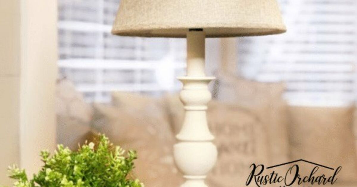
Replace harsh bulbs with warmer ones, add under-cabinet lights, or bring in a small counter lamp if space allows. A lamp in the kitchen sounds oddly fancy until you try it; then you become the person who says, “The kitchen lamp changed my life,” at dinner parties.
4. Bring in Natural Wood
Wood cutting boards, oak shelves, woven stools, a walnut bowl, or a small vintage table can warm up a white or gray kitchen quickly. Wood is the trend’s best supporting actor.
5. Use Accessories Carefully
Choose ceramics, linen towels, stoneware, baskets, plants, and muted art. Keep the palette soft. The cashmere kitchen does not need neon signs, novelty mugs on open shelves, or seventeen jars labeled “pasta” when everyone can see it is pasta.
Best Materials for a Cashmere Kitchen
The most successful cashmere kitchens combine practical surfaces with natural beauty. Here are the materials that work especially well:
- White oak: Great for cabinets, shelves, floors, and range hoods.
- Quartzite: Durable, natural, and often beautifully warm in tone.
- Quartz: A practical option with many soft veined designs.
- Marble: Elegant and timeless, though it requires more maintenance.
- Zellige tile: Adds handmade texture and light variation.
- Limestone or travertine: Earthy, warm, and quietly luxurious.
- Brass and bronze: Ideal for hardware, faucets, and lighting.
Who Should Try the Cashmere Kitchen Trend?
This trend is ideal for homeowners who want a kitchen that feels warm, elegant, and timeless. It is especially good for people who like neutral interiors but are tired of sterile white. It also suits open-concept homes because the palette flows easily into living and dining spaces.
A cashmere kitchen may not be the best fit if you love bold color, high contrast, glossy modern drama, or a very industrial look. That does not mean you cannot borrow pieces of it. A warm stone counter, brass faucet, or mushroom-colored island can soften almost any kitchen style.
Real-Life Experience: What It Feels Like to Live With a Cashmere Kitchen
The best part of a cashmere kitchen is not just how it photographs. It is how it feels at 7:12 a.m. when someone is making coffee, the dishwasher is humming, and the morning light is sliding across the cabinets. A stark white kitchen can look beautiful in a magazine, but in daily life, it sometimes exposes every crumb, fingerprint, and existential worry. A cashmere kitchen is more forgiving. It still looks clean and polished, but it does not announce every toast casualty like breaking news.
In real homes, the trend works because it supports normal life. Warm beige cabinets hide minor dust better than bright white. Softly veined counters disguise a few crumbs until you wipe them away. Brass hardware develops character instead of looking ruined the second it ages. Wood accents make the room feel relaxed, especially when paired with stone or tile. The whole space starts to feel less like a showroom and more like a place where people actually gather.
One practical experience many homeowners notice is that choosing the right undertone takes patience. Warm neutrals are friendly, but they are not all the same friend. Some lean pink, some yellow, some green, some gray. A cabinet sample that looks perfect online can shift dramatically beside your floor or countertop. The smartest approach is to bring large samples home and check them in morning light, afternoon light, and evening artificial light. This step may feel tedious, but it is far less tedious than repainting cabinets because your “soft taupe” turned into “mystery salmon.”
Another lived-in lesson: cashmere kitchens benefit from contrast, but only in small, intentional doses. A room that is cream on cream on cream can feel sleepy. A little contrast from a darker bronze faucet, a walnut cutting board, a slightly deeper island, or a textured backsplash gives the eye somewhere to land. The goal is gentle rhythm, not drama. Think acoustic guitar, not drum solo.
Maintenance is also refreshingly realistic. Natural stone may need sealing, marble may etch, and unlacquered brass may patina. But that is part of the charm for many people. Cashmere kitchens are not about frozen perfection. They are about materials that age gracefully. A tiny mark on brass or a mellowed wood surface can make the kitchen feel more personal over time. Of course, if you prefer everything to remain spotless and unchanged forever, quartz counters and lacquered brass finishes may be more your speed.
The trend also changes how people decorate. Instead of adding bright seasonal items everywhere, many homeowners find that one vase of branches, a linen runner, a ceramic fruit bowl, or a small framed print is enough. The room already has warmth, so it does not need much styling. This is excellent news for anyone who has ever bought decorative objects and later wondered why their kitchen looked like a home goods aisle had sneezed.
Most importantly, a cashmere kitchen creates a mood. It makes cooking feel calmer, hosting feel easier, and everyday routines feel a little more elegant. It does not demand that you become a different person. You can still burn the toast. You can still eat cereal for dinner. You can still use the island as a temporary mail mountain. The difference is that the room around you feels softer, warmer, and more forgiving while you do it.
Conclusion
The cashmere kitchen trend is popular because it gives homeowners what many modern kitchens have been missing: warmth, softness, and emotional comfort. It keeps the timeless appeal of neutral design but replaces cold whites and grays with richer, more livable tones. With warm cabinets, natural wood, veined stone, brass hardware, layered lighting, and touchable textures, this look feels elegant without being stiff.
Whether you are planning a full remodel or simply swapping hardware and lighting, the cashmere kitchen offers a flexible formula for creating a space that feels calm, refined, and welcoming. It is dreamy, yesbut not in an impractical way. It is the kind of dream where the counters are beautiful, the lighting is flattering, and someone else has already unloaded the dishwasher.
Note: This article is original editorial content written for web publication and synthesized from current kitchen design trends, designer commentary, and industry research. It does not copy or duplicate source material.