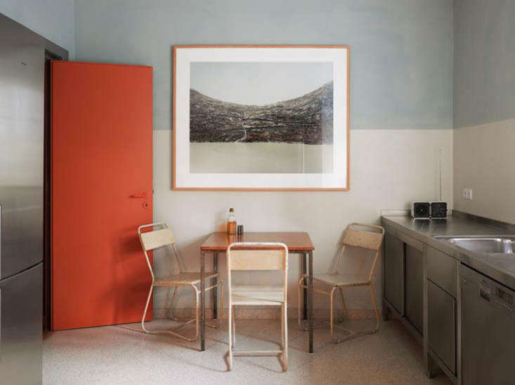
There was a time when the dream kitchen was so white it looked like it had been edited with a snow filter. White cabinets, white tile, white counters, white everythingbeautiful, yes, but also one spaghetti-sauce incident away from emotional collapse. Today, the kitchen is loosening its apron strings. Color is back, and not in the “one cautious blue vase on the counter” way. We are talking about bold color zoning: using strong, intentional color to define different parts of the kitchen while keeping the room cohesive, practical, and full of personality.
Bold color zoning in the kitchen is not just painting one wall and calling it a design revolution. It is more thoughtful than that. It uses color to create visual destinations: a green prep island, a burgundy pantry wall, a cobalt cooking zone, a butter-yellow breakfast nook, or a smoky charcoal coffee bar. The result is a kitchen that works harder, looks smarter, and doesn’t feel like every cabinet came from the same polite committee meeting.
Current kitchen design trends point toward warmer tones, deeper hues, natural materials, colorful cabinetry, layered lighting, and more personal spaces. Greens, blues, browns, burgundy, terracotta, yellow, and moody neutrals are showing up in cabinets, islands, backsplashes, appliances, and painted millwork. The key is not to throw every color at the room like a confetti cannon. The magic lies in choosing where color belongs and why.
What Is Bold Color Zoning in the Kitchen?
Color zoning is the practice of using different colors to visually separate areas by function, mood, or architectural feature. In a kitchen, this might mean painting the island a saturated forest green to mark it as the prep and gathering hub, using deep blue tile around the range to frame the cooking area, or wrapping a pantry corner in warm terracotta so it feels like a special little room within the room.
Unlike random accent colors, zoning has purpose. It guides the eye, helps open-plan kitchens feel more organized, and gives small kitchens a stronger sense of structure. It can also solve a common design problem: how to add personality without committing every cabinet, wall, and ceiling to one dramatic color that may scare your future self at 7 a.m.
Why Bold Kitchen Color Is Having a Moment
Homeowners are moving away from sterile, cool-toned kitchens and leaning into warmth, character, and individuality. Nature-inspired greens, grounded browns, warm neutrals, deep blues, and rich reds are especially popular because they feel expressive without becoming cartoonish. Painted cabinets are now treated as a major design feature rather than a risky move. Islands are becoming statement pieces. Even appliances and pantry areas are joining the color party, probably after years of feeling ignored.
Another reason color zoning works so well is that kitchens are multifunctional. They are cooking stations, breakfast spots, homework counters, coffee bars, Zoom backgrounds, snack headquarters, and occasionally the place where someone dramatically announces there is “nothing to eat” while standing in front of a full refrigerator. Color helps each zone feel intentional.
5 Favorite Bold Color Zoning Ideas for the Kitchen
1. The Forest Green Prep Zone
Forest green, olive, sage, and deep moss tones have become modern kitchen favorites because they feel bold and calming at the same time. Green connects naturally with wood, stone, brass, cream, black, and marble, which makes it unusually flexible for a saturated shade. It gives a kitchen freshness without making the space feel like a smoothie bar.
The best place to use green zoning is on the island or lower cabinets. This grounds the room visually, especially when paired with lighter upper cabinets or warm white walls. A forest green island with a white quartz or marble-look countertop creates a beautiful focal point while still feeling classic. If the kitchen has natural wood floors, open shelving, or woven bar stools, green becomes even richer and more layered.
For a small kitchen, try a muted sage or gray-green on the lower cabinets and keep the upper area light. This gives the room depth without closing it in. In a larger kitchen, a deeper hunter green can work across a long run of cabinetry, especially if there is plenty of natural light. Add aged brass hardware, creamy walls, and warm under-cabinet lighting, and suddenly your kitchen has the energy of a boutique hotel where someone definitely knows how to make risotto.
Best use: island, lower cabinets, built-in banquette base, or open shelving backdrop.
Pair it with: white oak, walnut, unlacquered brass, creamy white walls, marble, soapstone, or zellige tile.
2. The Cobalt or Inky Blue Cooking Zone
Blue is one of the safest bold colors for kitchens because it has range. Navy feels polished, cobalt feels energetic, powder blue feels airy, and blue-green tones bring a coastal or vintage mood. For color zoning, blue works beautifully around the range, backsplash, or cabinet wall because it frames the cooking zone like a stage. And yes, your weeknight scrambled eggs deserve theater.
An inky blue backsplash behind the stove can turn a plain white or wood kitchen into something memorable. Glossy blue tile reflects light, while matte blue cabinets create a softer, more architectural effect. If you want a high-impact but controlled approach, paint only the range wall cabinets blue and keep the rest of the kitchen warm neutral. This creates a strong focal point without making the entire room feel heavy.
Cobalt is especially effective in modern kitchens with simple cabinet fronts and clean lines. It pairs well with stainless steel, white counters, chrome, and light wood. Navy works better when you want sophistication and contrast. A navy range hood surround or blue pantry cabinet can act like a built-in exclamation pointstylish, useful, and not yelling in all caps.
Lighting matters with blue. In a north-facing kitchen, very cool blues can look icy, so choose navy with a slight green or gray undertone. In sunny kitchens, brighter blues can look crisp and joyful. Test samples at different times of day before committing, because paint has a dramatic personality and enjoys changing costumes.
Best use: range wall, backsplash, pantry doors, island base, or cabinet interiors.
Pair it with: white tile, brass or chrome fixtures, pale oak, stainless steel, warm stone, and woven textures.
3. The Burgundy, Merlot, or Terracotta Pantry Zone
Red-based kitchen colors are back, but not the glossy tomato red of retro diners. The new versions are deeper and earthier: burgundy, oxblood, merlot, clay, cinnamon, terracotta, and muted brick. These shades bring warmth and drama, making them ideal for smaller zones like pantries, coffee bars, butler’s pantries, or a single bank of cabinets.
Why use red in a zone instead of the whole kitchen? Because rich reds are powerful. A little can feel elegant and cozy; too much can feel like the kitchen is preparing to deliver a Shakespeare monologue. A pantry wrapped in burgundy paint, however, feels special and jewel-box-like. Open the doors and there it is: your cereal boxes suddenly living in luxury.
Terracotta is a softer choice for homeowners who want warmth without intensity. It looks beautiful with natural wood, plaster-style walls, handmade tile, and cream cabinetry. Burgundy and merlot feel more formal and dramatic, especially with marble, dark stone, or brass. For a transitional kitchen, try burgundy lower cabinets on a beverage station with glass-front uppers above. It creates a grown-up entertaining zone that says, “Yes, I own cocktail napkins that are not paper towels.”
This color family also works well in historic homes or kitchens with vintage details. It has depth and nostalgia without feeling dated when balanced by clean hardware and simple surfaces.
Best use: pantry, coffee bar, beverage station, butler’s pantry, lower cabinets, or niche shelving.
Pair it with: cream, khaki, moss green, walnut, marble, antique brass, handmade tile, and warm lighting.
4. The Butter Yellow Breakfast Zone
Yellow in the kitchen can be tricky. Too bright and it screams “lemon sale at the craft store.” Too dull and it can feel dated. But butter yellow, custard, ochre-tinted cream, and muted golden shades are surprisingly useful for color zoning because they add warmth and optimism without overwhelming the room.
The breakfast zone is the perfect place for yellow. A painted banquette wall, cheerful cabinet nook, or soft yellow open shelving area can make morning routines feel gentler. It also works beautifully in kitchens that do not get much natural light. Yellow brings a little sunshine indoors, which is helpful when your coffee has not yet negotiated with your personality.
For a refined look, pair butter yellow with natural wood, white stone, and soft green accents. For a vintage-inspired kitchen, combine it with checkerboard flooring, chrome details, or powder blue accessories. In a modern kitchen, use yellow only on the island base or breakfast cabinet and keep surrounding surfaces simple.
The secret is choosing a yellow with warmth and softness. Avoid harsh neon or overly saturated school-bus shades unless your goal is to make toast feel like an emergency. A muted yellow reads more like sunlight and less like caution tape.
Best use: breakfast nook, banquette wall, island base, open shelving, small cabinet run, or appliance accent.
Pair it with: oak, cream, sage green, blue-gray, marble, white tile, linen shades, and natural fiber rugs.
5. The Chocolate, Espresso, or Charcoal Utility Zone
Dark brown, espresso, charcoal, and near-black shades are becoming the new moody neutrals. They provide contrast, hide wear better than pale finishes, and add a polished architectural quality to the kitchen. Used as a color zone, they are especially good for utility areas: coffee bars, appliance garages, tall storage walls, mudroom transitions, or cleanup stations.
A charcoal cabinet wall can make a refrigerator, ovens, and pantry storage feel intentionally grouped instead of visually chaotic. Chocolate brown lower cabinets add richness while feeling warmer than black. Espresso works well in traditional and modern kitchens because it behaves like a neutral but has more personality than plain gray.
Dark zoning is also practical. In high-touch zones where fingerprints, splashes, and daily wear are part of the plot, deeper colors can be more forgiving. The trick is contrast. Pair dark cabinetry with lighter counters, warm metals, or textured tile so the zone feels designed rather than heavy. Integrated lighting is especially important; a dark coffee bar with under-shelf lighting can look sophisticated, while a dark unlit corner can look like where measuring spoons go to disappear.
For open-plan kitchens, a dark utility wall can visually anchor the space and separate it from the dining or living area. It adds structure without needing a physical partition.
Best use: appliance wall, coffee bar, cleanup zone, tall cabinets, mudroom-kitchen transition, or hidden pantry doors.
Pair it with: warm white walls, pale stone, walnut, copper, brushed nickel, textured tile, and layered lighting.
How to Make Bold Color Zoning Look Intentional
Start With One Hero Color
Choose one bold color as the star and let the other tones support it. If your island is forest green, the rest of the palette might include cream, oak, brass, and black. If your pantry is burgundy, keep nearby cabinetry quieter. A kitchen can have multiple colors, but they should have a hierarchy. Otherwise, the room may start looking like it lost a paint sample argument.
Use the 60-30-10 Rule Loosely
A helpful guideline is to use a dominant color for about 60 percent of the room, a secondary color for 30 percent, and an accent for 10 percent. In a kitchen, the dominant color might be warm white walls and perimeter cabinets, the secondary color might be green lower cabinets, and the accent might be brass hardware or blue tile.
Repeat Color in Small Details
Repetition keeps color zoning from feeling random. If the island is deep blue, echo that tone in a vase, patterned rug, art print, or dishware. If the pantry is terracotta, repeat the warmth with copper cookware or clay planters. The goal is not to match everything perfectly. In fact, please do not force your toaster to match your cabinet paint unless your toaster volunteered. The goal is rhythm.
Pay Attention to Undertones
Bold colors are sensitive to undertones. A green with yellow undertones feels warmer and more botanical; a green with blue undertones feels cooler and more modern. Burgundy can lean purple, brown, or red. Cream paint can look warm and lovely beside terracotta but dingy next to a cool blue. Always test samples near your counters, flooring, backsplash, and lighting before making the final call.
Let Materials Balance the Color
Natural materials make bold color easier to live with. Wood softens jewel tones. Marble and quartz calm deep cabinets. Handmade tile adds texture so color feels layered, not flat. Metal finishes also matter: brass warms green and burgundy, chrome sharpens blue, and copper brings out chocolate and terracotta tones.
Small Kitchen? Bold Color Zoning Still Works
Small kitchens do not need to avoid bold color. They simply need smarter placement. Try painting only the lower cabinets, the island, the backsplash wall, or a compact pantry niche. Keeping upper cabinets, ceilings, and surrounding walls lighter will preserve openness while still allowing color to create impact.
In a galley kitchen, one bold end wall can create depth. In a one-wall apartment kitchen, colored cabinets can define the cooking area from the living space. In a tiny kitchen with open shelves, painting the wall behind the shelves creates a strong zone without taking up a single inch of storage.
Another trick is to use glossy tile or satin paint in darker zones. Light reflection keeps saturated color from feeling flat. Add under-cabinet lighting, and even a compact kitchen can feel layered and dramatic rather than cramped.
Mistakes to Avoid With Bold Kitchen Color
Choosing a Color Before Choosing the Zone
Do not start with “I love emerald” and then paint something random. Start with the function. Do you want to highlight the island? Frame the range? Make the pantry feel special? Once the zone has a purpose, the color choice becomes easier and more successful.
Ignoring the Countertops
Countertops are bossy. They occupy a large visual area and often contain undertones that must be respected. A cool gray counter may clash with warm terracotta. A creamy stone may look odd with icy blue. Bring paint samples home and test them beside the counters before ordering gallons of regret.
Using Too Many Saturated Colors
Bold color zoning is not the same as turning the kitchen into a crayon box. Two strong colors can work beautifully, especially if one is dominant and the other appears in a smaller zone. Three or more bold colors require a very careful palette and enough neutral space to breathe.
Forgetting Lighting
Color changes dramatically under different lighting. Warm bulbs can make yellow and terracotta glow but may muddy blue. Cool bulbs can sharpen navy but make cream feel flat. Layered lightingambient, task, and accentis essential if you want bold color to look good in real life, not just in a perfectly lit photo.
Real-Life Experience: Living With Bold Color Zoning in the Kitchen
The most useful thing about bold color zoning is that it makes a kitchen feel designed around daily life, not just around a mood board. In practice, a colored zone becomes a habit cue. A green island says, “This is where chopping happens.” A dark coffee bar says, “This is where civilization begins.” A yellow breakfast nook quietly suggests that maybe mornings do not have to be a full-contact sport.
One of the best experiences with color zoning is how quickly it changes the emotional temperature of the kitchen. A plain kitchen can be functional and still feel unfinished, like it is waiting for someone to give it a personality. Add a deep blue range wall or a terracotta pantry, and suddenly the room has a point of view. Guests notice it. Family members gravitate toward it. Even the daily act of unloading groceries feels slightly less like a chore and more like participating in a space that has been thoughtfully shaped.
Another benefit is flexibility. Many homeowners worry that bold color means permanent commitment, but zoning actually reduces the risk. Painting an island, pantry, or breakfast nook is much less intimidating than repainting every cabinet. If your taste changes later, updating one zone is manageable. This makes bold color feel less like a tattoo and more like a very confident haircut: noticeable, expressive, but not impossible to revise.
In everyday use, darker zones are especially forgiving. A charcoal appliance wall or espresso coffee station can handle fingerprints, splashes, and the mysterious dust that appears five minutes after cleaning. Green lower cabinets also tend to age gracefully because they pair naturally with wood, stone, and metal. Burgundy or terracotta zones are more dramatic, but when used in smaller areas, they bring warmth without taking over the room.
The biggest lesson is that bold kitchen color feels best when it has company. A single strong color needs supporting details: a repeated tone in art, a warm metal finish, a wood stool, a patterned runner, or a backsplash that connects the palette. Without those supporting players, a colored zone can look like it wandered in from another house. With them, it feels intentional and collected.
There is also a psychological advantage. Color zoning can make the kitchen feel more organized even when life is not. The coffee bar has its own mood. The prep island has its own identity. The pantry becomes a little destination. This visual structure helps the kitchen feel calmer, even on nights when dinner is pasta, the sink is full, and someone has used the last clean fork to eat cake directly from the container. No judgment. The kitchen understands.
For anyone hesitant to start, the easiest first step is the smallest zone with the biggest payoff. Paint the island. Tile the backsplash behind the range. Refresh the inside of open shelving. Wrap a pantry nook in a warm, saturated shade. Live with it for a few weeks. Chances are, the kitchen will feel more personal, more layered, and more alive. Bold color zoning works because it respects both beauty and functionand in a kitchen, that is the design equivalent of perfectly browned butter.
Conclusion
Bold color zoning in the kitchen is one of the smartest ways to bring personality into the busiest room in the home. It lets you use rich, expressive shades without overwhelming the entire space. Whether you choose a forest green prep island, an inky blue cooking wall, a burgundy pantry, a butter-yellow breakfast nook, or a charcoal utility zone, the strategy is the same: give color a purpose.
The best kitchens are not just beautiful in photos. They support the way people cook, gather, snack, spill, clean, celebrate, and occasionally negotiate who left one olive in the jar. Color zoning helps each part of the kitchen feel intentional while adding warmth, depth, and character. Done well, it is bold without being chaotic, practical without being boring, and stylish without acting like it is too good for leftovers.
Note: This article was written for clean web publication and synthesized from current U.S. kitchen design, renovation, paint, and color trend guidance without embedding source links.