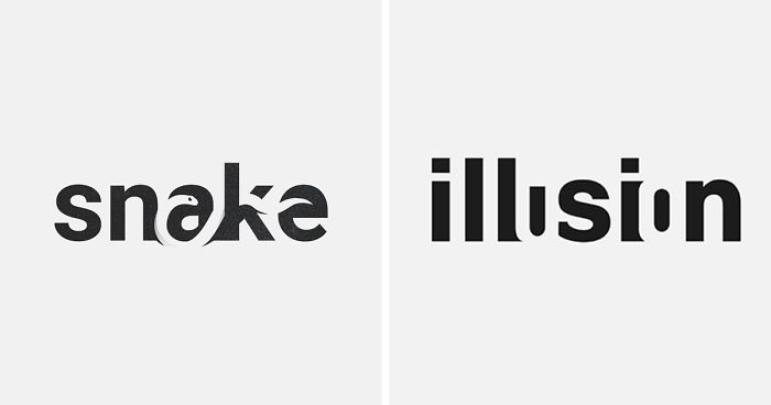
Some logos walk into the room wearing a neon sign. Others whisper, “Look closer.” Negative space logos belong to the second group: clever, quiet, and oddly satisfying once your brain finally spots the trick. They use the empty area around or inside letters to create a second image, turning a simple wordmark into a tiny visual puzzle.
The magic is not just decoration. In strong negative space logo design, the hidden shape helps explain the meaning of the word. The “empty” space becomes active. A gap becomes a symbol. A missing chunk of a letter suddenly becomes a light bulb, a fish, a key, a mountain, or a bird. It is the design equivalent of finding fries at the bottom of the bag: unexpected, delightful, and absolutely worth mentioning to everyone nearby.
This article explores 30 impressive word logos and logo-style ideas that illustrate meaning through negative space. It also explains why the technique works, what designers can learn from it, and how brands can use it without turning their identity into a confusing optical illusion wearing a tiny hat.
What Is Negative Space in Logo Design?
Negative space is the empty or unmarked area around, between, or inside design elements. In a typical logo, the positive space is the visible shape: the letters, icon, or symbol. The negative space is everything surrounding it. But in clever logo design, that background is not lazy. It has a job.
Designers often use negative space to create a hidden image that supports the brand message. The famous FedEx arrow between the “E” and “x” suggests speed, direction, and precision. The WWF panda uses white space to complete the animal’s head and body. Toblerone hides a bear in the mountain, connecting the chocolate brand to Bern, Switzerland, known as the City of Bears. These logos work because the second image is relevant, not random.
For wordmarks, the challenge becomes even more interesting. Instead of adding icons outside the word, the designer must use the letters themselves. The best results feel inevitable, as if the word was secretly shaped that way all along.
Why Negative Space Wordmarks Are So Memorable
Negative space logos are sticky because they reward attention. At first, the viewer reads the word. Then the hidden image appears, and the brain gets a tiny “aha!” moment. That moment builds memory. People are more likely to remember a logo when they have participated in decoding it.
This is also why negative space works especially well for visual storytelling. A regular wordmark says, “This is the name.” A negative space wordmark says, “This is the name, and here is what it means.” That extra layer can make a logo feel smarter, more premium, and more shareable.
30 Impressive Logos That Use Negative Space to Explain Words
1. Light
A wordmark for “light” can hide a light bulb inside the counter of a letter such as “g” or “o.” The negative space becomes the glow source, turning typography into meaning. It is simple, clear, and brighter than a phone screen at 2 a.m.
2. Fish
In a “fish” logo, the gap between letters can form a fish silhouette. The tail may appear between the “s” and “h,” while the body emerges from the surrounding white space. This is a perfect example of letting the word swim inside itself.
3. Bird
A bird-shaped cutout between upright letters can suggest flight without adding wings outside the wordmark. The hidden bird gives the logo movement while keeping the design clean and compact.
4. Key
The word “key” practically begs for a hidden keyhole. By shaping the negative space inside the “e” or between letters, the logo can communicate access, security, and solutions in one neat visual move.
5. Cut
A “cut” wordmark can use a sharp diagonal slice through the letters, with the missing space becoming the idea. It works for barbers, editors, tailors, or anyone whose brand promise involves trimming the excess.
6. Shark
For “shark,” negative space can create a fin rising between letters. The result is instantly recognizable without needing a full animal illustration. It says danger, speed, and ocean energy with just one triangular gap.
7. Sleep
A clever “sleep” logo might shape the space between letters into a crescent moon or a closed eyelid. The word becomes calmer, softer, and more visual. Even the typography seems ready for a nap.
8. Coffee
In a coffee wordmark, the counter of an “o” can become a cup, while steam appears in the white space above. The design feels warm and familiar, which is exactly what a coffee brand wants before the caffeine starts negotiating with your soul.
9. Rocket
A rocket hidden between tall letterforms can suggest launch, growth, and ambition. This kind of logo works beautifully for startups, education platforms, and technology brands that want to look fast without screaming “disruption” into a conference room.
10. Music
The space inside or between letters can form a musical note. A “music” wordmark using this idea becomes immediately understandable and rhythmically balanced. Good spacing matters here; otherwise, the note may look like a confused tadpole.
11. Smile
A smile can be formed using the negative space beneath rounded letters. This approach is friendly, human, and ideal for dental clinics, wellness brands, children’s products, or customer service businesses.
12. Cat
For “cat,” the space above the letters can form ears, while a tail may curve from a letterform. The trick is to keep it minimal. A tiny hint often feels more elegant than a full cartoon cat judging your life choices from a bookshelf.
13. Dog
A dog logo can hide a snout, paw, or tail in the space between letters. Because pet brands need warmth and trust, negative space helps create personality without cluttering the mark.
14. Tree
The word “tree” can use branching white space inside a vertical letter. This gives the logo an organic feel while preserving readability. It is especially useful for landscaping, sustainability, and outdoor brands.
15. Mountain
Angular gaps between letters can become peaks. A “mountain” logo using negative space can feel adventurous and stable at the same time. This is the same kind of visual thinking that makes heritage-rich logos like Toblerone so satisfying.
16. Pencil
A pencil can emerge from the negative space of a long letter or between two vertical strokes. This concept works well for schools, writers, studios, and creative tools. The hidden point suggests making, drafting, and thinking.
17. Book
The counters of letters can be shaped like open pages. A “book” wordmark becomes more than text; it becomes an invitation to read. Bonus points if the spacing feels calm enough for a library and not like a garage sale flyer.
18. House
A roofline can appear in the empty space above or between letters. For real estate, architecture, and home services, this creates instant meaning without relying on the overused house icon that has been through enough already.
19. Camera
The letter “o” can become a camera lens through negative space. The surrounding letters act like the body of the camera, making the wordmark useful for photographers, studios, and visual media brands.
20. Leaf
A leaf hidden inside a letter counter is a classic negative space move for eco-friendly brands. The shape communicates growth, nature, and freshness while keeping the logo modern and restrained.
21. Wave
Curved negative space between letters can become a wave. This works well for surf brands, water companies, spas, travel businesses, and coastal organizations. The best versions feel fluid without sacrificing legibility.
22. Arrow
An arrow can be hidden between letters to suggest progress and movement. The FedEx logo is the most famous example of this principle, proving that a tiny background shape can become a global design legend.
23. Crown
A crown can appear above letters or inside the spaces between tall strokes. It is useful for luxury brands, premium services, and events. The danger is making it too fancy; a logo should not look like it demands a velvet rope.
24. Spoon
Food brands can use negative space to hide a spoon, fork, or plate inside a wordmark. The Guild of Food Writers logo is a classic inspiration because it combines a pen nib and spoon, neatly linking writing and cuisine.
25. Pen
A pen nib hidden in a letterform can communicate writing, editing, publishing, or education. This is especially effective when paired with elegant typography and generous spacing.
26. Heart
A heart formed between two rounded letters can suggest care, love, health, or community. The key is subtlety. Too obvious, and it feels generic. Too hidden, and people need a detective license to find it.
27. Clock
A clock face can be created inside an “o,” with the hands formed by simple white shapes. This works for productivity tools, delivery services, scheduling apps, and time-management brands.
28. Cloud
Soft negative space around rounded letters can suggest a cloud. This is ideal for software, storage, weather, or dream-related brands. Rounded typography helps the concept feel airy and approachable.
29. Lock
A lock shape can hide inside a letter counter or between two vertical strokes. Security brands benefit from this because the hidden symbol reinforces protection without looking aggressive.
30. Eye
An eye can appear inside the negative space of an “e,” “o,” or “a.” This is effective for design studios, research firms, vision care, photography, and analytics brands. It says observation without needing a giant eyeball staring into the customer’s browser history.
Design Lessons From These Negative Space Logos
Start With the Word, Not the Trick
The strongest negative space logos begin with meaning. Designers should ask, “What does this word suggest?” before asking, “Where can I hide a shape?” A hidden icon is only useful when it supports the concept. Otherwise, the logo becomes a party trick, and party tricks are fun until someone brings out juggling pins.
Protect Readability
A wordmark still has to be read. If the letters are distorted so heavily that the word becomes a mystery, the design has failed. Negative space should sharpen communication, not turn the logo into a CAPTCHA with branding ambitions.
Use Simple Shapes
The best hidden images are usually simple: arrows, leaves, birds, waves, hearts, keys, and tools. Complex illustrations rarely survive at small sizes. A logo may appear on a website header, app icon, business card, package label, or social profile. If the idea disappears when shrunk, it needs simplification.
Balance Surprise and Clarity
Negative space works because it creates discovery. But the discovery should not require an instruction manual. A viewer should be able to spot the second meaning after a moment, not after three coffees and a design degree.
Why Brands Love Negative Space Logos
Brands love negative space logos because they can communicate more with less. They feel intelligent without being loud. They create a memorable “aha” moment. They also work well in black and white, which is important for printing, signage, embroidery, packaging, and digital use.
For small businesses, a negative space wordmark can make a brand look more thoughtful and polished. For larger companies, it can add depth to an already simple identity system. Either way, the real value is not the hidden shape itself. The value is the way that shape supports positioning.
Common Mistakes to Avoid
Forcing the Concept
If the hidden image does not naturally fit the letters, do not wrestle it into place. Forced negative space looks awkward, like a couch jammed through a doorway at the wrong angle.
Adding Too Many Ideas
A logo does not need to say everything. A bakery logo does not need a whisk, cupcake, oven, rolling pin, wheat stalk, grandma, and emotional backstory. Choose one strong idea and let it breathe.
Ignoring Brand Personality
A playful wordmark may work for a pet shop but feel wrong for a law firm. Negative space should match the brand’s tone. Clever does not always mean casual.
Experience Notes: What It Feels Like to Work With Negative Space Logos
Designing a negative space logo is a lot like cleaning your room and discovering there was a floor under there the whole time. The shape often exists before the designer notices it. You type the word, adjust the spacing, test a few fonts, squint at the screen, move one letter slightly, and suddenly the empty area starts behaving like an image.
The first lesson is patience. Negative space rarely appears on command. You cannot sit down, crack your knuckles, and say, “Today I shall produce a world-class hidden swan between the letters R and K.” The process is more like exploring. You try bold sans-serif fonts, condensed typefaces, rounded letters, high-contrast serifs, and custom spacing. Some words cooperate immediately. Others act like they have hired a lawyer.
The second lesson is restraint. Once designers discover the joy of hidden shapes, the temptation is to hide something everywhere. But a logo is not an Easter egg hunt. One smart visual idea is usually stronger than five competing tricks. The empty space should feel intentional, not crowded with secret symbols waving for attention.
The third lesson is testing. A logo that looks brilliant on a large monitor may fail on a phone screen. It may also lose clarity when embroidered, printed on rough paper, or placed over a busy background. That is why professional logo design often includes small-size tests, black-and-white versions, spacing checks, and mockups. A negative space logo must work in real life, not just in the perfect lighting of a designer’s portfolio.
The fourth lesson is that viewers enjoy discovery. When people spot a hidden shape, they often smile. They may point it out to someone else. That small interaction creates emotional ownership. The audience feels clever, and the brand benefits from that positive feeling. This is one reason logos like FedEx are discussed decades after their creation.
The fifth lesson is that typography matters more than beginners expect. Negative space wordmarks are not just about drawing icons. They depend on letter anatomy: counters, stems, bowls, terminals, curves, and spacing. A designer may need to customize the type heavily so the hidden image appears naturally. In other words, the font is not just clothing for the word. It is the construction material.
Finally, negative space teaches a larger creative principle: sometimes the smartest design choice is not what you add, but what you remove. In branding, clarity is powerful. A logo with fewer elements can feel more confident. A quiet mark can speak loudly when every gap, curve, and edge has purpose. That is the real charm of negative space logos. They remind us that emptiness is not always empty. Sometimes it is where the best idea is hiding.
Conclusion
Negative space logo design proves that great branding does not always need more lines, more colors, or more visual noise. Sometimes the best idea is hiding in the gap between two letters. When a wordmark uses empty space to reveal a second meaning, it becomes more than a name. It becomes a compact story.
The 30 examples above show how words like light, fish, key, sleep, coffee, rocket, music, tree, wave, lock, and eye can become visual ideas through careful spacing and smart typography. The technique works because it rewards attention, improves memorability, and communicates meaning with elegant efficiency.
For designers, the lesson is simple: do not treat negative space as leftover space. Treat it as creative material. For brands, the takeaway is even better: a clever logo does not need to shout. Sometimes it only needs to leave just enough room for people to discover something brilliant.