Paint isn’t just colorit’s geometry. A few gallons can make walls feel farther away, ceilings feel higher, and hallways feel less like you’re walking through a polite cardboard tube. But the reverse is also true: the wrong paint decisions can visually shrink a room even when the square footage hasn’t changed one inch.
Most “my home looks smaller” paint problems come down to three things: light (how much you have and what color it is), contrast (where you create hard edges), and continuity (whether the eye can travel smoothly through the space). Let’s tackle the seven mistakes that most often make rooms feel tighterand how to fix them without turning your house into a beige apology.
1) Choosing a Color Without Testing It in Your Room’s Real Light
Why it makes a space feel smaller
Paint chips are tiny liars. A color that looks bright and balanced under store lighting can shift dramatically at home because of window direction (north light vs. south light), time of day, and your bulbs’ color temperature. If the color ends up reading darker, muddier, or oddly tinted, the walls absorb more light and the room feels smaller and heavier.
Do this instead
- Test large: Paint a 2×2-foot patch or a poster board and move it around the room.
- Check it in “real life”: Morning, afternoon, and nightunder the lamps you actually use.
- Watch undertones: Warm woods + cool whites, or cool grays + warm lighting, can create a clash that makes edges feel sharper.
Quick example: A “soft gray” in a window-poor hallway can turn steely-blue by evening. A warmer off-white or pale greige often keeps the corridor feeling longer and less tunnel-like.
Plain-English note on LRV
You’ll sometimes see LRV (Light Reflectance Value) on paint specs. Higher LRV colors reflect more light and can make a room feel brighter and more spacious; lower LRV colors absorb more light and can feel moodier. LRV isn’t a “good vs. bad” scoreit just tells you whether a color tends to brighten a space or deepen it, especially in rooms with limited daylight.
2) Using Bright-White Trim That Outlines the Room Like a Coloring Book
Why it makes a space feel smaller
High-contrast trim (baseboards, door casings, window frames) creates strong borders. In a compact roomespecially one with lots of doors or windowsthose borders act like visual stop signs. Your eye reads the perimeter as a series of hard edges, so the walls feel closer and the ceiling can feel lower. Bonus downside: ultra-bright whites can look harsh next to warmer wall colors and highlight scuffs like they’re auditioning for a close-up.
Do this instead
- Lower the contrast: Choose a softer white, or paint trim the wall color (or a close tint).
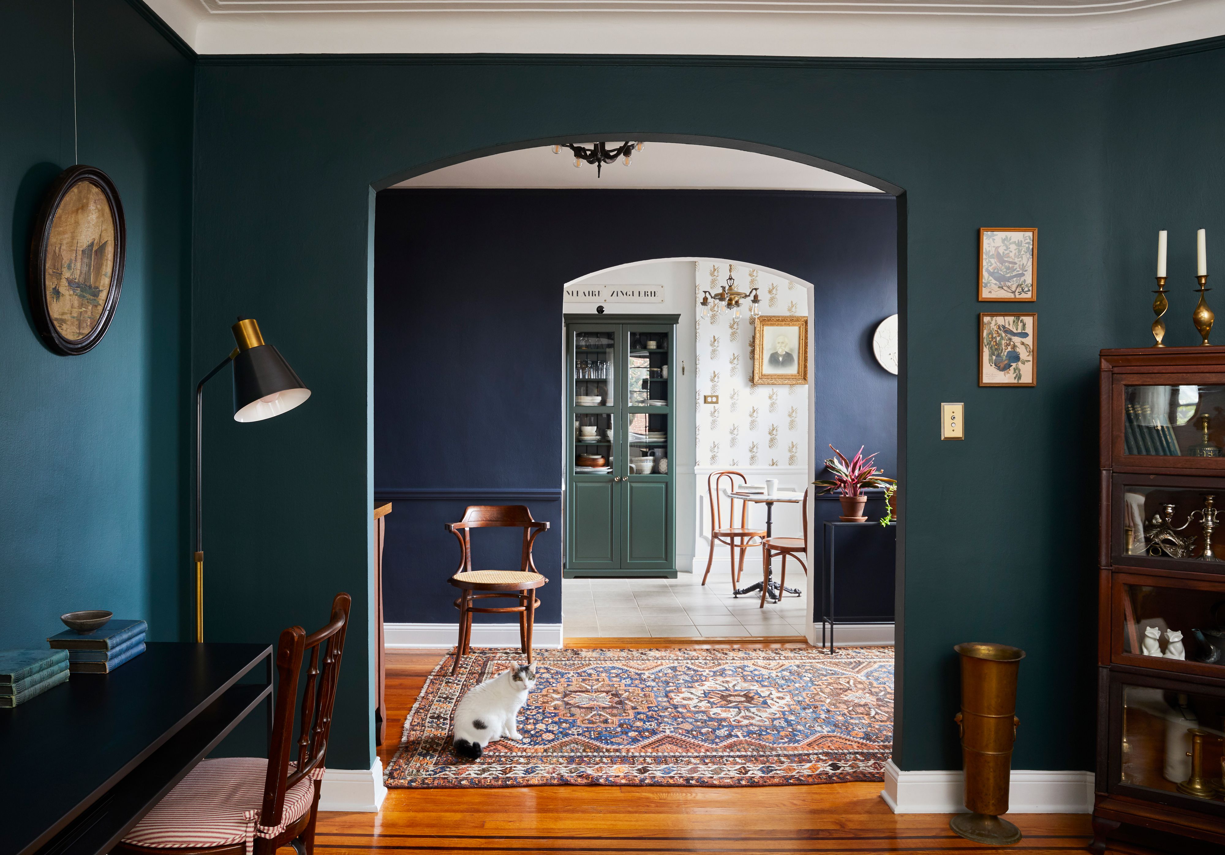
- Try “color drenching” for small rooms: Walls + trim + doors in one hue can blur edges and make the room feel bigger and calmer.
- Match the undertone: If walls lean warm, pick a warm trim white. If walls lean cool, keep trim cool (but not icy).
Quick example: In a small bedroom with lots of trim, painting baseboards and door casings in the same tone as the walls reduces visual clutter and makes the room feel less boxed in.
3) Treating the Ceiling Like It’s Not Part of the Room
Why it makes a space feel smaller
A ceiling that’s dramatically darker than the walls can create a cozy vibebut in many average-height rooms it also creates a “low lid” effect. On the flip side, a glaring builder white ceiling above warmer walls can make the wall/ceiling line feel extra sharp, which visually chops height. Either way, your eye catches the transition, and the room reads shorter.
Do this instead
- Go close in color: Use the wall color in a lighter tint on the ceiling, or pick a ceiling white that shares the same undertone.
- For low ceilings, consider same-color: Painting walls and ceiling the same shade can erase the break and make corners feel farther away.
- Keep sheen sensible: Too much shine overhead can highlight texture and draw attention to the ceiling (not always the goal).
Quick example: A compact office with 8-foot ceilings often feels taller when the ceiling is the wall color (or a close tint) instead of a stark white that creates a hard line.
4) Using Too Many Colors in One Sightline
Why it makes a space feel smaller
In open-concept layouts and connected rooms, perceived size comes from long sightlines. If every zone gets a different paint color, those changes become visual speed bumps. Even if there’s no wall, the home starts to read as several smaller “paint rooms” instead of one larger flow.
Do this instead
- Pick one main wall color for connected spaces and let furniture, rugs, and lighting create zones.
- Use tone-on-tone if you need variation: two related shades read calmer than high-contrast color jumps.
- Carry color through transitions: Matching the hallway to the main space can make the entire home feel longer.
Quick example: In a small apartment, one consistent wall color across living/dining areas often makes the footprint feel bigger than three different paints competing for attention.
5) Placing an Accent Wall Where It Shortens Depth
Why it makes a space feel smaller
Accent walls aren’t automatically badthey’re just easy to misfire. A high-contrast accent on a short wall can make that wall “advance” visually, reducing perceived depth. An accent wall on a wall full of doors/windows can also look busy, because trim and openings interrupt the color, creating more visual breaks.
Do this instead
- Choose the wall that helps proportions: Sometimes the far wall in a narrow room benefits from a slightly deeper tone to balance the shape.
- Try a soft accent: One or two shades deeper (or a subtle pattern) adds interest without slicing the room.
- When in doubt, go cohesive: In tiny rooms, a single wraparound color often looks larger than a one-wall statement.
Quick example: A powder room can feel surprisingly spacious when a deep color wraps all walls (and even trim), because edges blurwhereas one deep accent wall with bright white everywhere else can make the room feel split.
6) Choosing the Wrong Sheen and Turning Light Into Glare (or Gloom)
Why it makes a space feel smaller
Sheen affects how light bounces. Glossy walls can reflect bright spots and highlight texture, making surfaces feel closerespecially in sunlit rooms. Ultra-flat paint can do the opposite problem in dim spaces: it absorbs light, making the room feel dull and smaller. The goal is balanced reflection: enough to keep the space bright, not so much that your walls look like they’re sweating.
Do this instead
- Walls: Matte or eggshell for most living spacessoft, modern, and forgiving.
- Trim & doors: Satin or semi-gloss to add crispness and bounce light at the edges.
- Small, low-use rooms: A slightly higher sheen can brighten a closet or powder roomjust be mindful of wall texture.
Quick example: In a small living room with strong afternoon sun, satin walls can create hot spots. Matte walls with satin trim often look larger because light feels smoother.
7) Leaving “Visual Clutter” in Contrasting Colors
Why it makes a space feel smaller
Doors in a different white, built-ins in another color, vents that pop, radiators that don’t matcheach one is a tiny interruption. In a big room, you might not care. In a small room, those interruptions add up and make the space feel busier and tighter because your eye keeps stopping to process boundaries.
Do this instead
- Blend the extras: Paint doors, trim, and built-ins close to the wall color so they visually recede.
- Use contrast intentionally: One focal feature (art, a piece of furniture, a statement light), not ten mini outlines.
- Simplify the perimeter: Fewer color breaks = larger feel.
Quick example: A small den with two doors can feel chaotic if each door is a different shade of white. Matching doors and trim to the wall color often makes the room feel instantly calmerand bigger.
Fast Checklist: Paint Choices That Help Rooms Look Bigger
- Test paint in your room’s lighting, not the store’s.
- Reduce harsh trim contrast, especially in low-ceiling spaces.
- Treat the ceiling as part of the palette (close tint or same color).
- Limit color changes in connected spaces to preserve sightlines.
- Choose sheen to manage light: avoid glare and avoid gloom.
- Blend secondary elements to cut visual clutter.
Conclusion
The best “make my home look bigger” paint strategy is rarely “paint everything white.” It’s smarter than that: pick colors that behave well in your light, soften outlines, keep ceilings and trim working with the walls, and avoid unnecessary color breaks. When your eye can travel smoothly, your rooms feel biggerno new square footage required.
Extra: of Real-World Experiences With These Paint Mistakes
These are the patterns that show up again and again in real-home refreshesespecially in apartments, older houses with lots of trim, and rooms with standard 8-foot ceilings.
Case study 1: The bright-white trim that made a small room feel “outlined”
A homeowner painted their walls a warm neutral and used a super-bright white on every baseboard, door, and window casing. It looked sharp in the paint aisle. In the room, it created a high-contrast frame around everythingso the eye kept jumping from border to border. The walls felt closer, and the room felt busier than it actually was. The fix was to soften the trim: swapping to a warmer white (or painting trim to match the walls) reduced the outlining effect. Suddenly the room read as one calm volume instead of a collection of edges.
Case study 2: The ceiling line that “lowered” an 8-foot bedroom
In a small bedroom with limited daylight, the walls were a mid-tone color and the ceiling stayed a bright, separate white. At night, warm lamps made the ceiling look creamier while the walls stayed cooler, so the ceiling line became very obvious. The homeowner described it as “closing in.” The fix was to tint the ceiling toward the wall coloreither the same shade cut slightly lighter or the exact wall color in the same sheen family. That softened the transition, reduced corner shadows, and made the ceiling feel higher without changing anything structural.
Case study 3: Open-concept paint patchwork that shortened sightlines
In an open-plan main floor, the kitchen, dining area, and living room each had a different wall color. There were no physical walls, but the paint breaks created invisible ones. The space felt segmented and smaller because every color change told the eye to stop. The fix was to choose one main wall color for the connected area and use accent color in smaller, deliberate placeslike an island, a pantry door, or built-ins. With fewer “stop signs,” the long sightlines returned, and the whole floor felt larger and easier to furnish.
Case study 4: Shiny walls that turned sunlight into glare
In a small living room with big windows, someone chose a higher-sheen wall paint for “easy cleaning.” During the day, the sun hit those walls and created bright glare spots that made the room feel visually busylike the walls were closer and louder than they needed to be. The fix was switching the walls to a softer sheen (matte or eggshell) while keeping satin or semi-gloss on trim and doors. The room still looked crisp, but light felt smoother, and the space read bigger because your eyes weren’t constantly pulled to reflections.
If you need wipeability in a small, high-traffic room, you can still get it without glare: use an eggshell or durable matte on walls, then put the tougher sheen on trim and doors. That way you get cleanable surfaces where hands touch, while the big wall planes stay visually calm and expansive.
Across all three experiences, the lesson is the same: paint works best when it reduces accidental boundaries. When trim, ceiling, sheen, and color changes are intentionaland not randomrooms feel brighter, taller, and more open.