Every year, paint companies announce a “Color of the Year,” and every year the internet politely pretends it was not already arguing about beige, greige, sage green, and “is this white or is this just landlord white?” Then Behr stepped into 2023 with a shade that sounded simple but turned out to be surprisingly strategic: Blank Canvas.
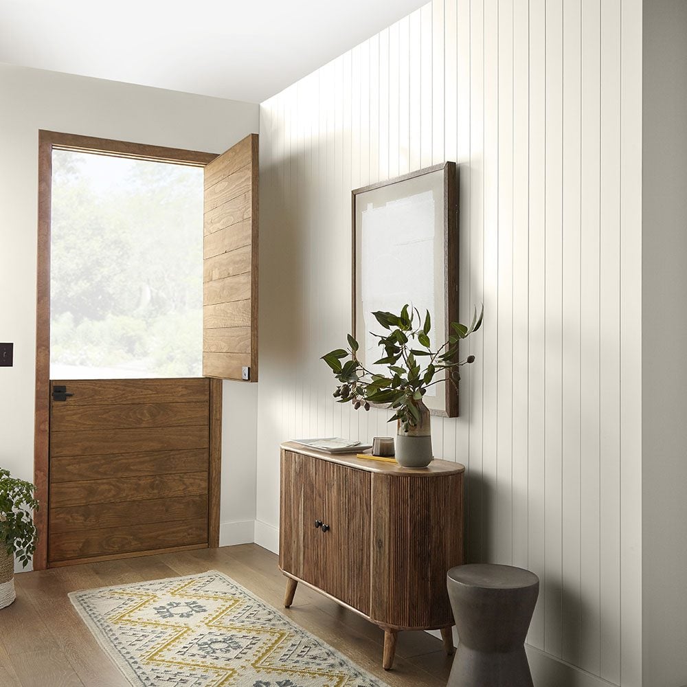
Officially known as Blank Canvas DC-003, Behr’s 2023 Color of the Year is a warm white with a soft, welcoming personality. It is not the icy, gallery-wall white that makes a room feel like nobody is allowed to sit down. It is also not a yellowed cream that looks like it has been listening to old radio dramas since 1948. Blank Canvas sits in that highly useful middle zone: fresh, calm, flexible, and quietly warm.
In other words, it is the paint equivalent of taking a deep breath, clearing the kitchen counter, and deciding that this year the junk drawer will finally become a functional place. Ambitious? Yes. Possible? With enough little baskets, absolutely.
What Is Behr Blank Canvas?
Behr Blank Canvas is a warm off-white paint color chosen by Behr as its Color of the Year 2023. The shade was created to reflect renewal, tranquility, optimism, and the desire for homes that feel peaceful without becoming boring. Its color code is DC-003, and Behr describes it as a hopeful, welcoming white designed to work as a foundation for endless design possibilities.
That “foundation” idea is important. Blank Canvas is not trying to be the loudest guest at the dinner party. It is the calm host who sets the table, lights the candles, remembers everyone’s dietary restrictions, and somehow makes the room feel pulled together before the salad arrives.
As a warm white, Blank Canvas has gentle undertones that help it avoid the sterile look some bright whites can create. It can brighten a room, soften harsh edges, and make existing furniture, art, wood tones, textiles, and decor feel more intentional. For homeowners and renters alike, it is the kind of color that gives a space breathing room.
Why Behr Chose Blank Canvas for 2023
The timing of Blank Canvas made sense. After years of people rethinking how they live, work, rest, and recover at home, design trends shifted toward colors that support comfort and emotional ease. Homes were no longer just places to sleep. They became offices, gyms, classrooms, movie theaters, meditation corners, snack headquarters, and occasionally places where someone asks, “Why is there a sock in the fruit bowl?”
Behr’s choice reflected this desire for calm and flexibility. Blank Canvas speaks to a wider movement in interior design: warmer neutrals, softer whites, nature-inspired palettes, and spaces that feel personal rather than overly staged. Instead of pushing one dramatic style, Behr selected a color that allows many styles to happen around it.
That is the secret power of a good white paint color. It does not demand that your home become modern farmhouse, minimalist, coastal, traditional, bohemian, Scandinavian, or “I saw one hotel lobby and now I own three boucle chairs.” It simply gives the room a clean, warm starting point.
Blank Canvas Is Not Just Another White Paint
White paint sounds easy until you stand in front of a wall of paint chips and realize there are approximately 900 versions of white, all with names that suggest clouds, desserts, wedding stationery, or emotionally unavailable snow. Some whites look blue. Some look gray. Some look pink. Some look perfectly fine in the store and then turn into sour cream under your kitchen lighting.
Blank Canvas works because it is approachable. Its warmth helps it feel softer than a stark white, while its clean appearance keeps it from becoming too heavy or creamy. It can make a room feel fresh without making it feel cold. It can also pair with both quiet neutrals and bold accent colors, which makes it useful for people who like to change decor without repainting every six months.
Key qualities of Behr Blank Canvas
Blank Canvas is best understood through its main design strengths: it is warm, versatile, calming, and easy to layer. It works well with natural materials like wood, linen, rattan, leather, stone, and woven textures. It also creates a balanced backdrop for black accents, brass hardware, colorful artwork, patterned rugs, and plants that are hopefully still alive.
Because it is a soft white rather than a harsh one, Blank Canvas can help rooms feel more inviting. It is especially useful in spaces where you want brightness but not glare, simplicity but not emptiness, and freshness without that “new printer paper” vibe.
Best Rooms for Behr Blank Canvas
One reason Blank Canvas became such a practical Color of the Year is that it works in almost every room. It can serve as the main wall color, a trim color, a cabinet color, or a quiet companion to stronger shades.
Living Rooms
In a living room, Blank Canvas can create an easy, relaxed backdrop for daily life. It works beautifully with tan sofas, brown leather chairs, light oak furniture, black metal lighting, patterned pillows, and warm wood coffee tables. If your living room currently contains three design personalities fighting for custody of the rug, Blank Canvas can help negotiate peace.
For a layered look, pair it with textured curtains, boucle or linen upholstery, ceramic lamps, framed art, and a mix of matte and glossy finishes. The goal is to keep the room from looking flat. White walls love texture. They practically send it handwritten thank-you notes.
Bedrooms
Blank Canvas is a strong bedroom choice because it supports rest. A bedroom painted in a warm white can feel clean and calm without feeling empty. Add oatmeal bedding, soft gray throws, warm wood nightstands, and muted green or blue accents for a restful retreat.
If you prefer a romantic look, layer it with dusty rose, antique brass, cream textiles, and soft lighting. If you prefer a modern look, use black accents, simple bedding, and minimal artwork. Either way, Blank Canvas gives the room a quiet base.
Kitchens
In kitchens, Blank Canvas can be used on walls, cabinets, or both. It works especially well with butcher block countertops, white oak cabinets, marble-look quartz, brass pulls, matte black fixtures, and handmade tile. It can also soften stainless steel appliances, which sometimes make kitchens feel more like a professional food lab than a place where cereal becomes dinner.
For a timeless kitchen, use Blank Canvas on upper cabinets and a deeper shade such as navy, forest green, taupe, or charcoal on the island. For a brighter look, pair it with warm wood shelves and simple white tile. The color’s warmth helps the space feel lived-in rather than overly polished.
Bathrooms
Bathrooms can easily feel cold, especially when they include white tile, chrome fixtures, and bright overhead lighting. Blank Canvas helps warm things up. It can create a spa-like effect when paired with natural stone, wood vanities, woven baskets, eucalyptus, soft towels, and warm metallic finishes.
Small bathrooms also benefit from its brightness. A warm white can make the room feel larger while still keeping it cozy. Add a framed mirror, soft sconces, and a small piece of artwork, and suddenly the bathroom looks designed instead of simply “the place where toothpaste happens.”
Home Offices
Blank Canvas is an excellent home office color because it feels clean but not distracting. It supports focus while still allowing personality through bookshelves, artwork, plants, desk accessories, and lighting. For video calls, a warm white wall can also look more flattering than a cold, bluish white.
Pair it with wood furniture, black frames, and a soft accent color such as sage, muted terracotta, or deep blue. The result is professional but not stiff, which is exactly what many home offices need.
Best Colors to Pair With Blank Canvas
Blank Canvas is flexible enough to pair with many different palettes. Its warm undertone makes it especially friendly with earth tones, muted colors, and natural finishes.
Warm neutrals
For a soft, layered look, combine Blank Canvas with beige, taupe, sand, camel, mushroom, and warm gray. This palette works well in living rooms, bedrooms, and open-concept spaces. The result feels calm, grown-up, and quietly expensive, even if your side table was assembled with an Allen wrench and emotional support.
Nature-inspired greens
Sage, olive, eucalyptus, moss, and forest green all pair beautifully with Blank Canvas. Green brings a natural, grounding quality, while the warm white keeps the room light. Try green cabinets with Blank Canvas walls, or Blank Canvas walls with green textiles and plants.
Bold black accents
Black and warm white are a classic combination. Use black window frames, picture frames, lighting, cabinet hardware, or furniture legs for contrast. Blank Canvas softens the contrast so the room does not feel too severe.
Soft blues
Dusty blue, denim, navy, and muted coastal blues can make Blank Canvas feel fresh and relaxed. This combination works well in bedrooms, bathrooms, mudrooms, and beach-inspired interiors that do not involve hanging a sign that says “Life is better in flip-flops.” We understand the sentiment, but the wall knows.
Earthy reds and terracotta
Terracotta, clay, rust, and muted coral add warmth and personality. Against Blank Canvas, these shades feel modern and grounded rather than overly loud. Use them in rugs, pillows, pottery, art, or an accent wall.
Design Styles That Work With Blank Canvas
Blank Canvas can fit into many design styles because it behaves like a flexible background rather than a rigid theme. In a minimalist home, it emphasizes clean lines and simplicity. In a traditional home, it supports classic trim, wood antiques, and layered textiles. In a modern organic home, it pairs naturally with stone, wood, linen, and sculptural decor.
For farmhouse spaces, Blank Canvas feels softer than stark white and pairs well with weathered wood, black metal, and vintage pieces. For coastal interiors, it works with sandy neutrals and soft blues. For bohemian rooms, it allows woven textures, plants, and patterned rugs to shine. For transitional homes, it bridges modern and classic pieces without creating visual drama.
That adaptability is why Blank Canvas is more than a trend color. It is a practical design tool.
How to Use Blank Canvas Without Making a Room Look Plain
The biggest risk with any white or off-white paint is flatness. A room painted in a beautiful white can still look unfinished if everything else is also flat, plain, and texture-free. The solution is not necessarily more color. The solution is depth.
Add texture
Use linen curtains, woven baskets, chunky knit throws, ribbed glass, jute rugs, ceramic vases, wood furniture, and layered bedding. Texture gives warm white walls something to respond to.
Vary your finishes
Mix matte, satin, glossy, rough, smooth, soft, and hard materials. A room with Blank Canvas walls, matte black lighting, a wood table, a glass vase, and a wool rug will feel more complete than a room where every surface has the same visual weight.
Use contrast
Contrast does not have to mean a neon orange sofa, although if that is your destiny, proceed with confidence. Contrast can be as simple as dark picture frames, wood beams, charcoal pillows, or a deep green cabinet.
Layer lighting
Warm white paint changes throughout the day. Morning light, afternoon shadows, and evening lamps can all shift the mood. Use a mix of overhead lighting, table lamps, sconces, and natural light to bring out the best in Blank Canvas.
Paint Finish Tips for Blank Canvas
The finish you choose matters almost as much as the color. A flat or matte finish can look elegant on walls, especially in bedrooms and low-traffic living areas. Eggshell or satin is often practical for family rooms, hallways, and spaces that need occasional cleaning. Semi-gloss is commonly used for trim, doors, and cabinets because it is more durable and easier to wipe.
For kitchens and bathrooms, consider moisture, cleaning needs, and traffic. For trim and doors, a slightly shinier finish can create a subtle contrast even when using the same color. This “same color, different finish” technique is especially useful if you want a quiet, cohesive look.
Should You Test Blank Canvas Before Painting?
Yes. Always test paint before committing. Paint colors are like online dating profiles: lighting changes everything.
Apply samples on multiple walls and observe them in morning, afternoon, and evening light. Look at the color next to flooring, cabinets, countertops, furniture, and trim. A warm white can look different beside cool gray tile than it does beside oak floors or beige carpet.
If your room has north-facing light, Blank Canvas may appear slightly more subdued. In south-facing light, it may look warmer and brighter. Artificial light also matters. Warm bulbs can enhance its creamy quality, while cool bulbs may make it appear cleaner and more neutral.
Is Blank Canvas Good for Resale?
Warm whites and soft neutrals are often smart choices for resale because they make a home feel clean, bright, and move-in ready. Blank Canvas can help buyers imagine their own furniture and decor in a space. It is neutral without feeling lifeless, which is exactly what many sellers want.
For resale, use it in main living areas, bedrooms, hallways, and kitchens where a broad, welcoming appeal matters. Pair it with clean trim, updated lighting, and decluttered rooms. The goal is to make the home feel fresh, not anonymous.
Blank Canvas vs. Stark White: What Is the Difference?
A stark white often has a cooler, sharper appearance. It can look crisp and modern, but in some rooms it can also feel harsh. Blank Canvas is warmer and softer. It gives you brightness without the clinical edge.
That difference matters in real homes, where walls have shadows, furniture has undertones, and life has fingerprints. A warm white tends to be more forgiving. It can hide slight imperfections better than a very bright white and can make everyday spaces feel more comfortable.
Experience Notes: Living With Behr Blank Canvas
The real charm of Blank Canvas becomes obvious after you imagine it in a normal home, not just a perfectly styled photo where nobody owns phone chargers, mail, or a suspicious number of reusable tote bags. In everyday life, a warm white like this can make rooms feel easier to live in.
Picture a living room that has gone through several design phases. Maybe it started with gray walls, then gained a tan sofa, then inherited a wood cabinet from a relative, then somehow acquired blue pillows, a black floor lamp, and a rug that was definitely “on sale for a reason.” A color like Blank Canvas can bring those pieces into a calmer conversation. It does not erase personality; it organizes it.
In a bedroom, the experience is quieter. Blank Canvas can make the room feel clean in the morning and cozy at night. With soft lamps turned on, the walls take on a gentle warmth that feels restful. It is not dramatic, but that is the point. Not every room needs to enter wearing a cape.
In a kitchen, Blank Canvas feels especially useful when there are already strong materials in play. Wood floors, stone counters, metal fixtures, and tile backsplashes can all compete visually. A warm white wall or cabinet color gives the eye a place to rest. It can make a kitchen feel brighter without making it look like a showroom where the cutting board is only decorative.
One of the most practical experiences with Blank Canvas is how easily it adapts when decor changes. During spring, it works with greenery, pale blue glass, and fresh flowers. In fall, it pairs with rust, brown, olive, and woven textures. Around the holidays, it lets garlands, candles, ribbons, and metallic accents stand out. In January, when the decorations come down and the house looks like it just exhaled, Blank Canvas still feels intentional.
It is also a friendly choice for people who are nervous about color. Some homeowners want warmth and style but panic when shown a paint chip darker than oatmeal. Blank Canvas offers a safe but not boring solution. It adds softness, supports decor, and makes the room feel updated without forcing a major personality change.
The best experience comes when Blank Canvas is treated as a beginning, not the entire design plan. Add art. Add plants. Add wood. Add fabric. Add a lamp that makes you feel like a more organized person, even if the cabinet behind it is full of tangled cords. Blank Canvas gives you permission to build slowly. It is a reset button with good manners.
That is why Behr’s 2023 Color of the Year still feels relevant. It does what a great neutral should do: it makes a home feel lighter, calmer, warmer, and more open to change. It is not flashy. It is not fussy. It is simply ready for whatever you want the room to become next.
Conclusion
Behr Paint’s Color of the Year 2023, Blank Canvas, is more than a pretty warm white. It is a response to the way people want to live: with more calm, more flexibility, and less visual noise. Its soft undertone makes it inviting, while its clean character keeps it fresh and modern.
Whether used in a living room, kitchen, bedroom, bathroom, hallway, or home office, Blank Canvas offers a reliable foundation for personal style. It pairs well with warm neutrals, natural woods, earthy greens, bold blacks, soft blues, and textured materials. It can help a room feel finished, peaceful, and adaptable without making it feel plain.
If your home needs a reset but you are not ready to commit to a dramatic color, Blank Canvas is a smart place to begin. It is calm without being dull, warm without being yellow, and versatile without being forgettable. In a world full of paint colors shouting for attention, Blank Canvas proves that sometimes the quietest shade is the one doing the most work.
Note: This article is an original synthesis based on real information from reputable U.S. paint, home improvement, and interior design sources, rewritten in a natural editorial style for web publication.