Some designers open a showroom and call it a day. David Weeks opened one and made it feel like a design thought experiment with very good lighting. That distinction matters. When Weeks unveiled his Tribeca studio at 38 Walker Street, the move was not just about getting a Manhattan address with better foot traffic and prettier cast-iron neighbors. It was about creating a space where his work could finally be seen the way it was meant to be seen: not as isolated products, but as part of a complete visual language.
That language is unmistakably his. Weeks has long built a reputation around sculptural lighting that feels smart, calm, and a little mischievous. His fixtures often look as if geometry went to art school, got serious about balance, and still remembered how to have fun. But the Tribeca studio showed that his world extends well beyond lamps and chandeliers. It brought together furniture, accessories, prototypes, collaborations, and curated objects in one place, turning the storefront into a full-scale expression of the David Weeks universe.
For anyone interested in New York design, modern lighting, or how a studio can double as a gallery without becoming pretentious wallpaper for expensive objects, this space deserves a close look. Weeks did not simply open a store. He created a working studio, an exhibition platform, and a public-facing design statement that helped anchor Tribeca as a serious design destination.
Why the Tribeca Studio Mattered
By the time the Tribeca studio opened in fall 2013, David Weeks was hardly a newcomer. He had founded his studio in 1996, studied painting and sculpture at the Rhode Island School of Design, and spent years developing a practice rooted in craft, formal reduction, and hands-on making. His Brooklyn operation had already established him as a major name in independent American design. What the new storefront offered was visibility, range, and control.
That was the real headline. Weeks had worked out of Brooklyn for years, building a practice that mixed sculpture, engineering, furniture design, and product development. The Tribeca location allowed him to bring that body of work into the open. Instead of meeting his brand piece by piece, visitors could see the entire conversation at once. Lighting sat near seating. Accessories played off larger sculptural forms. Experimental works had room to breathe. The effect was less “retail display” and more “walk-in essay on how a designer thinks.”
Tribeca was also a savvy choice. The neighborhood was evolving into a bona fide design district, with galleries, showrooms, and specialty retailers giving downtown Manhattan a new creative density. Weeks was not a random arrival; he became part of the momentum that helped define the area. His Walker Street storefront put his work in dialogue with the neighborhood’s industrial bones, cast-iron architecture, and increasingly design-literate audience. In other words, the setting had taste. And high ceilings. Always helpful.
Inside the Space: A Showroom That Behaves Like a Studio
What made the new David Weeks studio so compelling was the refusal to settle into one identity. Yes, it functioned as a showroom. But it also behaved like a creative lab. That hybrid character came through in both the layout and the display strategy.
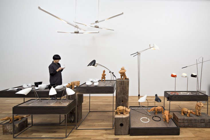
The branding and environment were shaped with the help of 2×4, which created modular display fixtures and a reconfigurable system for presenting the studio’s broad range of work. That decision was smart and revealing. A rigid showroom would have flattened the experience; a flexible one supported change, experimentation, and storytelling. Lighting, toys, tableware, furniture, and one-off pieces could be shifted and regrouped, making the space feel active instead of embalmed.
And there was plenty to look at. In the window, the Kopra Burst and Kopra Cluster fixtures announced the studio with graphic confidence. Inside, the showroom gathered together pieces such as the Doublepod Standing Lamp, the Sculpt Sectional Sofa, the Boi Sconce, the Torroja Standing Lamp, and the Hennen Cross ceiling fixture. Elsewhere, Weeks’s tall Cernan Light illuminated Folha tables and prints by Todd St. John. The result was a room full of objects that felt related without becoming repetitive. Every piece had its own silhouette, but the studio as a whole maintained a disciplined visual rhythm.
That consistency is one of Weeks’s greatest strengths as a designer. He understands that a strong design language does not mean making the same object over and over again until everyone loses the will to decorate. Instead, he works within a family of ideas: proportion, balance, line, asymmetry, movement, and a sculptural sense of restraint. The Tribeca studio made those ideas legible at room scale.
The Opening Exhibition: Brass, Leather, and No Unnecessary Drama
If the new storefront established the setting, the inaugural exhibition gave it a personality. Titled Brass and Leather, the opening presentation set the tone for what the studio could become: part showroom, part gallery, part collaborative platform.
At the center of the exhibition was a limited edition of 40 Semana Chairs, reimagined in collaboration with Big Bend Saddlery in Alpine, Texas. That detail alone tells you a lot about Weeks. He has always been interested in material honesty and the expressive power of construction, so working with a century-old saddlery was more than a rustic detour. It was a way of bringing traditional workmanship into contemporary design without turning the result into cowboy cosplay. The thick saddle leather gave the chair physical authority while promising the kind of patina that only improves with age.
The exhibition also included brass basketry by Rodger Stevens and introduced the Fenta lighting series, which drew on brutalist inspiration and technique. That mix of leather, brass, and sculptural lighting created an atmosphere that was tactile without being fussy. You could sense the hand of the maker everywhere, but the presentation remained sharp and urbane. It was not nostalgia. It was material intelligence with a downtown zip code.
Most importantly, the exhibition clarified Weeks’s ambitions for the space. He described the studio as a working environment that would give him the freedom to make and share one-of-a-kind prototypes, collaborations, and work by other artists he admired. That mission matters because it shifts the showroom away from pure commerce. Selling objects is part of the story, obviously. New York rent does not pay itself out of admiration alone. But the studio was clearly designed to cultivate exchange, surprise, and discovery.
David Weeks’ Design Language, Fully Visible
The Tribeca studio worked because it translated Weeks’s design philosophy into an interior experience. His best lighting has always carried a sculptural tension between refinement and play. You see it in the way arms extend, shades pivot, clusters gather, and silhouettes feel reduced to their most memorable essentials. He often begins with a problem or a formal question, then trims, adjusts, and refines until the piece lands exactly where it should. That process of reduction is not cold minimalism. It is edited expressiveness.
The showroom let visitors see how that approach carries across categories. Furniture such as the Sculpt collection brought softness into the conversation without losing structural clarity. Accessories and smaller objects echoed the same discipline in miniature. Even his better-known toys and collaborations made sense in context, because they revealed that the playful side of the brand is not a side project at all. It is part of the same design DNA.
That breadth is important for SEO-minded readers searching terms like “David Weeks Tribeca studio,” “David Weeks showroom,” “sculptural lighting,” or “New York design studio.” The point is not just that Weeks designs beautiful fixtures. It is that he operates as a world-builder. The Tribeca space made that undeniable.
Why the Studio Still Feels Relevant
Years after its debut, the logic behind the Tribeca studio still feels fresh. In an era when design brands are constantly asked to choose between gallery credibility, retail accessibility, and studio authenticity, Weeks built a place that combined all three. It was polished but not precious, curated but not stiff, and commercial without losing its sense of experimentation.
There is also a bigger lesson here about American design. Weeks’s Brooklyn-based practice has long emphasized making by hand, collaboration with skilled fabricators, and a deep respect for process. The Tribeca studio turned those values into something visible for clients, architects, collectors, and curious visitors. Rather than hiding the labor behind the object, the space helped frame the work as the result of thinking, testing, making, and revising. That is one reason the studio felt substantial. It was not selling vibe alone. It was selling evidence.
And while many showrooms aim for neutral elegance, Weeks’s space had something better: point of view. It did not try to please everyone. It tried to express something coherent. In design, that is usually the difference between “nice” and memorable.
The Experience of Walking Through David Weeks’ Tribeca Studio
Part of what made the Tribeca studio special was the way it likely changed your pace the moment you entered. Walker Street outside has all the classic downtown Manhattan ingredients: architecture with character, a little grit, a little glamour, and the feeling that behind every large pane of glass something expensive and thoughtfully lit is happening. Then you step into Weeks’s world, and the mood shifts. The street noise softens. Your attention narrows. Suddenly you are looking up, then across, then back again, because the room is organized less like a traditional store and more like a sequence of visual cues.
The first sensation is probably balance. Even when Weeks’s fixtures appear playful or offbeat, they do not feel chaotic. They hover, branch, cluster, and arc with a kind of controlled energy. That makes the room feel animated without becoming loud. You are not hit over the head with “design capital D.” Instead, the space invites you to notice relationships: a lamp’s outline against a sofa’s volume, a wall of sconces creating rhythm, a leather chair grounding a more delicate form nearby. It is the kind of room that makes you stand straighter and examine details you would normally miss, like the curve of an armature or the exact way a finish catches the light.
Then there is the material experience. Brass, leather, powder-coated steel, upholstery, paper, and wood all speak differently, and in the Tribeca studio they seem to have been given room for a proper conversation. That matters because Weeks’s work is not only about shape. It is about how a shape becomes believable through material. A leather sling that promises to soften with time feels different from a crisp metal fixture that throws light upward. A sculptural chair carries one kind of weight; a clustered chandelier carries another. In a well-designed showroom, you understand those distinctions instantly, almost physically.
The studio also seems to have offered that rare thing in design retail: curiosity without intimidation. Some high-end showrooms make visitors feel as if they should either buy a custom chandelier immediately or quietly disappear into the sidewalk. Weeks’s space appears to have been more welcoming than that. Because it functioned like a working studio and rotating exhibition venue, it suggested movement and experimentation. You were not just there to shop. You were there to see what had been made, what had been rethought, and what might show up next.
That is why the space likely stayed with people after they left. It was not simply a place full of beautiful objects. It was a place where those objects explained themselves through proximity, contrast, and atmosphere. You could leave remembering a specific fixture, sure, but also a bigger feeling: that design can be rigorous without being severe, luxurious without being stuffy, and playful without losing sophistication. That is a hard balance to strike. Weeks made it look annoyingly easy.
Final Thoughts
David Weeks’ Tribeca studio succeeded because it did more than introduce a new address. It framed his work in a way that finally matched its ambition. By bringing together lighting, furniture, accessories, prototypes, collaborations, and rotating exhibitions, the Walker Street space became a full portrait of a designer whose strengths lie in clarity, craft, and controlled surprise.
It also proved that a showroom can be both commercially smart and creatively alive. That may sound obvious, but it is surprisingly rare. Weeks built a place that sold objects while also telling a story about process, material, and authorship. In the process, he helped define Tribeca’s emergence as a serious design district and gave visitors a richer way to understand what contemporary American design can look like when it refuses to stay in one lane.
If great design is about shaping experience as much as form, then David Weeks’ new Tribeca studio was never just a room full of products. It was an argument for seeing design as a living practice. And thanks to the lighting, it made that argument look very, very good.