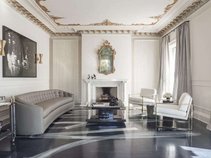
Some rooms whisper. Some rooms politely clear their throat. And then there are rooms that enter wearing vintage sunglasses, a white suit, a little gold, and the confidence of a rock star arriving fashionably late. Catherine Kwong’s Mick-and-Bianca-inspired living room at the 2013 San Francisco Decorator Showcase belongs firmly in that last category.
Created for the historic Herbst Manor in Pacific Heights, the room did not simply decorate a formal living space. It staged a full character study: old San Francisco architecture meets 1970s European glamour, refined tradition meets rebellious brushwork, and a stately mansion suddenly discovers it has excellent taste in music. The result was a living room that felt elegant, edgy, and just theatrical enough to make the marble fireplace seem as though it had seen things.
The title “Mick and Bianca Rule at the San Francisco Decorator’s Showcase” captures the room’s mood perfectly. It was not about copying celebrity style in a literal way. There were no costume-party clichés, no faux stage lights, and thankfully no leopard-print panic attack. Instead, the room translated the mystique of Mick Jagger and Bianca Jagger in their glamorous 1970s years into a layered interior language: midnight blue, gold trim, modern silhouettes, expressive floors, and the kind of polished attitude that makes a room unforgettable.
The San Francisco Decorator Showcase: Where Design Gets a Stage
The San Francisco Decorator Showcase is one of the West Coast’s most anticipated design events, known for giving top interior and landscape designers a rare challenge: take a grand San Francisco residence and transform it room by room into a temporary design exhibition. The event has also long supported the San Francisco University High School Financial Aid Program, which gives the Showcase a purpose beyond beauty. In other words, visitors get inspiration, designers get a spotlight, and a good cause gets a serious boost. That is a better arrangement than most living room furniture layouts.
The 2013 edition was held at Herbst Manor, an architecturally significant Georgian mansion at 2800 Pacific Avenue in Pacific Heights. The house itself already had personality: grand scale, historic detailing, formal rooms, decorative ceilings, and the kind of old-world bones that make designers both thrilled and slightly nervous. A home like that does not need someone to “add character.” It has character stacked in the crown molding.
For Catherine Kwong, the living room became a chance to push against the expected. Rather than treating the mansion’s history as something fragile and untouchable, she used it as a dramatic counterpoint. She respected the architecture but refused to let it become a museum piece. That balance is what made the room so compelling: it felt rooted in tradition but alive in the present.
Catherine Kwong’s Vision: Glamour With a Sharp Edge
Catherine Kwong is known for interiors that combine elegance, restraint, and a subtle sense of tension. Her design language often favors refined materials, disciplined composition, and spaces that feel luxurious without trying too hard. In this Showcase living room, however, she allowed the drama to stretch its legs.
The concept reportedly grew from images of Mick and Bianca Jagger in the 1970s: young, stylish, cosmopolitan, and a little dangerous in the way only extremely attractive people in excellent tailoring can be. This was the era of European nightlife, Saint-Tropez energy, polished rebellion, and interiors that could host both a cocktail party and a minor scandal. Kwong did not imitate a celebrity apartment; she captured a feeling.
That feeling was “luxe, but not sleepy.” The room had polish, but it also had movement. It had symmetry, but not stiffness. It respected formal architecture, but it did not bow down to it. The living room seemed to ask: What if a historic San Francisco mansion met a rock-and-roll couple who knew exactly how to use a bar cart?
The Floor That Stole the Show
The room’s most talked-about feature was the hand-painted floor. Finished in a deep midnight blue and animated with bold, sporadic white brushstrokes, the floor drew comparisons to the expressive work of Cy Twombly. It was not merely a surface; it was the room’s rhythm section.
In many traditional living rooms, the floor is expected to behave. It supports the furniture, holds the rug, and stays quiet. Kwong’s floor did the opposite. It became art underfoot. The white strokes created movement across the dark ground, adding spontaneity to a space framed by ornate historic architecture. The contrast was delicious: a gilded ceiling above, a painterly storm below, and modern furniture floating between them like well-dressed guests at a very chic party.
This choice worked because it was daring but disciplined. The floor was not random decoration; it was the anchor of the concept. By keeping the walls crisp and the furniture relatively restrained, Kwong allowed the painted floor to remain the star without overwhelming the room. The lesson for anyone studying interior design is clear: when one element is powerful, the rest of the room must know how to support it. Not every piece can play lead guitar.
Historic Details, Reimagined
Herbst Manor’s original ceiling and ornate moldings were not hidden or softened into the background. They were emphasized. Gilded details added warmth and grandeur, creating a refined counterpoint to the modern floor. This blend of old and new is one of the room’s strongest design moves.
Many designers face a common problem in historic homes: preserve too much and the space can feel frozen; modernize too aggressively and the architecture loses its soul. Kwong avoided both extremes. She allowed the classical elements to shine, but she placed them in conversation with contemporary gestures. The result felt less like a renovation and more like a remix.
The marble fireplace, ornate mirror, gilded trim, and formal proportions gave the room its heritage. The painted floor, modern seating, black accents, and metallic details gave it a pulse. Together, they formed a layered interior that felt glamorous but not dusty, sophisticated but not stiff, and dramatic without tipping into costume design.
Why the Mick and Bianca Inspiration Works
Mick and Bianca Jagger remain enduring style references because their image combines elegance with rebellion. Mick’s rock-star charisma and Bianca’s cool, tailored glamour created a visual mythology that still resonates in fashion, photography, and interior design. They represent a kind of cultivated nonchalance: the sense that the room, the outfit, and the evening all happened effortlessly, even though everyone knows effort was involved.
Kwong translated that mythology into design choices rather than obvious references. The room did not need a framed concert poster or a white horse entering Studio 54 to make the point. The cues were subtler: deep color, shine, architectural drama, confident negative space, a bar-cart mood, and materials that felt luxurious without being overly sweet.
This is why the room still feels relevant. It was not dependent on trend. It used a cultural reference as a springboard, then turned that reference into atmosphere. The best inspiration does not trap a room in the past; it gives the room a story.
Design Lessons From the Room
1. Contrast Creates Energy
The living room succeeded because it embraced contrast. The historic ceiling contrasted with the modern painted floor. The crisp walls contrasted with dark accents. The refined furniture contrasted with the rebellious brushstrokes. In interior design, contrast is often what keeps luxury from becoming bland.
2. One Bold Idea Is Better Than Ten Loud Ones
The floor was the major statement, and the rest of the room supported it. That restraint made the boldness feel intentional. A common decorating mistake is adding too many “wow” moments until the room feels like a design showroom having a group chat. Kwong’s approach proves that a single powerful idea can carry an entire space.
3. Glamour Does Not Have to Be Soft
Glamour is often associated with velvet, curves, sparkle, and gentle lighting. This room showed another version: sharp, artistic, moody, and slightly rebellious. The metallic details, dark floor, and graphic brushstrokes made the glamour feel grown-up and fearless.
4. Historic Homes Can Handle Modern Drama
Older architecture does not always need traditional decorating. In fact, historic rooms often become more interesting when paired with contemporary art, modern furniture, and unexpected finishes. The key is proportion, respect, and confidence. Kwong had all three.
How to Bring This Look Home Without Owning a Mansion
Most of us do not live in a Pacific Heights Georgian mansion with gilded ceilings and a marble fireplace. Some of us are just trying to keep throw pillows from migrating to the floor. Still, the design ideas from this room can be adapted to real homes.
Start with a dark, dramatic base. A navy rug, deep blue painted furniture piece, or moody accent wall can create a similar sense of depth without requiring a hand-painted floor. Add contrast with crisp white, warm metallic finishes, and sculptural lighting. If you want the Mick-and-Bianca feeling, think tailored glamour: clean lines, polished surfaces, and one element that feels a little daring.
A vintage mirror over a mantel or console can add instant old-world elegance. Brass sconces, black lacquered furniture, or a lucite bar cart can introduce the 1970s glam note. Keep the palette focused. Midnight blue, white, black, brass, and touches of marble or glass are enough. The goal is not to recreate the Showcase room exactly; it is to borrow its attitude.
Why This Room Still Matters
Design showhouses are temporary by nature, but the best rooms live on through memory, photography, and influence. Catherine Kwong’s Mick-and-Bianca living room remains memorable because it captured a precise design tension: formal yet wild, historic yet modern, glamorous yet edgy. It felt like a room with a soundtrack.
In a broader sense, the room also reflects why the San Francisco Decorator Showcase continues to matter. It gives designers permission to experiment in public. Real client projects often require compromise, budget diplomacy, and deeply serious conversations about drawer pulls. A Showcase room allows for a bolder statement, and sometimes that statement becomes a reference point for years.
Kwong’s room showed that luxury design does not have to be predictable. It can be intellectual, playful, art-driven, and a little mischievous. It can honor a grand old house while giving it a new personality. And it can remind us that the most memorable interiors often come from pairing opposites: polish and rebellion, discipline and movement, architecture and attitude.
Experience: Walking Into a Mick-and-Bianca Kind of Room
Imagine stepping into a room like this during a decorator showcase. You have already seen beautiful spaces, because showhouses tend to be full of them. There are elegant bedrooms, jewel-box powder rooms, inventive staircases, and kitchens that make your own kitchen look like it needs a motivational speech. Then you enter the living room, and the energy changes.
The first thing you notice is the floor. It pulls your eyes downward before you even have time to admire the ceiling. The midnight blue has depth, almost like lacquered evening sky, while the white strokes move across it with artistic confidence. It feels spontaneous, but not messy. It feels like someone invited fine art to take off its shoes and dance.
Then your eyes rise to the ceiling, where the gilded ornamentation reminds you that this is not an ordinary room. The architecture has weight and history. It carries the memory of formal entertaining, old San Francisco society, and rooms where people probably used words like “splendid” without irony. But the floor interrupts that formality in the best possible way. It says, yes, the room has manners, but it also knows where the fun is.
The furniture adds another layer. Instead of overfilling the space, the pieces allow the room to breathe. This is important. In a dramatic interior, emptiness is not a failure; it is punctuation. The seating feels elegant and contemporary, giving the room a sense of ease. Nothing appears accidental, but nothing feels painfully arranged either. That is a difficult balance, and when it works, people may not know why they like the room so much. They simply feel it.
There is also an emotional quality to the space. It does not feel like a room designed only to be admired from behind a velvet rope. It feels like a room where people would gather, talk, laugh too loudly, refill glasses, and stay longer than planned. That livability is what separates great design from beautiful staging. A room can be photogenic and still feel cold. This one had glamour, but it also had a pulse.
For homeowners, the experience offers a useful reminder: a memorable room does not come from buying expensive things alone. It comes from a point of view. Kwong’s living room had a story, and every choice helped tell it. The painted floor was not simply decorative. The gilded ceiling was not simply preserved. The furnishings were not simply stylish. Together, they created a mood that visitors could understand instantly, even if they had never studied interior design.
That is the magic of the Mick-and-Bianca concept. It gives permission to be glamorous without being precious. It suggests that a room can be polished and still have bite. It encourages homeowners to combine something classic with something unexpected: a formal mirror above a modern console, a traditional fireplace beside sculptural chairs, a quiet wall color paired with a fearless rug. The spirit is not about copying celebrity style. It is about designing with charisma.
If you were to take one experience from this Showcase room and apply it at home, it would be this: let one element be unforgettable. Maybe it is a painted floor, a dramatic ceiling, an oversized artwork, a vintage brass lamp, or a deep blue wall that makes every neutral in the room suddenly stand up straighter. Then edit everything else so that the star can perform. Even rock stars need good lighting and a decent supporting band.
Catherine Kwong’s living room at the San Francisco Decorator Showcase remains a design lesson wrapped in glamour. It proves that history does not have to be quiet, that elegance can have an edge, and that a room inspired by Mick and Bianca Jagger can still feel sophisticated enough for a Pacific Heights mansion. That is not just decorating. That is storytelling with better furniture.
Conclusion
“Mick and Bianca Rule at the San Francisco Decorator’s Showcase” is more than a catchy title. It describes a room that understood the power of atmosphere. Catherine Kwong’s 2013 living room at Herbst Manor turned a formal historic space into a glamorous design moment full of movement, contrast, and personality. With its gilded architectural details, midnight-blue hand-painted floor, modern furnishings, and rock-and-roll inspiration, the room offered a master class in mixing old-world elegance with contemporary edge.
The lasting appeal of the design comes from its confidence. It did not chase trends or rely on obvious nostalgia. Instead, it transformed cultural inspiration into a sophisticated interior mood. For design lovers, homeowners, and anyone who believes a room should have a little drama, this Showcase space remains a reminder that great interiors do not merely look good. They make an entrance.