Blank walls are like plain toast: useful, dependable, and slightly disappointing when you know jam exists. The good news is that paint is one of the fastest, most budget-friendly ways to change the mood of a room without moving walls, buying a new sofa, or pretending that one sad throw pillow counts as a makeover.
Whether you live in a city apartment, a family home, a cozy cottage, or a rental where the lease reads like a legal thriller, the right wall painting idea can make your space feel brighter, warmer, taller, calmer, bolder, or simply more “you.” From soft neutrals to dramatic color drenching, playful stripes to painted ceilings, these 21 wall painting ideas for any space will help you choose a look that fits your room, your style, and your tolerance for painter’s tape.
Why Wall Paint Still Matters in Modern Interior Design
Trends come and go, but wall paint remains the superhero of home updates. It can create a focal point, hide awkward architecture, define zones in open spaces, and give furniture a brand-new personality. A deep green wall can make thrifted wood furniture look intentionally collected. A soft warm white can make a small room feel fresh instead of cramped. A bold ceiling can turn a basic bedroom into a boutique-hotel moment.
The secret is not choosing the “perfect” paint color. The secret is choosing the right idea for the room’s light, size, function, and mood. A home office may need energizing contrast, while a bedroom may beg for calm. A hallway can handle drama because nobody has to live in it for eight straight hours. A nursery might want charm, but not so much stimulation that bedtime becomes a tiny circus.
21 Wall Painting Ideas for Any Space
1. Create a Classic Accent Wall
An accent wall is popular for a reason: it delivers big impact with less paint, less time, and fewer opportunities to question your life choices halfway through the project. Choose the wall that naturally draws attention, such as the wall behind a bed, fireplace, sofa, dining table, or built-in shelving.
For a timeless look, try navy, charcoal, olive green, terracotta, deep teal, or warm brown. In a minimalist room, a soft greige or muted sage accent wall adds depth without shouting. The key is purpose. Do not randomly paint the wall nearest the snacks unless the snacks are the focal point. In that case, respect.
2. Try Color Drenching for a Sophisticated Look
Color drenching means painting the walls, trim, doors, and sometimes even the ceiling in the same color or closely related shades. The result feels immersive, polished, and surprisingly calming when done thoughtfully. This idea works especially well in dining rooms, libraries, powder rooms, bedrooms, and small spaces where a single-color envelope can feel intentional rather than cramped.
Deep blue, forest green, aubergine, dusty rose, warm taupe, and smoky gray are excellent choices. Use different finishes to add subtle dimension: matte or eggshell on the walls, satin or semi-gloss on trim and doors.
3. Paint the Ceiling as the “Fifth Wall”
The ceiling is often ignored, which is unfair because it has been holding the room together this entire time. Painting the ceiling can make a room feel cozy, dramatic, cheerful, or taller depending on the color. A soft blue ceiling can feel airy in a bedroom or bathroom. A deep charcoal ceiling can add theater to a dining room. A blush or pale peach ceiling can warm up a room with cool light.
If your room has high ceilings, a darker ceiling can make the space feel more intimate. If the room is small, choose a soft tint related to the wall color for a gentle, lifted effect.
4. Go Two-Tone with a Painted Chair Rail Effect
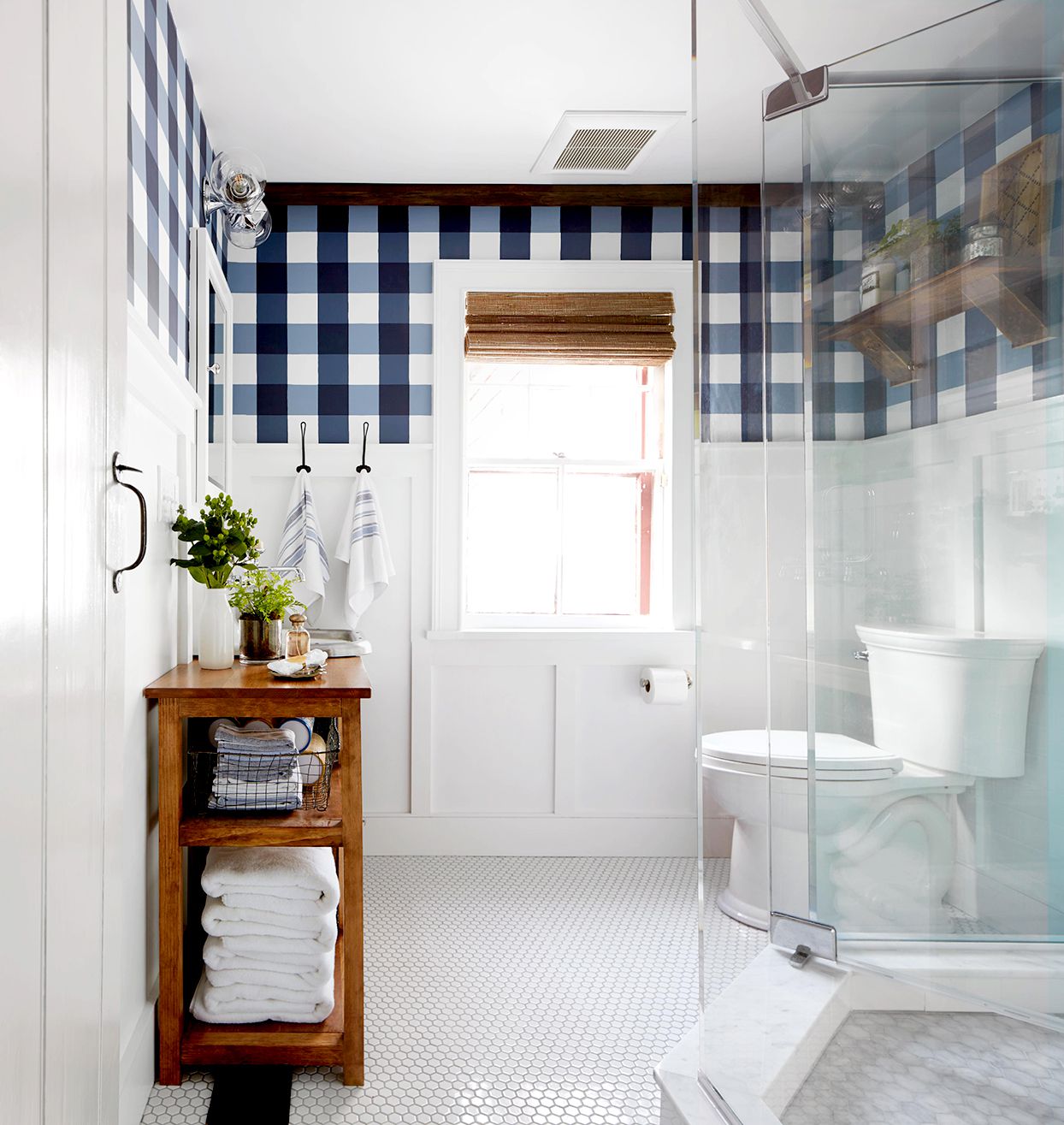
You do not need actual molding to create the look of a chair rail. Paint the lower third or lower half of the wall in a deeper color and keep the top lighter. This wall painting idea works beautifully in hallways, kids’ rooms, entryways, bathrooms, breakfast nooks, and casual dining spaces.
Try olive green below and creamy white above, dusty blue below and pale gray above, or warm terracotta below and soft beige above. The darker lower section grounds the room and can also help disguise everyday scuffs. Stylish and practical? That deserves applause and maybe a snack.
5. Add Vertical Stripes to Make Walls Feel Taller
Vertical stripes create the illusion of height, making them ideal for low-ceiling rooms, narrow hallways, powder rooms, and small bedrooms. Wide stripes feel modern and bold, while thin stripes feel more traditional and tailored.
For subtle elegance, use two shades from the same color family, such as soft beige and warm ivory or pale blue and slightly deeper blue. For a playful space, try cheerful combinations like white and butter yellow or blush and coral. Measure carefully, use quality painter’s tape, and remove the tape before the paint fully dries for cleaner lines.
6. Use Horizontal Stripes to Widen a Narrow Space
Horizontal stripes can visually stretch a room, making them useful in tight hallways, small bathrooms, laundry rooms, and compact guest rooms. A single thick horizontal stripe behind a bed or sofa can also act like a painted headboard or art band.
Keep the palette controlled so the room does not start looking like a beach towel with furniture. Soft neutrals, coastal blues, muted greens, or warm earth tones usually work best.
7. Paint a Geometric Accent Wall
A geometric wall turns paint into architecture. Triangles, diamonds, rectangles, and angled blocks can create a custom look without wallpaper or paneling. This idea is especially effective in home offices, playrooms, teen bedrooms, creative studios, and modern living rooms.
Choose three to five colors that share an undertone. For example, pair clay, cream, taupe, and rust for an earthy palette, or use navy, slate blue, pale gray, and white for a crisp contemporary style. Sketch the design first, tape patiently, and remember that “random” shapes look better when secretly planned.
8. Paint an Arch Behind Furniture
A painted arch is a simple way to frame a bed, desk, reading chair, console table, or nursery crib. It adds softness to boxy rooms and creates a focal point without requiring new furniture. Rounded shapes feel friendly and relaxed, which is why painted arches became a favorite in bedrooms, apartments, and small-space design.
Use warm beige, muted coral, sage green, dusty blue, or clay pink for a look that feels stylish but not overwhelming. For best results, use a pencil, string, and level to map the shape before painting.
9. Choose a Painted Mural for Personality
A mural does not have to mean a museum-level landscape with tiny deer and heroic clouds. It can be abstract, botanical, minimalist, coastal, celestial, or playful. A simple mountain mural in a child’s room, a large botanical silhouette in a dining room, or an abstract wash of color in a living room can make the space feel custom.
Murals work best when the rest of the room gives them breathing room. Let the mural be the main character, and keep nearby furniture, bedding, or art from starting a visual argument.
10. Try Ombre or Gradient Walls
Ombre walls blend one shade into another, creating a soft, artistic effect. This idea works beautifully in bedrooms, nurseries, meditation corners, creative studios, and bathrooms. A blue-to-white gradient can feel like sky. A terracotta-to-blush gradient adds warmth. A green gradient can bring a calm, nature-inspired mood indoors.
The technique requires patience, but the effect can be stunning. Use colors from the same family for a sophisticated result, and blend while the paint is still workable. Translation: this is not the project to begin at midnight after three cups of coffee.
11. Paint Trim the Same Color as the Walls
Matching trim and walls creates a seamless, modern look. It can make older rooms feel updated and small rooms feel less chopped up. This approach works especially well in bedrooms, living rooms, offices, and hallways with lots of doors or molding.
If you want subtle dimension, keep the same color but change the finish: eggshell on walls and satin on trim. The room will feel cohesive, but the trim will still catch the light.
12. Highlight Architectural Details with Contrast
If your home has built-ins, crown molding, wainscoting, beams, niches, or arched doorways, paint can help those features shine. A darker color inside built-in shelves adds depth. A contrasting color on window trim can frame the view. A painted niche can turn a forgotten corner into a display moment.
This idea is perfect for older homes with character, but it also works in newer spaces that need a little personality. Paint is basically eyeliner for architecture: use it to define the good features.
13. Use Warm Neutrals for a Cozy Whole-Room Refresh
White walls are classic, but warm neutrals can feel more inviting. Think cream, oatmeal, mushroom, clay beige, warm gray, and soft taupe. These colors work well in living rooms, bedrooms, open-concept spaces, and homes with wood floors or natural textures.
Warm neutrals are also flexible. They pair with black accents, brass fixtures, woven baskets, linen fabrics, leather furniture, colorful art, and plants. In other words, they play nicely with others, which is more than we can say for some dining chairs.
14. Add Drama with Moody Dark Paint
Dark paint can make a room feel elegant, cozy, and surprisingly expansive when used well. Deep navy, charcoal, espresso, plum, oxblood, and dark green are excellent choices for dining rooms, bedrooms, libraries, media rooms, and powder rooms.
The trick is balance. Add warm lighting, reflective surfaces, textured fabrics, and lighter artwork or rugs. A dark room without lighting feels like a cave. A dark room with layered lighting feels like a private club where the chairs are comfortable and nobody asks you to network.
15. Paint a Faux Headboard
If your bedroom needs a focal point but a new headboard is not in the budget, paint one. A rectangular panel, rounded arch, scalloped shape, or oversized color block behind the bed can anchor the room instantly.
For a calm bedroom, use soft green, muted blue, warm beige, or dusty rose. For a bold bedroom, try terracotta, navy, black, or deep olive. Make the painted area wider than the bed so it looks intentional and generous, not like the bed is wearing a tiny hat.
16. Paint the Back of Shelves or Built-Ins
This is a low-risk, high-reward painting idea. Paint the inside back panel of a bookcase, kitchen shelf, bathroom cabinet, or built-in unit. It adds depth and makes books, dishes, art, and collectibles stand out.
Try charcoal behind white dishes, sage behind books, navy behind brass accents, or blush behind glassware. Because the painted area is smaller, you can use a stronger color without overwhelming the room.
17. Use Color Blocking to Define Zones
Color blocking is ideal for open floor plans, studio apartments, kids’ rooms, and multipurpose spaces. Paint can visually separate a workspace from a living area, a reading nook from a bedroom, or a play corner from the rest of a room.
For example, paint a rectangle behind a desk to create a home office zone, or use a soft color block behind a dining table in an open kitchen. The effect is cleaner than adding extra furniture and cheaper than building walls, which your landlord will appreciate.
18. Try Painted Wainscoting or Faux Paneling
Faux paneling uses paint and sometimes thin molding to create the look of classic wall detailing. You can paint the lower wall a contrasting color, add simple picture-frame molding, or use tape to mimic panels without carpentry.
This idea works beautifully in dining rooms, entryways, powder rooms, and bedrooms. For a traditional look, try deep blue, green, or charcoal on the lower portion with a lighter upper wall. For a cottage look, use soft cream, sage, or dusty blue.
19. Paint Doors for a Surprise Pop
Interior doors are often plain white by default, but painting them can make a space feel designed. A black door adds crisp contrast. A soft blue door brings charm. A deep green door feels timeless. A red, coral, or mustard door adds personality without taking over the room.
This is a great option if you want color but do not want to repaint every wall. It also works well in hallways, where painted doors can turn a pass-through space into a design feature.
20. Choose Limewash or Textured Paint Effects
Limewash-style and textured finishes create movement, softness, and depth. They are especially popular in bedrooms, living rooms, dining rooms, and spaces with organic modern, Mediterranean, rustic, or minimalist decor. The finish can make a plain wall feel handmade and layered.
Soft beige, stone, clay, warm gray, and muted green are beautiful choices. These finishes usually require a specific application technique, so test first. A sample board is your friend. It will not judge you.
21. Paint Small Spaces Boldly
Small rooms do not always need white paint. Powder rooms, closets, mudrooms, laundry rooms, and tiny offices can handle bold color because they are contained. Try emerald green, raspberry, navy, eggplant, burnt orange, or dramatic black.
In fact, small spaces are often the best places to experiment. If you love a bold shade but fear commitment, start with a powder room. It is small, fun, and guests will think you are brave and stylish instead of someone who panicked in the paint aisle.
How to Choose the Right Wall Painting Idea
Consider the Room’s Purpose
Before choosing a paint idea, ask what the room needs to do. A bedroom should support rest, so calming colors and soft contrasts often work well. A home office may benefit from energizing tones or a strong accent wall behind the desk. A dining room can handle more drama because evening lighting makes rich colors glow.
Study the Natural Light
Paint changes throughout the day. A color that looks creamy in morning light may turn yellow at night. A gray that looks elegant online may look chilly in a north-facing room. Always test samples on the actual wall and observe them in morning, afternoon, and evening light.
Think About Finish
Flat and matte finishes hide imperfections but can be harder to clean. Eggshell is a common choice for living spaces because it balances softness and durability. Satin and semi-gloss are useful for trim, doors, bathrooms, and high-traffic zones. Glossy finishes can look glamorous, but they also reveal flaws faster than a toddler reveals family secrets in public.
Connect Paint to Existing Decor
Your paint should work with what already exists: floors, countertops, tile, rugs, furniture, curtains, and artwork. Pull inspiration from a rug pattern, wood tone, stone surface, or favorite piece of art. This keeps the room cohesive and helps avoid the classic mistake of choosing a color in isolation under fluorescent store lighting.
Practical Painting Tips Before You Start
Prepare the Wall Properly
A beautiful paint job begins before the can opens. Clean the wall, patch holes, sand rough spots, remove dust, and tape carefully. Preparation may not be glamorous, but neither is a lumpy wall that looks like it lost a fight with a stapler.
Use Primer When Needed
Primer is helpful when covering dark colors, painting over stains, switching from glossy to matte finishes, or painting new drywall. It improves coverage and helps the final color look more even. Skipping primer may save time at first, but it can cost more in extra coats later.
Invest in Better Tools
A good angled brush, quality roller, sturdy tray, extension pole, drop cloth, and painter’s tape can make the job smoother. Cheap brushes shed bristles into wet paint, which is one of life’s tiny but memorable betrayals.
Paint in the Right Order
Start with the ceiling if it is part of the project, then move to walls, then trim and doors. Cut in along edges with a brush, then roll the larger areas while the edges are still wet enough to blend. Work in sections and maintain a wet edge to reduce lap marks.
Extra Experience: What Real Wall Painting Projects Teach You
After looking at enough painted rooms, DIY makeovers, designer projects, and everyday home updates, one lesson becomes clear: paint is simple, but decisions around paint can feel oddly emotional. People are not just choosing blue or beige. They are choosing how they want to feel when they walk into the room after a long day. They are choosing whether the hallway should be quiet or cheerful, whether the bedroom should feel like a retreat, and whether the dining room should finally stop looking like a place where unused mail goes to retire.
One of the best experiences with wall painting is discovering how much a small change can do. A painted arch behind a desk can make a work-from-home corner feel intentional. A rich accent wall behind a bed can make mismatched furniture look curated. Painting interior doors can make a plain hallway feel finished. Even painting the inside of a bookcase can make old shelves feel custom, especially when the color picks up tones from nearby art or textiles.
Another lesson: sample paint is not optional. It is tempting to choose a color from a tiny paper chip and confidently march forward like a decorating warrior. Unfortunately, paint chips lie by omission. They do not show how the color behaves in your room, beside your floor, under your lamps, next to your sofa, or during that strange late-afternoon light that makes everything look slightly dramatic. Testing paint on the wall saves money, time, and the awkward feeling of realizing your “soft beige” is actually “aggressive banana.”
Experience also shows that bold colors are often less scary once they are applied with intention. A deep green powder room can feel luxurious, not gloomy. A navy dining room can feel intimate, not dark. A terracotta laundry room can make chores slightly less tragic. The key is to balance bold paint with good lighting, simple accessories, and finishes that support the mood. If the room has no natural light, warm bulbs and reflective accents can make a dramatic paint color feel cozy instead of heavy.
For beginners, the easiest wins usually come from contained projects. Paint one wall, a door, a closet interior, a small bathroom, or the lower half of a hallway. These projects build confidence without turning your whole home into a construction zone. They also help you learn basic skills: taping clean lines, rolling evenly, cutting in corners, and understanding how much paint your wall actually drinks. Spoiler: thirsty walls are real.
For renters, wall painting can still be possible with permission, but temporary-looking painted shapes are especially useful because they create impact without major renovation. A color-blocked rectangle behind a desk, a soft arch behind a bed, or painted shelves can personalize a rental while keeping the project manageable. If repainting before moving out is required, choose one or two high-impact areas instead of painting every wall in sight.
Finally, the most important experience is this: a painted wall does not have to be perfect to be beautiful. Homes are lived in. Walls get bumped, touched, patched, and repainted. The goal is not to create a museum. The goal is to create a space that feels better every time you enter it. Good paint choices support daily life. They make morning coffee nicer, movie nights cozier, work corners sharper, and guest bathrooms more memorable than they have any right to be.
Conclusion
Wall paint is one of the most powerful design tools in any home. It can create structure, mood, contrast, warmth, playfulness, and personality without requiring a full renovation. From classic accent walls and vertical stripes to color drenching, painted ceilings, murals, arches, and bold small spaces, these 21 wall painting ideas for any space offer something for every style and comfort level.
The best idea is not always the trendiest one. It is the one that works with your light, your furniture, your room’s purpose, and your actual life. Start with samples, prepare your walls, choose the right finish, and give yourself permission to have fun. After all, paint is not permanent. It is design with an undo button, a roller, and occasionally a pair of pants you will never wear in public again.