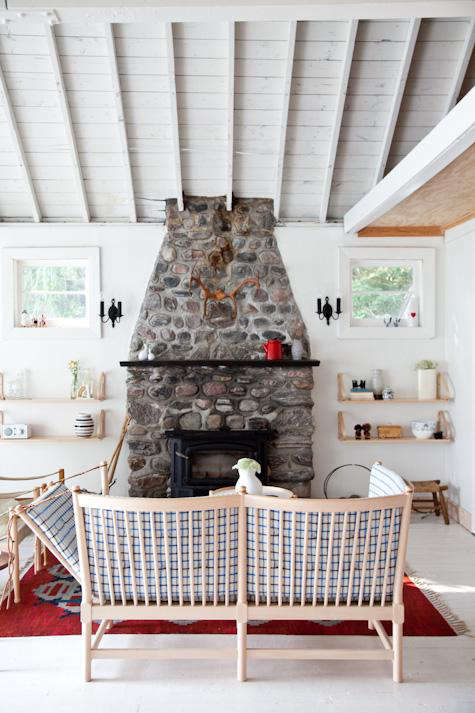
If a summer cabin, a Scandinavian design manual, and a very calm Japanese tea room all got together and decided to raise a wonderfully stylish child, the result might look a lot like Juli and John Baker’s Canadian retreat. This is not the kind of house that screams for attention from the roadside. It does not wave a giant “look at me” flag made of shiplap and trend forecasts. Instead, it quietly wins you over with white-painted walls, honest materials, vintage treasures, and the kind of restraint that makes every object feel as though it earned its place.
That quiet confidence is exactly what makes House Call: Juli and John Baker in Canada such an enduring design story. The Bakers, founders of Toronto’s Mjölk, have long been associated with interiors that blend Scandinavian clarity with Japanese warmth, utility, and reverence for craft. Their cabin in Canada translates that point of view into a place that feels deeply personal rather than overly polished. It is minimalist, yes, but not in the cold, suspiciously joyless way that makes you afraid to set down a coffee mug. This home has soul. Better yet, it has a sense of humor about itself.
Who Are Juli and John Baker?
Before the cabin became a small icon of relaxed design, Juli and John Baker were already known in the interiors world through Mjölk, their Toronto lifestyle shop and gallery. The store built its reputation around functional, timeless objects and an elegant mix of Scandinavian and Japanese design traditions. That background matters, because their home is not a random pretty space assembled for a photo shoot. It is the lived-in extension of a design philosophy they have been refining for years.
And that philosophy is refreshingly unpretentious. The Bakers are clearly serious about craftsmanship, but they are not snobs about where things come from. In this house, a handsome vintage chair can happily coexist with IKEA kitchen cabinets. A beautiful tabletop can arrive with a backstory involving a movie shoot accident and a bargain price. A shell-framed painting can stay on the wall precisely because it prevents the room from becoming too serious. In other words, this is a design-savvy home that still remembers how to exhale.
A Family Cabin, Not a Blank-Slate Fantasy
Part of what gives the house its emotional gravity is its origin story. This was not a brand-new build staged to perfection and dropped onto the landscape like a catalog fantasy. The property came from Juli’s family, and the cabin had history long before the couple began reshaping it. That family connection changes the whole tone of the renovation. Instead of treating the home like a design experiment, the Bakers approached it like caretakers with better taste and a lot more white paint.
When they took it on, the house was reportedly cramped, musty, and crowded with years of accumulated clutter. Their solution was not to bury the past under layers of flashy upgrades. They stripped the place back to its original state, painted the walls and floors white, and let the architecture breathe again. It is a simple move, but not a simplistic one. White in this home is not emptiness. It is editing. It is light. It is room to notice the grain of wood, the curve of a chair, the humor of a shell frame, and the lake-country softness coming through the windows.
Why the White Works
White interiors can go wrong very quickly. One minute you are aiming for airy serenity; the next minute you are accidentally living inside an aggressively expensive marshmallow. But in the Baker house, white works because it is balanced by texture, age, and material honesty.
It lets the light do the decorating
The white walls and floors turn the entire cabin into a reflector for daylight. In a lakeside setting, that matters. Instead of fighting the natural mood of the place, the palette amplifies it. The result is brightness without brashness and calm without boredom.
It gives vintage finds room to shine
The Bakers understand that a restrained backdrop is not the enemy of personality; it is often the thing that makes personality visible. Vintage dining chairs, an old yacht photograph, a Dala horse watercolor, and a well-chosen sofa all feel more vivid because the room around them is quiet. This is the design equivalent of lowering the background music so the good conversation can finally be heard.
It keeps the cabin from becoming a cliché
Many cabins lean hard into rough-hewn nostalgia: antlers, plaid, enough knotty pine to make the walls feel like they are closing in. The Baker house avoids that trap. It still feels rooted in place, but it does so with a lighter touch. The mood is less “lumberjack costume party” and more “let’s make coffee and talk about architecture by the lake.”
The Kitchen Is Clever, Not Flashy
If the kitchen had a slogan, it would probably be: “We do not need a marble island the size of a small nation.” One of the smartest things about this home is how confidently it uses modest materials. Juli has shared that they assembled IKEA cabinets themselves, finished the wall and ceiling in fir plywood boards, and saved money by using a birch plywood countertop sealed with a clear finish.
That combination tells you a lot about the Bakers’ priorities. They value function. They value warmth. They value surfaces that feel human rather than over-engineered. And perhaps most importantly, they understand that a beautiful room is not necessarily the one with the fanciest receipt. Sometimes it is the one where practical decisions are made with clarity and taste.
The kitchen’s appeal also lies in how cohesive it feels. Nothing is trying too hard. The woods are warm. The forms are straightforward. The open, pared-back composition gives everyday objects a visual role. A kettle, a dish rack, a row of tools, a good cutting board: these are not hidden away as if daily life were embarrassing. They are part of the beauty.
Scandinavian Calm, Japanese Restraint, Canadian Soul
Today, a lot of people would probably describe the Bakers’ style as Japandi, even though their work has always felt more grounded than trendy labels. What makes the house compelling is that it genuinely reflects the overlap between Scandinavian and Japanese aesthetics: simplicity, natural materials, uncluttered spaces, craftsmanship, and comfort without excess.
But this cabin does not feel like a textbook exercise in design theory. It feels lived in. It has the warmth of Scandinavian interiors without drifting into sugary coziness. It embraces Japanese ideas of imperfection and usefulness without becoming solemn or overly precious. And because it sits in Canada, on a family property by the water, it also carries a distinctly local humility. The whole place feels like it understands weather, weekends, work, memory, and the value of a room that does not need to perform for social media every second of the day.
That is the magic here: the Bakers do not simply decorate with beautiful things. They create an atmosphere where beauty comes from use, age, calm, and a few delightfully offbeat details. This is why the shell-framed artwork matters. This is why a vintage bargain table matters. This is why the home feels memorable rather than merely tasteful. Taste alone can be a little boring. Character is what keeps a house alive.
Design Lessons Worth Stealing, Politely
1. Strip back before you add on
The Bakers’ first move was subtractive. They removed clutter and visual noise before introducing new layers. That is a lesson many homeowners skip because buying things feels more exciting than editing them. But the fastest route to a better room is often removing what is not helping.
2. Mix high and low without apology
This house proves that great interiors do not depend on luxury-only shopping. A room becomes interesting when the mix is thoughtful, not when every item arrives in velvet packaging. Designer pieces, handmade objects, thrifted finds, and flat-pack basics can absolutely coexist. Frankly, they should. A house where everything is precious can start to feel like a museum gift shop.
3. Use white as a canvas, not a cop-out
White works best when it highlights texture, craftsmanship, and contrast. Pair it with wood, natural light, old objects, and strong silhouettes, and it becomes timeless. Use it without depth and the room can feel like an unfinished rental. The Bakers chose the first path, thankfully.
4. Let everyday tools be beautiful
One of the strongest ideas in the Baker world is that daily rituals matter. Coffee gear, dishes, stools, shelves, linens, and storage are not afterthoughts. They shape how a home feels. When useful things are also well-made and well-placed, the house becomes more than attractive. It becomes satisfying.
5. Leave room for wit
A home should not feel terrified of humor. The shell-framed painting and other quirky pieces stop the cabin from drifting into holy minimalism. Good design does not have to wear a turtleneck and speak in whispers. Sometimes it can wink.
Why This House Still Feels Fresh
More than a decade after it was first featured, the Baker cabin still feels relevant because it never chased novelty in the first place. It leans on principles that age well: natural materials, careful editing, functional planning, collected vintage, and a willingness to let imperfection stay visible. Those choices do not expire every time the algorithm changes its mind.
In an era of fast interiors and quick trend cycles, this home remains a useful reminder that restraint can be richer than excess. The cabin is not empty. It is intentional. It is not sterile. It is clear. It is not trying to look expensive. It is trying to feel right. That is a much harder target to hit, and the Bakers hit it beautifully.
The Experience of a House Like This: 500 Extra Words on What It Feels Like
What makes House Call: Juli and John Baker in Canada linger in your mind is not just the layout or the furniture list. It is the feeling of being there, or at least the feeling the house projects so convincingly that you can practically hear the kettle warming up. This is a home that seems to slow your pulse the second you imagine stepping inside.
You enter and the first surprise is not luxury. It is relief. There is relief in the white-painted walls, relief in the open sightlines, relief in the fact that nothing is shouting. So many homes today seem desperate to impress you within the first four seconds. Giant light fixture! Statement island! Dramatic slab! This house takes a different route. It acts as if it has nothing to prove, which naturally makes it cooler than almost everything else in the room.
Then the textures start doing their quiet work. The wood does not gleam like it has been shellacked into submission. It feels warm, practical, and believable. The vintage pieces add that wonderful sensation that someone with an actual eye lives here, someone who can spot value, history, and humor in objects other people might walk right past. The space feels curated, yes, but not overly managed. You get the sense that if a book were left on the table or a sweater landed over the back of a chair, the room would not collapse into aesthetic despair.
And then there is the kitchen, which might be the most likable room of all. It is beautiful in the least annoying way possible. You can imagine chopping vegetables there, stacking dishes there, leaning on the counter with a coffee, or opening a window while dinner simmers. The modest materials are part of the charm. Because the room is not built around spectacle, it feels available for real life. It invites use. It forgives use. That is rarer than people think.
The emotional center of the house, though, may be the tension between refinement and memory. This is not just a styled retreat by the water; it is a family property reshaped with care. That backstory gives the house weight. It feels connected to time, to inheritance, to the gradual act of making something old feel true again. Even the imperfections become part of the appeal. The place does not pretend it arrived fully formed from a luxury catalog in one dramatic delivery. It was worked on. Lived in. Improved. Understood.
Imagine a weekend there. Morning light lands softly on white floors. Someone makes coffee. The lake is doing its usual show-off routine outside, all shimmer and breeze. There is probably jazz somewhere in the background, because of course there is. Breakfast happens without ceremony, but the room makes it feel ceremonial anyway. Later, a chair gets dragged into the best patch of light for reading. At some point, somebody notices how good an old picture frame looks against the wall and feels vaguely inspired to stop buying soulless things online at midnight.
That is the deeper experience this house offers: it changes your standard for what “nice” means. Nice no longer means bigger, shinier, or more expensive. Nice starts to mean calmer. More thoughtful. Better used. More personal. More breathable. More honest. By the end of the mental visit, you are not fantasizing about recreating every exact item. You are fantasizing about recreating the mood. And really, that is the highest compliment any home can receive.
Final Thoughts
Juli and John Baker’s house in Canada remains compelling because it solves a challenge many homes never quite crack: how to be minimal without being cold, stylish without being rigid, and personal without becoming cluttered. Their retreat is proof that the most memorable interiors are not necessarily the loudest. Often, they are the ones that trust natural light, trust craftsmanship, trust editing, and trust a few beautifully strange details to do the talking.
So yes, this cabin is gorgeous. But more importantly, it is convincing. It makes a persuasive argument that a home can feel elevated and relaxed at the same time. It can honor family history and still feel modern. It can be disciplined without being humorless. And it can absolutely pair IKEA cabinets with vintage Scandinavian furniture and come out looking cooler than most homes that spent ten times more trying.