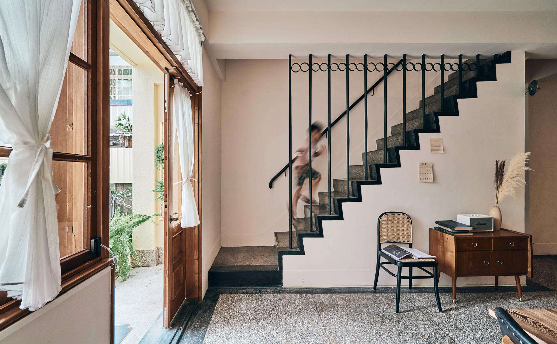
Some cafes announce themselves with glowing signs, polished storefronts, and enough branding to make a coffee bean feel underdressed. Home Home Cafe in Taichung takes the opposite approach. Tucked among residences and taller urban buildings, it looks as though someone’s stylish grandfather simply opened the front door and invited the neighborhood in for brunch.
Created from an aging, Japanese-influenced two-story house, Home Home demonstrates how adaptive reuse can preserve memory without turning a building into a museum exhibit. Taichung-based Big Sense Design retained much of the original layout, reused architectural elements, introduced carefully placed circular openings, and allowed wood, terrazzo, greenery, and daylight to do most of the talking.
The result is neither a theatrical “retro cafe” nor a clinical renovation wearing one vintage chair as an apology. It is a layered, welcoming space where the old house remains recognizable, yet clearly belongs to a new chapter.
From Private Residence to Neighborhood Cafe
Home Home Cafe began as a longstanding private residence in Taichung’s West District. The approximately 148-square-meter project, equal to about 1,593 square feet, was designed and constructed between late 2018 and spring 2019. Rather than flattening the property and starting over, the design team treated the existing house as the main ingredient.
The owner’s original concept was emotional rather than stylistic: guests should feel as though they were returning to a familiar grandfather’s home. That brief could easily have produced a room full of clocks, lace doilies, and furniture that threatens your lower back. Big Sense chose a subtler path. The designers focused on warmth, modesty, domestic scale, and the comforting irregularity of an actual home.
That decision matters because houses and restaurants organize behavior differently. A conventional restaurant often relies on a broad dining room, obvious service routes, repeated furniture, and a strong visual hierarchy. A residence is divided into smaller rooms, thresholds, stairs, windows, and private corners. Home Home preserves those domestic transitions, allowing visitors to experience the cafe as a sequence rather than a single commercial floor.
A Business That Does Not Erase the Building
The strongest adaptive-reuse projects do not merely occupy old structures; they learn from them. At Home Home, the original proportions and circulation patterns became design assets. Existing partitions were largely retained so that each dining area still feels like a room in a house. Customers can settle near a window, gather around a communal table, or occupy a smaller corner that feels pleasantly removed from the crowd.
This approach keeps the building’s history legible. The cafe does not pretend that the house was always designed for brunch service. Instead, it lets the slight awkwardness of conversion become part of the experience. There are turns, framed views, changes in intimacy, and glimpses between rooms. Efficiency is present, but it does not march around wearing a clipboard.
A Garden Entrance That Slows the City Down
The transformation begins before visitors reach the front door. The house sits back from the lane, with a generous front setback that once felt closed and private. The renovation opened the former gated entrance and reimagined the outdoor area as a planted arrival court.
Ferns, upright tropical foliage, and layered greenery soften the path into the property. Wood decking and simple outdoor furniture create an easy transition between street and interior. A light, slatted structure provides partial enclosure without forming a visually heavy wall. Its circular opening offers the first hint of a shape that appears repeatedly throughout the project.
This courtyard is not decorative leftover space. It performs several useful jobs at once. It identifies the cafe from the lane, creates separation from traffic, accommodates outdoor seating, filters views, and gives arriving guests time to adjust their pace. The building does not shout, “Coffee over here!” It clears its throat politely from behind the plants.
The garden also helps the old house coexist with its denser surroundings. Taller buildings may rise nearby, but the green foreground creates a small world at pedestrian level. What could have felt like a vulnerable old structure overshadowed by urban development instead feels protected, deliberate, and quietly self-assured.
Preserving the Old Layout Without Freezing It in Time
Inside, Big Sense kept most of the house’s existing partitions. This choice protected the domestic atmosphere but presented a practical challenge: restaurant employees needed better sightlines between compact rooms.
The solution was a series of large circular openings cut into selected walls. These porthole-like forms allow daylight and views to travel farther through the plan. Staff can monitor adjacent dining areas, while guests receive playful glimpses of movement, furniture, and food arriving in the next room.
The circles are memorable, yet they do not compete with the old architecture. Their dark frames relate to the charcoal-painted ceiling structure, giving the renovation a clear contemporary identity. At the same time, their softness balances the house’s rectangular doors, windows, tables, and tile patterns.
Why the Circular Openings Work
A circular opening is more than an Instagram-friendly detail. It creates a strong visual connection without completely merging two spaces. Unlike removing an entire wall, it preserves the sensation of passing from room to room. Unlike a small window, it feels generous enough to share light and activity.
This is a useful lesson for compact cafe design. Openness does not always require an open floor plan. Strategic apertures, internal windows, partial-height walls, and framed views can improve orientation while preserving intimacy. Home Home feels connected, but it never becomes a cafeteria with better chairs.
Materials That Carry Memory
The material palette combines original features with restrained new additions. Gray terrazzo floors reflect afternoon light from the large wooden windows. White walls brighten the rooms without erasing their age. Timber doors, communal tables, and bentwood or Windsor-style chairs provide warmth, while simple pendant bulbs keep the visual field uncluttered.
Upstairs, broad wooden windows invite sunlight deep into the interior. Exposed roof rafters and a charcoal-painted ceiling add depth above the pale walls. Rather than hiding the roof behind a smooth new surface, the design reveals the structure and allows the upper level to feel taller.
One of the most thoughtful moves involved the reuse of old iron window grilles. Removed from exterior positions, they were retained as interior installations and decorative screens. These pieces hold local associations with Taiwanese residential architecture, security, and craftsmanship. Reusing them avoids the empty nostalgia of purchasing newly manufactured “vintage-style” objects.
Brass accents appear in carefully controlled doses. Industrial piping was adapted into door pulls, adding a little polish without turning the entrance into a jewelry counter. White curtains at the wooden doors reinforce the residential character, while hanging ferns make the transition from garden to interior feel almost seamless.
Old, New, and Refreshingly Unlabeled
Home Home does not force itself into a single design category. It contains Japanese-influenced calm, Taiwanese terrazzo and metalwork, Nordic-looking furniture, subtropical planting, and contemporary geometric interventions. On paper, that mixture sounds like five mood boards fighting over one wall. In practice, the muted colors and honest materials bring everything into balance.
The design succeeds because it prioritizes atmosphere over labels. Guests do not need to identify every historical influence. They simply recognize that the space feels lived-in, relaxed, and assembled over time.
How the Menu Supports the Idea of Home
The cafe was conceived as a brunch destination, with souffle-style pancakes among its signature offerings. These tall, soft pancakes suit the building unusually well. They are familiar but a little special, comforting but visually memorablethe culinary equivalent of an old house receiving a clever new doorway.
The original concept also emphasized ingredients sourced from Taiwanese small-scale farms. That local focus strengthened the idea of returning to recognizable childhood flavors rather than importing an entirely foreign cafe identity. Food and architecture tell the same story: preserve what feels familiar, refine it carefully, and present it with enough freshness to keep nostalgia from becoming dusty.
Domestic-scale dining rooms also change how brunch feels. Instead of facing a large commercial hall, guests eat near curtains, wooden windows, plants, shelves, and neighboring rooms. The environment encourages conversation and slower meals. A cup of coffee becomes less of a transaction and more of a temporary claim on a comfortable corner.
Adaptive Reuse as a Sustainable Design Strategy
Converting an existing house into a cafe can reduce the demand for new structural materials and avoid sending usable building components to a landfill. It also preserves embodied energythe resources already spent extracting materials, manufacturing products, transporting them, and constructing the original building.
Environmental value, however, is only one part of adaptive reuse. Old buildings contribute variety to streets that might otherwise become visually uniform. Their setbacks, rooflines, windows, gardens, and smaller rooms offer spatial experiences that are difficult to reproduce in new commercial construction.
Successful reuse requires judgment. Old does not automatically mean valuable, and preservation does not mean refusing every alteration. Buildings adapted for public use may require structural reinforcement, updated wiring, plumbing, ventilation, fire protection, accessibility improvements, and safer circulation. The goal is not to trap a property in its original condition. It is to make necessary changes while protecting the features that give the place its identity.
Home Home illustrates this balance. The designers changed the building enough to support hospitality operations, but not so aggressively that the old residence became unrecognizable. The intervention is confident, yet the house remains the star of the show.
A Cafe as a “Third Place”
Urban sociologists often use the term “third place” for gathering spaces outside the home and workplace. Cafes can serve this role particularly well because they support both solitude and sociability. A person may arrive alone with a book, meet a friend for lunch, work quietly for an hour, or join a long table where conversation travels farther than expected.
Home Home adds an amusing twist to the concept: it is a third place designed to feel like a first place. The building was literally a home, and its preserved rooms continue to communicate domestic comfort. Yet it is now open to a broader public, turning private architecture into shared neighborhood space.
The garden entrance, varied seating, human-scale rooms, and visible traces of age make the cafe feel less scripted than a standardized commercial interior. That informality can encourage repeat visits. People return not merely because a room is beautiful, but because they know where they like to sit, how the light changes, and which corner feels best on a quiet afternoon.
Design Lessons From Home Home Cafe
1. Begin With the Existing Building
Before selecting finishes, identify the property’s strongest qualities. At Home Home, those qualities included the two-story domestic plan, deep front yard, pitched wooden roof, large windows, terrazzo surfaces, and residential details. The renovation amplified them rather than covering them.
2. Preserve Useful Imperfection
Older houses rarely offer perfectly symmetrical rooms or effortless restaurant circulation. Some irregularity can make a hospitality space more memorable. The objective is to correct genuine safety and operational problems without sanding away every trace of character.
3. Use One Bold New Gesture
The circular wall openings provide a recognizable contemporary signature. Because the remaining design is restrained, the circles feel purposeful rather than gimmicky. One repeated idea is often stronger than a parade of unrelated “statement features.”
4. Treat Outdoor Space as Part of the Floor Plan
The planted entrance court shapes the visit as much as any interior room. It manages privacy, shade, orientation, seating, and atmosphere. Even a modest cafe can benefit from treating its threshold as usable space rather than somewhere to park a signboard.
5. Reuse Details, Not Just Walls
Keeping an old structure is valuable, but salvaging smaller elements adds another layer of continuity. Home Home’s reused ironwork carries a story that a new decorative panel could imitate but never truly possess.
6. Design for Operations Without Advertising Them
The circular openings improve staff visibility, demonstrating that functional solutions can contribute to the visual identity. Good hospitality design makes service easier while allowing guests to remain blissfully unaware of the logistical ballet behind their pancakes.
Experiencing Home Home Cafe: A Visit in Slow Motion
The experience of Home Home begins with a small moment of uncertainty. From the lane, the property could still be mistaken for a private residence. There is no monumental facade demanding attention. Instead, plants, wood, and a partially screened courtyard suggest that something welcoming is happening beyond the street.
As you enter the garden, the city begins to recede. Leaves interrupt views of neighboring buildings, and the path encourages a slower approach. The circular opening in the slatted structure acts like a camera lens, framing portions of the house and hinting at the visual game waiting inside. It feels less like walking into a restaurant and more like arriving early at the home of a relative who has recently become extremely good at interior design.
The wooden entrance doors and white curtains strengthen that impression. Once inside, there is no single grand reveal. The cafe unfolds through individual rooms, each offering a slightly different relationship to light, furniture, and movement. One space may feel social, with a long table and hanging bulbs. Another may provide smaller tables where conversation can remain private.
The circular openings create moments of connection. A server passes through the next room. Sunlight catches a tabletop. A souffle pancake appears briefly within the frame and then vanishes, which is a surprisingly effective way to make everyone reconsider what they ordered.
Moving upstairs changes the atmosphere again. Large wooden windows draw attention toward daylight, while the darker exposed ceiling makes the pale walls feel brighter. The terrazzo floor takes on different tones as the sun shifts. Nothing needs to flash, rotate, or announce that it is “interactive.” The interaction comes from walking, looking, sitting, and noticing.
At the table, the domestic scale becomes especially important. The soundscape is divided by walls rather than concentrated in one enormous room. Nearby activity remains perceptible without becoming overwhelming. Plants soften edges, wood warms the neutral surfaces, and old ironwork adds just enough texture to reward a closer look.
A brunch dish such as a souffle-style pancake fits naturally into this environment. Its preparation invites patience, and the setting makes waiting feel less like a delay. Guests can watch light move across the floor, study the salvaged grille in a wall niche, or speculate about how the rooms were used when the building was still a residence.
Eventually, leaving requires passing back through the garden. That reverse sequence provides a quiet conclusion. The cafe disappears behind foliage, and the surrounding city returns to full volume. What remains is not simply the memory of a meal or a photogenic room. It is the sensation of having temporarily inhabited another kind of Taichungslower, greener, and connected to the everyday architecture of an earlier period.
That is why Home Home Cafe stands out among house-to-cafe conversions. Its success does not depend on making the old building look dramatically new. It depends on helping visitors notice what was already worth keeping. The project shows that adaptive reuse can be commercially practical, environmentally responsible, and emotionally engaging at the same time.
Home Home is ultimately a lesson in hospitality through restraint. The garden welcomes without shouting. The rooms connect without losing intimacy. Historical details remain visible without becoming props. Contemporary additions improve function without dominating the architecture. In a world full of cafes designed to look perfect for fifteen seconds on a screen, this converted Taichung house offers something more durable: a place that feels better the longer you stay.