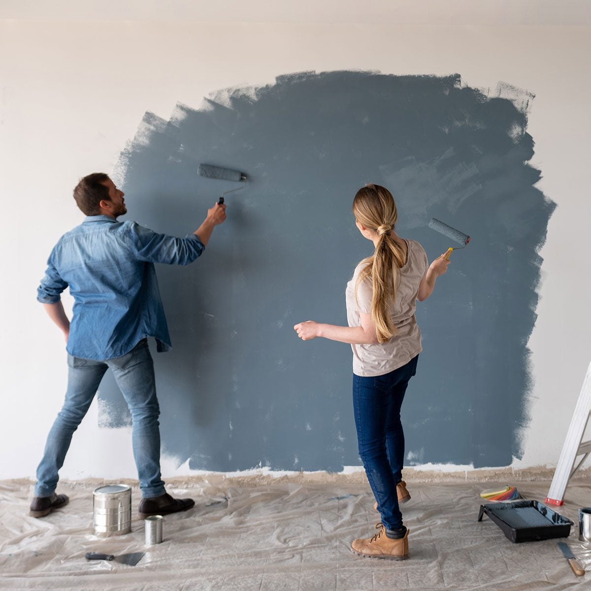
You have chosen the perfect paint color. The swatch looked sophisticated, the sample seemed promising, and the person at the paint counter gave you an encouraging nod. Then the first roller stroke hits the walland suddenly your tasteful sage green resembles radioactive pea soup.
Before you panic, return the paint, or blame the lighting department at the hardware store, let the coating dry. Wet paint rarely represents its final appearance accurately. Its color, undertones, depth, and sheen continue changing as water or solvent evaporates and the paint film forms.
So, do paints dry darker or lighter? The most useful answer is that most ordinary wall paints look slightly lighter, softer, or less intense after drying than they do when wet. However, the finished color may appear lighter or darker than the original swatch depending on sheen, lighting, the underlying wall color, surface texture, coverage, and even the bulb in your lamp.
Do Paints Dry Darker or Lighter? The Quick Answer
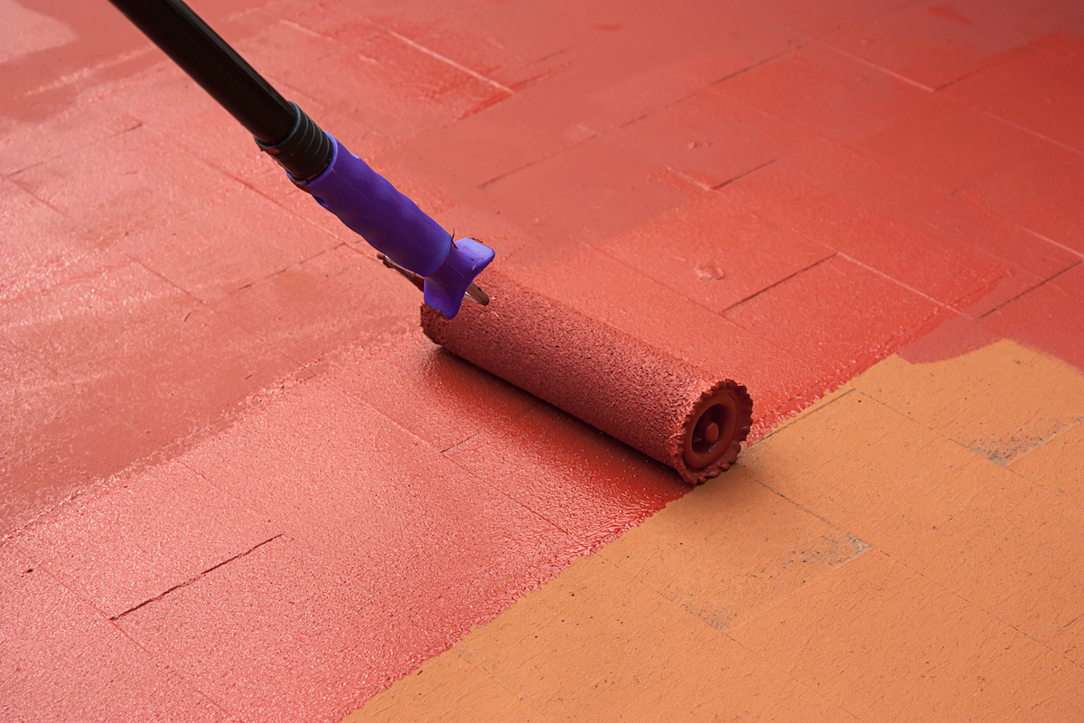
Wet paint typically looks darker and more saturated because its smooth, moist surface absorbs and reflects light differently from a dry coating. As the liquid portion evaporates, the surface develops its final texture and sheen. The result often looks a little lighter or less dramatically colorful.
That does not mean every paint follows one universal rule. When comparing dried paint with a printed color chip rather than with the wet coating, finish becomes especially important:
- Flat and matte paint may look lighter or chalkier than the swatch.
- Eggshell and satin paint usually remain relatively close to the intended color.
- Semi-gloss and high-gloss paint can look deeper or darker from some angles because their reflective surfaces intensify the color.
Major paint manufacturers and home-improvement retailers consistently emphasize that sheen changes how the eye perceives a color. A higher-gloss surface reflects more directed light, while a matte surface scatters light and produces a softer visual effect.
Why Wet Paint Usually Looks Darker
Paint contains pigments, binders, additives, and a liquid carrier. In water-based latex paint, that carrier is primarily water. In traditional oil-based coatings, it is a solvent. While the paint is wet, this liquid fills spaces between pigment and binder particles, creating a smoother surface that often gives the color a deeper, richer appearance.
As the liquid evaporates, the binder and pigment particles move closer together and form a solid film. The texture of that film determines how light is reflected or scattered. A matte coating has microscopic surface irregularities that scatter light in many directions, reducing shine and softening the apparent color. A glossy coating forms a smoother surface that reflects light more directly.
This is why a freshly painted navy wall can look almost black during application, then settle into a recognizable navy after drying. It is also why bright red, orange, or teal paint may initially appear alarmingly intense. Wet paint enjoys making dramatic entrances; dry paint is usually better behaved. Coatings research describes glossy surfaces as producing more directed reflection, while rougher matte surfaces scatter light across multiple angles.
How Paint Sheen Changes the Final Color
Flat and Matte Finishes
Flat and matte paints have little or no visible shine. Because they scatter or absorb more light, they often appear softer and somewhat lighter than the same color in a shinier finish. Dark matte colors can still look deep, but they tend to have a velvety quality instead of the crisp intensity produced by gloss.
These finishes are popular for ceilings, bedrooms, low-traffic rooms, and imperfect walls because their low reflectivity helps conceal dents, patches, and uneven texture. They are less forgiving when it comes to scrubbing, although modern washable matte formulas have improved considerably.
Eggshell and Satin Finishes
Eggshell and satin occupy the middle of the sheen scale. Eggshell has a subtle glow, while satin is slightly more reflective. In many rooms, these finishes reproduce the selected color more predictably than either very flat or very glossy paint.
They are common choices for living rooms, hallways, kitchens, bathrooms, and family spaces because they balance appearance with cleanability. Even so, a satin version of a color may look richer than its eggshell counterpart when light strikes the wall from the side.
Semi-Gloss and High-Gloss Finishes
Semi-gloss and high-gloss paints reflect substantially more light. Their colors can appear darker, sharper, or more saturated, particularly when viewed away from the brightest reflection. At the point where a lamp or window reflects directly from the surface, the paint may look temporarily lighter because of glare.
This combination can seem contradictory: the same glossy wall may look pale in one spot and deeper in another. That is not the paint changing color every three feet. It is the viewing angle changing the balance between reflected light and visible pigment.
Glossy finishes are commonly used on cabinets, doors, trim, and architectural details. They are durable and washable, but they also highlight brush marks, dents, and surface imperfections with the enthusiasm of a spotlight at a bad school play.
Lighting Can Make Dry Paint Look Completely Different
Paint does not generate its own color. You see the wavelengths of light reflected from its surface, which means the room’s lighting has enormous influence over the final result.
Natural Light
A wall near a sunny window may look lighter and clearer during the day. The same wall can become darker and more muted after sunset. Room orientation matters as well:
- North-facing rooms often receive cooler, steadier light.
- South-facing rooms generally receive stronger, warmer daylight.
- East-facing rooms are brightest in the morning.
- West-facing rooms become warmer and brighter later in the day.
A gray that feels calm at breakfast may look bluish by lunchtime and slightly purple in the evening. The paint formula has not changed; the available light has.
Artificial Light
Warm bulbs around 2700K emphasize yellow, cream, peach, red, and brown undertones. Cooler daylight-style bulbs can strengthen blue, green, and gray notes. That fashionable off-white may look buttery beneath warm LEDs and almost icy under a cooler bulb.
This is why judging a paint color under one store light is risky. Paint samples should be examined in the actual room during the morning, afternoon, evening, and nighttime. Benjamin Moore, Behr, Lowe’s, Dunn-Edwards, Consumer Reports, and other U.S. paint authorities recommend testing colors under multiple natural and artificial lighting conditions.
Does a Second Coat Make Paint Darker?
A second coat does not normally change the designed color formula. It improves coverage, opacity, uniformity, and depth. However, that improvement can make the wall appear lighter or darker depending on what lies underneath.
Suppose you are applying pale beige over a dark blue wall. The first coat may look muddy or darker because the blue background remains partially visible. The second coat blocks more of the old color, allowing the beige to look cleaner and lighter.
Now imagine applying deep green over white. The first coat may look thin, patchy, and surprisingly pale. After the second coat, the green gains full hiding power and looks richer, more consistent, and apparently darker.
The second coat is not secretly adding black pigment. It is simply helping the paint reach its intended opacity. Two coats are especially valuable when making a dramatic color change, using saturated colors, covering repairs, or painting a porous surface.
Other Reasons Dry Paint May Look Too Light or Too Dark
The Previous Wall Color Is Showing Through
Old paint can influence a new color until coverage is complete. Deep colors beneath pale paint can make the new shade look dull, while a white background can make a dark first coat look weak or unusually bright. A suitable primer creates a more consistent base and reduces interference from the previous finish.
The Surface Is Porous
Fresh drywall, joint compound, bare wood, and repaired patches can absorb paint unevenly. This creates areas with different sheen levels, sometimes called flashing. The wall may appear to contain several slightly different colors even though they came from the same can.
Priming porous surfaces helps control absorption and promotes a uniform finish. PPG and KILZ both recommend sealing inconsistent or highly absorbent surfaces when uniform color and sheen are important.
The Paint Was Not Mixed Thoroughly
Pigments and flattening agents can settle during storage. Stir the paint thoroughly before application and occasionally during a long project. If you are using several gallons of the same color, combine them in a larger bucketa technique known as boxing the paintto minimize small batch differences.
The Application Method Changed
Brushes, rollers, and sprayers leave different textures. Even when the color is identical, a smoother sprayed area may reflect light differently from a rolled wall. Touch-ups are especially noticeable when the original wall was rolled but the repair was dabbed with a brush.
The Paint Has Aged
Older paint can fade, collect dirt, or lose sheen. Fresh touch-up paint may therefore look darker, cleaner, or shinier than the surrounding wall. Matching the original color name is not always enough; the product, sheen, application tool, surface condition, and age must also be considered.
How Long Should You Wait Before Judging Paint Color?
Do not judge paint while it is wet, tacky, or only partly dry. Wait at least for the manufacturer’s stated drying period. Many interior water-based paints allow recoating after roughly one to two hours under favorable conditions, although the correct interval varies by product.
For a reliable color evaluation, wait until the sample is fully dry, preferably overnight. Apply the recommended second coat and inspect it again after another full drying period. Deep colors, cool temperatures, limited airflow, and high humidity can extend the process.
Also remember that “dry” and “cured” are not identical. Dry paint may be safe to touch or recoat, while curing is the longer process during which the coating develops its final hardness and resistance to washing. Color generally stabilizes well before complete curing, but sheen can continue settling as the film develops.
How to Test a Paint Color Correctly
- Buy a real paint sample. Screens and printed chips cannot reproduce every effect of pigment, texture, and sheen.
- Use the intended finish. A matte sample cannot accurately predict the appearance of a semi-gloss final coat.
- Prepare the background. Prime strong, dark, stained, or unevenly patched surfaces before testing.
- Create a large sample. Paint at least a 2-foot-by-2-foot section or use a large movable sample board.
- Apply two coats. One thin coat may not provide enough hiding power for an accurate judgment.
- Let each coat dry completely. Follow the product’s recoat instructions rather than relying on impatience and optimism.
- Move the sample around. Check bright walls, shadowed corners, spaces near windows, and areas beside flooring or cabinets.
- Observe it for several days. Review the color in morning sun, afternoon light, evening shadows, and under your normal lamps.
Large samples are important because colors usually feel more intense across an entire wall than on a small chip. Nearby flooring, furniture, countertops, trim, and fabrics can also create contrast that makes the paint seem warmer, cooler, lighter, or darker.
Frequently Asked Questions
Does latex paint dry darker or lighter?
Latex wall paint commonly looks slightly lighter or less saturated after drying than it appears when wet. The final result still depends on sheen, lighting, coverage, and the underlying surface.
Does acrylic paint dry darker or lighter?
Water-based acrylic paint often becomes somewhat lighter or less glossy as water evaporates. Artist acrylics can show a more noticeable wet-to-dry color shift than architectural wall paints, particularly in dark or transparent colors.
Does oil-based paint dry darker?
Oil-based and alkyd coatings may maintain a richer, glossier appearance than flat latex paint. They can still change as solvents evaporate, and some light-colored alkyd coatings may yellow gradually as they age, especially in areas with limited natural light.
Why does my paint look lighter than the sample card?
The finish may be flatter, the room may receive brighter or cooler light, or the printed card may not perfectly represent the actual coating. A white or highly reflective surrounding surface can also make the paint appear lighter.
Why does the same paint look darker on one wall?
One wall may receive less direct light, face a different window, have a different texture, or reflect nearby furnishings. Uneven primer, porosity, roller technique, or sheen can also produce visible differences.
Will paint become lighter after 24 hours?
Most of the obvious wet-to-dry shift should be complete within 24 hours under normal indoor conditions. If the paint still looks uneven, it may need another coat, additional drying time, or correction of an underlying surface problem.
Final Verdict
Most paints look darker, shinier, and more intense while wet, then become slightly lighter or softer as they dry. When dried paint is compared with a color swatch, however, the outcome depends heavily on finish. Flat paint may look lighter, eggshell and satin often remain fairly true, and glossy paint can look deeper or darker from certain angles.
The smartest approach is not to rely on a universal wet-versus-dry rule. Test the actual product, color, and sheen on a properly prepared surface. Apply two coats, allow sufficient drying time, and observe the result under the lighting you use every day. It is cheaper to live with a sample board for three days than to live with four gallons of “Why Is This Purple?” for five years.
Real-World Paint Color Experiences
The following scenarios reflect common experiences reported by homeowners, decorators, and professional painters. They illustrate why two people using the same paint color can reach completely different conclusions about whether it dried darker or lighter.
Experience 1: The Terrifyingly Dark First Coat
A homeowner chooses a medium blue-gray for a bedroom. On the paint chip, it looks quiet and relaxing. The first wet section looks almost navy, causing immediate concern that the room will resemble the inside of a storm cloud. After several hours, the surface loses its wet shine and appears noticeably lighter. The second coat evens out the roller marks, and the next morning the color finally resembles the sample.
The lesson is simple: dark wet paint can exaggerate depth and saturation. Judging it during the first ten minutes is like judging a cake while it is still batter.
Experience 2: The White Paint That Turned Yellow
Another homeowner samples a warm white in a kitchen. During the bright afternoon, it looks clean and neutral. At night, 2700K bulbs emphasize its cream and yellow undertones. The homeowner assumes the paint dried darker or changed color, but the real culprit is artificial lighting.
After replacing one bulb with a cooler 3500K LED, the wall immediately appears more neutral. Nothing about the dried paint has physically changed. The spectrum of light reaching it has changed.
Experience 3: One Color, Four Different Walls
A family paints an open living room with soft greige. The wall opposite the windows looks darker, the sunlit wall looks pale, a corner near the wood floor appears warmer, and the wall beside a blue sofa develops a faint cool cast.
At first, everyone suspects inconsistent mixing. Closer inspection shows that the coating is uniform. Shadows, reflected colors, window direction, and surrounding furnishings create four visual versions of the same formula. This is a classic reminder that paint color is a relationship between surface and lightnot an isolated number printed on a label.
Experience 4: The Mysterious Touch-Up Patch
A small scuff is repaired using leftover satin paint from the original can. The color name is identical, yet the patch looks darker and shinier. The wall was originally rolled, while the repair was applied heavily with a brush. The surrounding paint has also aged for several years and lost some sheen.
When the repair is lightly rolled and feathered over a wider area, the difference improves but does not disappear completely. Repainting the wall from corner to corner ultimately provides the uniform result the homeowner expected from the tiny touch-up.
Experience 5: The Second Coat “Changed” the Color
A DIY painter applies charcoal paint over a pale beige wall. The first coat looks streaky and lighter than expected, especially where the roller layer is thin. After the second coat, the charcoal appears darker, smoother, and more luxurious.
The paint did not become a darker formula. The second layer prevented the beige background from reflecting through weak areas. Full opacity allowed the intended charcoal color to appear consistently.
Experience 6: The Sample Board That Prevented a Costly Mistake
A couple considers three nearly identical green paints for a dining room. Instead of painting tiny squares side by side, they apply two coats to separate poster boards and move them around for four days. One shade looks elegant in daylight but muddy at night. Another becomes too blue near the windows. The third remains balanced under both natural and artificial light.
The winning color was not the favorite in the store. It was the one that behaved best in the actual room. That experience captures the most dependable rule in paint selection: never ask only whether paint dries darker or lighter. Ask how the fully dried paint looks on your surface, in your finish, beside your furnishings, under your lighting.
Editorial note: This article synthesizes practical guidance from major U.S. paint manufacturers, coatings specialists, retailers, testing organizations, professional painters, and home-improvement publications, including Sherwin-Williams, Benjamin Moore, Behr, PPG, Valspar, Rust-Oleum, Dunn-Edwards, KILZ, The Home Depot, Lowe’s, Consumer Reports, This Old House, CertaPro Painters, Bob Vila, and the American Coatings Association.